Monday 28 December 2020

Chadwick Boseman

It's only 28th December but a new year's artwork kicks off here.  I wanted to have another go at a black and white portrait against a black background with there being no distinction between the shadows on the back of the head and the black background.  I went with a portrait of the late Chadwick Boseman, the actor who played the Black Panther in the Marvel Universe films.  His death earlier this year was a big shock to many fans.

And here's the portrait.  As usual, the likeness isn't great but some character has come through.  There's a lot of resilience and pride in that face.   I'm pretty happy with this one.  He's up for sale, although he may end up in an Avengers collection at some point.

Wednesday 23 December 2020

Gestural Heather

Another go at an expressive, gestural bit of figure drawing.  I picked a pose by Heather for this one, wanting something simpler and quite liking how the hands were hidden.

The inky stick figure went down again first.  I found myself fleshing out the figure too much rather than keeping her sticky, so decided to overflesh her in places where underfleshing was no longer possible.  One thing I did differently in this one was to wet the pencil underdrawing with kitchen roll rather than a brush, just to keep things a bit less controlled.

I think Heather came out OK.  The inconsistencies between the outline and the underdrawing are looking a bit more obvious here, which helps.  The lines in the torso look more interesting too.  And having no facial marks on the head seems to work.  But, best of all, Heather's confidence is shining through here.  Could I improve in this?  The first thing that springs to mind is that maybe I should try something closer up next, cutting off the head and lower neck.  That might be interesting.

Anyway, Heather's up for sale.

Gestural AnaIv

I was in the mood to take some risks today, so I thought I'd have a go at a technique recommended by Bill Buchman in Expressive Figure Drawing. What he does is to effectively lay down a rough stick figure in ink, then go round it afterwards with outlines (including missing outlines) in some sort of pencil.  The pencil outlining is often at odds with the ink underdrawing.  The idea is to inject some spontaneity into the drawing at the expense of accuracy.

I varied slightly form this by doing the stick figure in inktense pencils rather than ink, then wetting it, then outlining in another inktense pencil.  As a model I picked AnaIv again - this pose exuded energy so seemed like a good idea.

Execution-wise there are pros and cons.  The energy is there and there are some interesting lines.  It's good that the outlines don’t match up to the underdrawing.  On the other hand, I got carried away with the underdrawing, ending up with something that was roughly the right shape before the outlines were added when what I really wanted was a stick figure.  The lines that were supposed to hint at a face are pretty bad too.

Still, an interesting work.  It's up for sale.

Sunday 20 December 2020

2020 Survey Results

Thanks to everybody that participated in the survey.  There were 21 responses and these were the results, with some surprises in there as usual.

First, these were the works that got no votes.  The Vulture, The Led Zep Collection and The Hidden Gorilla.  I'm not surprised that the vulture and gorilla did badly.  I did consider leaving them out of the survey but people have a habit of voting for works that I don't rate.  The fact that there are only three works at the bottom is evidence of this.  I thought Led Zep might get more votes but can't complain as I didn't vote for them myself.

Next, only one vote for each of these.  So I guess the inktense pencil figure drawings and the marker portrait collections aren’t as popular as the watercolours then?  Still, I'm continuing with both as they're things I can do indoors when it's cold or wet outside.

Two votes for these.  I was shocked to see that watercolour so low as it's quite colourful and people normally talk about how they like my colours.  Maybe the problem was that the guy in the photo doesn't look human.

Three votes for these.  Yeah, these are not perfect.  I'm surprised Maxine with the undersized head did so well - I prefer some of the one-vote figure drawings to her.

Four votes for these.  We're starting to cross into decent stuff now.  The Hateful Eight came out lower than I was expecting.

Five votes now, and we're definitely into the good stuff.  The best of the figure drawings are all here.  Super Blood Wolf Moon with all those colourful fields did better than I was expecting.

Six votes.  The Tree Of Life and Sedona, Arizona both coming out lower than I was expecting. And the dogs and the Easter Island drawing are the highest rated of all my inktense pencil works.

A little jump up to eight votes and people clearly like the buildings that I was drawing in the summer to prepare for Landscape Artist Of The Year.  The Rose And Crown did better than I was expecting.  And Skyfall got more votes than a lot of other abstracty landscapes that I thought were better.

These two got nine votes.  Three Days Of Snow deserves its place up there.  And the archway is another of those works from when I was preparing for LAOTY that everybody likes, even if I thought there wasn't enough contrast in it between light and dark.

And top scorer with 11 votes was this sunset.  One that I was pleased with and voted for.  I can feel the heat coming off the page.  A worthy winner.


Friday 18 December 2020

A Date For The Diary


Wednesday 3rd February, 8pm, Sky Arts.  That's when I'll be appearing as a wildcard.  Best make sure you can access Sky Arts before then.

Sunday 13 December 2020

The Big 2020 Artistic Actuary Survey


The year's nearly over so I've created another survey.  As well as diversifying into markers and inktense pencils, my watercolours have moved in a different direction.  They've become more abstracty and (maybe paradoxically) become more colourful as a result of using fewer colours in each painting.  I'm excited to find out what people think of my 2020 output.

The survey is at

https://poll.app.do/the-big-2020-poll

It only takes a few minutes.  You see 49 artworks and just highlight whichever ones you like and press send at the bottom.  All responses appreciated!

Saturday 12 December 2020

Cross-Legged Jenni

For my second effort today, I'm back to Jenni for the third time.

I picked a pose that didn't have much shadow to it in the hope that I could make this more about jazzy colours than about shadows.  So after laying down the initial drawing, I started adding some colour with a yellow, a red and a blue.  I then went over some of the more important contours with a brush but then put the brush down and picked up a wet bit of kitchen roll instead.  And I wet the rest of the paper with the kitchen roll, sometimes in dabs and sometimes in extended strokes.

And the picture I ended up with was missing something.  I see now why I keep coming back to the indigo and violet.  I need those dark tones to prevent the pictures from looking washed out.  So I left it to dry, then darkened all the shadows with indigo and/or violet.  I also added an outline in charcoal grey, which I felt was something the drawing needed.  And then I wet everything with a brush.  This included wetting the outline and trying to drag it into the background to reduce its harshness.

End result?  Nah.  I'm not really feeling this one.  Dark outlines aren't good, especially on paintings like this where I'm cutting corners on the hands and feet.  This one won't be going in the shop window.  I have my standards.

It's not been my greatest arty day today.

Kevin

After all the dog drawing I needed a break last weekend but I'm back with the inktense pencils today.

To start off, here's a new model, Kevin.  I don't do that many male nudes but I thought I'd have a go today. I quite liked this pose, even if Kevin's not every woman's fantasy.

He's not perfect but he is my first inking of the day.  The left arm isn't great and there are shadows on the right thigh and shoulder that feel a bit too hard edged.  There's not much detail in the genitals, hands, feet and face but I'm happy to leave these to the imagination.  The highlights for me are the face and the invisible left shoulder - in both cases, less is more.

I could be accused of going through the motions in this one.  Why do I always reach for purple first and then drop in reds and blues?  For my next inking I need to choose a different colour scheme.  And maybe go back again to that idea of dabbing on the water with kitchen paper rather than using a brush.

Anyway, Kevin's up for sale.

Sunday 29 November 2020

Charlie, Dobbie And Mia - Best Two Yet?

Back to those three dogs.    The plans for today were to:

- make the other dogs' heads more similar in size to Dobbie's - achieved!

- use black rather than charcoal grey in the darkest bits - achieved!

- tone down the impressionistic colours in Mia - make her a bit more earthy - achieved!

I think this is the best Charlie and Mia so far.  It's not the best Dobbie though.  His greens are more understated but there's a green stripe on him that's a bit too hard edged for my liking.  On the other hand, he does have that look in his face as if he's in trouble.  He's not a failure by any means.

I like this one.  But then I had another go.

I think this is even better.  Mia on the right is definitely better.  Dobbie in the middle is still looking guilty but I think he's a bit better.  There is more green back in the fur but it's back to being more subtle after that sharp edged green mark first time round.  Charlie on the left is bigger, which he deserves to be, being the best model.  He has less impressionistic  colour to him this time (notably less red)  but is still the best of the three.

And indeed, this version of the portrait was sold and is going on the wall somewhere in the flat above the pub.  My first portrait sale, my first inktense sale and (if you want to call it that) my first commission sale.

Saturday 28 November 2020

Heather

Time for a break from the dogs, so I did a bit of figure drawing.  Today's model is Heather.

I chose quite a straightforward pose with an easily detachable head as I was feeling quite lazy.  I thought about a monochrome painting but instead chose to go with violet, shiraz and a red.  I found myself adding some indigo to the darker bits at the end.

Three interesting deliberate techniques things that I did with this one were:

- to have some missing edges.  Today they're on the left breast and thigh.

- to use interesting shadow colours.  The shadows mainly indigo closest to the model (whe shadows are most intense) but more colourful further away.

- to be more choosy about which pencils marks I wet.  There are a small number of places on this one where I left the pencil dry because more ink would not be beneficial to the painting.  In particular, around some of the limbs, I painted the shapes of the limbs with water rather than painting over all the pencil marks.  As well as helping to correct inaccuracies in the original drawing, this seems to add a bit of energy.

The only niggle I have about this painting is how, if you screw up your eyes, it looks as if a lot of Heather's body (her left arm in particular) is outlined very thickly in purple.  This is because I followed the shadows on her body quite literally, wanting a painting that would make sense in monochrome if all the colours except purple were filtered out.  Maybe I should have used a different colour for the shadows on the other side of the arm.

Heather's a winner though.  She's up for sale.

Still More Charlie, Dobbie And Mia

Had another attempt at Charlie, Dobbie and Mia.

I'm getting pretty good at Charlie on the left and it's tending to look like the same portrait over and over again.  The red and blue touches look good on him.

Dobbie in the middle has lots of green flourishes as usual.  Today I ended up with his left ear, left eye and some shadows on the left of his face running together.  It's an interesting Charles Reid-like effect but I've done better Dobbies than this.

Mia, of course, continues to frustrate.  The purple/red/orange colours might be the best I've found for her so far.

This one's Ok.  It's definitely getting there.  I'm going to have one more go at these dogs, probably tomorrow.  In tomorrow's I'm planning:

- to try to not make Dobbie's head so much bigger than the other two

- to use black rather than charcoal grey in the darkest bits

- to avoid the impressionistic colours in Mia's muzzle.  Maybe make it white with some very light greys.  Depending how this goes, I may tone down the impressionistic colours on the rest of Mia's head too.

Sunday 22 November 2020

Charlie, Dobbie And Mia Again

It's been a busy day.  Three works of art but two of them were so bad I'm not even going to show them here on the blog.

The first was an attempt at Mia using markers.  I tried to get around the awkwardness of her orange colours by using the most orangey skin tone marker in my set, with grey overlays.  It really didn't work, and Mia ended up with such a long snout she looked more like a crocodile.

So I went on to the inktense pencils and tried to draw all three dogs.  My first attempt was too rushed and ended up with Charlie and Dobbie having the wrong shaped heads.  But my idea of ignoring Mia's natural colouring and going for blues and violets showed promise.

So here's my fourth attempt at the four of them together.  Charlie and Dobbie are looking good again and Mia may have a bit of personality coming through at last, although she's still not perfect.  She may just be one of those subjects that's impossible to draw - the polar opposite of Noel Fielding.  I admit I did cheat a little on this one, using an app that drew grids in photos.  But the grids I drew on the paper were freehand and not measured out perfectly, so I see that as only half cheating.

That's my lot for this weekend.  Back to Christmas shopping now.

Saturday 21 November 2020

Charlie, Dobbie And Mia

It's all very well putting together a collection of marker drawings of the Rose And Crown dogs, but I think the landlady wants a painting.  While a watercolour portrait is still beyond me, I thought I might have a go at a triple portrait using the inktense pencils.

My first attempt is the one at the top of the page.  Charlie on the left has list of red and blue and Dobbie in the middle has greens.  Mia on the right is tricky though.  She screams out for orange but I've also put some reds and blues in there.  And all three dogs have browns and greys in them too.

I quite like this one.  There's some great blending going on in places, making this look like a watercolour.  Charlie looks best and Mia worst but they're all interesting.  I maybe made a mistake making this quite small.  It could fit into a 8x6 or 9x6 inch window.  Will be interesting to see the landlady's reaction to this on Instagram and/or Facebook.

And then this was my second attempt:

It's a better composition, with the dogs closer together and overlapping.  It fills the page too.  Charlie is still good, Dobbie not too bad, but Mia has definitely deteriorated and makes this the worse one of the two.

Charlie


The artwork is slowing down for a while now as I'm working on another actuarial contract during the week now.  But at the weekend, I'm back from being the actuary ti being the artist.

To start with, I'm back onto the Rose & Crown dogs.  Charlie is the second of the three.  He started with lots of blue around the eyes and orange in the fur but the orange was looking a bit garish, so I turned it down to something more neutral by putting some blue over the top.

I don't think he's come out as well as Dobbie, whose green tones were amazing.  But, as is always the case it's only when the collection is all viewed together that a proper judgement can be made.

Sunday 15 November 2020

Dobbie

Too distraught after a bad experience with the inktense pencils, I thought I'd have another go at Dobbie but with the markers.

This has come out much better.  The photo that I based this on had lots of greens and pinks in the fur that I've tried to reproduce here.  They actually came out really well in my opinion, resulting in one of my better impressionistic pieces.  If I were to do this again, I'd leave out the collar, which distracts from the dog and looks like either a medal around its neck or a toy that it's holding in its mouth.  And the pose is a bit weird, looking like a human head and shoulders shot.

Overall, though, a success.  It's not going up for sale yet.  Dobbie's owners have first refusal and might go for a set of three if I'm lucky.

Dobbie On The Sofa

Last night, when I nipped over to the Rose & Crown to pick up a takeaway (I had the duck pizza since you ask), the landlady suggested she might be interested in a portrait of her three dogs at some point and would send over a photo.  If I'm to do something about this I really need to practice drawing dogs.

The inktense pencils seemed like a good place to start.  I found a photo of one of their dogs, Dobbie, on line that might make a good starting point.  It was in black and white, so gave me a chance to go impressionistic with the colours.  I started with my usual favourites: deep indigo, violet and bright blue.  I also threw in some highlights on the dog in tangerine.

After this first attempt, I found that the dog didn't stand out well enough against the sofa and cushion.  I should have remembered that my best figure drawings have little or no background.  So I tried adding some chilli red to the sofa and leaf green to the cushion.  I also added some sunshine yellow as a background.

But the sofa came out too red and the green bin the cushion was too similar to the yellow background, so I went in with a third coat.  I put more bright blue on the sofa, more indigo into the shadows, some indigo onto the shadowy bits on the cushion and finally, in an attempt to bring it all together, some sunshine yellow highlights on the dog and cushion.

I've ended up with something that's way too overdone.  One for the bin.

But there are lessons here.  If I'm to paint dog portraits, I need to leave out the background. Maybe just go for vignettes with a little complementary background colour aura around them.  Or the sort of plain curtained background that I've used in some of my figure drawing.

Thursday 12 November 2020

Easter Island

I might have settled into a rut.  It's quite easy to keep drawing naked figures with inktense pencils, shading in the shadows and painting over with water (important lines first) and leaving the odd missing edge.  I can't keep doing this forever.  People will get bored.

So I decided I needed to draw something else.  If I can't draw real people, then my obvious next port of call must be statues, right?  So I googled for statues in search of ideas and ended up at Easter Island.  What I liked about the scene I found was the interesting shadow shapes (and interesting shadow shapes seems to be my thing in recent weeks).  In this case, the shadows were not just interesting but also looked like sunglasses.  So I had to give this one a go.  It will also be my first landscape for a while and I need some landscapes up here for when the Landscape Artist Of The Year judges come calling.

I used way too many colours in this one to list.  Mustard turned out to be quite a hero, putting those yellow highlights on the statues.

After my first attempt, I had two problems.  One was that the rocks in the background didn't contrast enough against the head in front of them.  The other was that the heads stood out too sharply against the background.  The first problem was solved by putting lots of blue in the rocky hill.  The second was solved by going over the grass three more times, adding some darker grass at the front to anchor the heads (a green and red mixed well to give that neutral brownish colour) and making the grass at the bottom of the heads grow up in front of them to softer people the bottom edge.  At the same time I added lots of blue to the furthest grass just to get away from the blue sky green grass colour scheme which I'm not keen on.

End result?  Yeah, not bad.  The head on the right is the best bit with the yellow highlights and the vertical lines adding some bulk.  The colour scheme is still a bit blue for sky, green for grass.  Maybe I should have made this a vignette of a pair of heads with very little background.  The shadows on the grass are combined with the shadows on the head, which would normally be good, but the effect is spoilt by the hard edges on the shadows.  In fact, hard edges are a general problem with these pencils and something I either need to find a solution to or allow for in how I paint.  Compositionally, the big head looking out of the painting is theoretically undesirable but I think it works here because the eye moves in a spiral from the big head to the next biggest, then to the two in the background.

This was an interesting runout.  It's up for sale.

JenB, Kneeling


 It's JenB again!  This is my third drawing of her.  Her poses are just consistently powerful, and that's what keeps me coming back to her.

Today's drawing was mainly in violet but with a bit of bright blue and shiraz in places to vary the hue and value of the shadows.  

It may be the worst of my JenBs.  The bottom half is great but it's let down slightly by the arms and head.  That top half looks a little small but I wanted to tweak proportions a bit, emphasising the bottom half by using a lower eye level.

Still, JenB's up for sale.

Sunday 8 November 2020

JenB, Recumbent


Much too early to put my gear away, so I followed up the marker portrait with a bit of figure drawing.  This is JenB's second appearance as one of my models.

I wanted to get back to simplicity by using just one colour.  Today it was charcoal grey.  I also wanted to leave at least one lost edge, which I've done near the right knee.  There are some great flowing lines, body contours and value contrasts in there today.  This is pretty good.  The right hand has to be one of my best limb ends for a while.  I left out the face today but maybe I chose the wrong painting to do this.  When I've left our faces with nothing behind them, things have looked OK.  But here, there's a pouffe behind the head and I wasn't sure whether to leave a head-shaped hole or to just fade things out the way I've done here.  I need to think about all that a bit more.

Still, JenB Recumbernt is up for sale.

Samira Ahmed

We’re into lockdown and, with grass roots football missing from the calendar, my Sundays are no longer messed up and I can participate again in Portrait Artist Of The Week.  This week's subject is Samira Ahmed who I believe is a TV journalist.

When Samira turned up in a black top, I knew immediately that I would be sacrificing creases and curls to merge the black top into her black hair.  I think that worked.  I thought the Asian skin tone might be a problem but that seemed to go OK.  In reality, I use the same colours as I do for white Europeans as it's the values that are more important than the colours themselves.  There's a bit of a likeness there too, although I think the face shape isn't quite right.  Maybe the face should be shorter, or maybe narrower at the top and wider at the bottom.

Let's be honest.  This one's a reject.

Thursday 5 November 2020

Thinking Jenni

A second appearance for Jenni, drawn using violet, light blue, deep indigo, fuchsia and sherbet lemon.  Those violet and indigo pencils are going to be the first to go.

The colours can be accused of being a retread of past glories but, like the difficult, second album, are struggling to achieve the same heights as the original.  And I'm not sure the yellow works in this one to be honest.

The worst bits about this painting are the right leg and foot - all in shadow and not looking right.  Hands could have been worse.  The left thigh,  though, is great.  And the face has something to it - the faces on my figure drawings are slowly getting better.  I also quite like how I got the outline of the figure to bleed slightly into the figure itself.

<Edit: I originally put this one up for sale but looking at what I've managed to produce as at September 2021,  this is a long way short of my best work.>

Thursday 29 October 2020

Michael Clarke Duncan

Ok, so there was still time left in the day for a portrait with the markers.  The Daredevil film was on the telly the other day and I couldn't help noticing that the late Michael Clarke Duncan, who played the Kingpin, would make a great portrait subject.

I found a great moody photo with lots of shadows and made a start by blacking out lots of shadow areas, like I did with John Paul Jones not too long ago.  But then what to do after that?  With MCD being dark skinned it would have been all too easy to reach for the brown marker and I wasn't convinced that my selection of flesh tones would really cut it, so I continued with neutral greys and ended up with something in black and white.

After thinking for a while about whether I should stop at that point, I decided that I needed some background to contrast against the white highlights on MCD's head.  I went for this metallic blue colour as it suited the monotone nature of what I'd already drawn.  But when I added the background blue, I found that I'd messed up the head shapeM which is why I ended up adding black outlines.  You can see some blue on MCD’s right jowl that was squeezing his lower head too tightly before I added the outline.

Good drawing?  Yeah.  All this work on figure drawing has improved my use of values so much that I can now do black and white drawings lime this!  The neck and body Look very MCD but I'm not convinced about the facial likeness.  There's definitely personality in there though.  This has ended up as a very sad, bluesy looking drawing as if MCD is contemplating his own mortality and a life barely lived.  He was only 54 when he died.

I'm feeling proud of this one.  It's up for sale.

Maxine

A late start in the painting today, so this will be the only one unless I decide to get the markers out and do a portrait.  Today's model is Maxine.

Most of the colour today is indigo.  I didn't fancy going 100% monotone so brought in some bright blue in places on the body and the thing she's sitting on.  And you can see I've used violet in the shadows, which was a mistake.

After my first attempt, I did two sets of touch ups.  The first was on the foot, which was the wrong shape.  The second was on the shadow, which was looking too square.

The end result is OK.  While there's too much purple in the shadow and the  hands and feet aren't perfect, the head and face works, even if it's maybe a bit too small.  The hair is particularly good but it's a shame this is something that will probably only work with these pencils and not with watercolour or markers.  The curves in the shape of her right arm look good too.

Maxine is up for sale.

Wednesday 28 October 2020

Brie, Relaxed


 You know me - when it comes to this figure drawing, I like to do two in a day.  This time, the model is Brie, someone I've drawn before but not very well (https://artisticactuary.blogspot.com/2020/10/brie.html).

I started off shading Brie in willow, with some apple green and tangerine in places and poppy red in her extremely red hair.  I'm still convinced that there's lots of green in her skin tone.  The background curtains were done in charcoal grey and the foreground cloth in indigo.  I was convinced this colour scheme would be a winner.

When it came to adding the water, though, I was really disappointed.  First the willow dried to a much lighter brown than I was expecting (which I'd have known if I'd actually looked at my swatches).  So light that it couldn't compete with the foreground, let alone the hair.  And the whole one colour scheme for the model and separate individual colours for the foreground and background wasn't working.

So after leaving the work to dry, I tinkered.  First I added more shading to Brie with bark colour.  Then more shading to the foreground cloth with charcoal grey.  Then I added outlines, first in willow (will I ever learn?), then in bark.  The colours now hang together reasonably well.

The colours are good but for once the best bit about this is the head.  That eyelash is the focal point of the whole painting , making Brie look real and adding a little bit of sex appeal.  Unfortunately, though, her feet are a bit too small.  And some people will find that a turnoff.

Still, Brie's up for sale.

NMA Model 15

Today's model doesn't even have a name.  She's Model 15 from the New Masters Academy.  Great pose though.

The idea behind this one was to make it another monotone drawing with no edges and using violet as the colour.  The strategy was changed in a couple of places.  First, my pencil outline was laid on a bit too hard, making it difficult to erase, so I did go over  the outline in violet.  Second, violet on its own was looking a little boring (somehow dull browns and indigos work on their own but bright colourful colours don't) so I also added a bit of indigo, fuchsia and field green in places.  I may have put on too much pencil, so when wetting it afterwards I was especially careful to start with the contours and wrinkles that most helped define the shape.

I'm happy with this one.  I think the pose has a lot to do with that.  The things I least like are the dodgy hand (with a strand of hair looking like an extra finger) and the way that one breast looks bigger than the other but these aren’t big problems.

Oh, and as a special bonus, here's what my original drawling looked like in the inktense pencils before adding water.


Friday 23 October 2020

I Am The Eye In The Sky

So, AA, when are we going to see what you're doing with that painting of an eye from the other day?

And why is it exactly that you're needing to practice snow scenes?

Listen, son-in-law, when you came round to help me move that old fridge outside and I said you could take away anything you might use in your art hobby, I still don't understand why you took what you did.

And hey, AA, it's been a while since we saw you really push some boundaries.

Listen guys, your questions are all about to be answered.

I went round the in laws the other day to help them move an old fridge outside the house.  The father-in-law told me that I could take away anything I wanted, thinking that one of the drawers could be useful for storing gear.  Instead, I took away a couple of glass shelves with the idea of painting on them.  Over the next couple of days while I was waiting for some new, white watercolour ground to arrive, I came up with two interesting extra ideas.  One was to have a painting of an eye stuck on the other side of the glass looking through a gap in the painting.  The other was to make it a cold, snowy scene, fitting with the whole fridge thing.

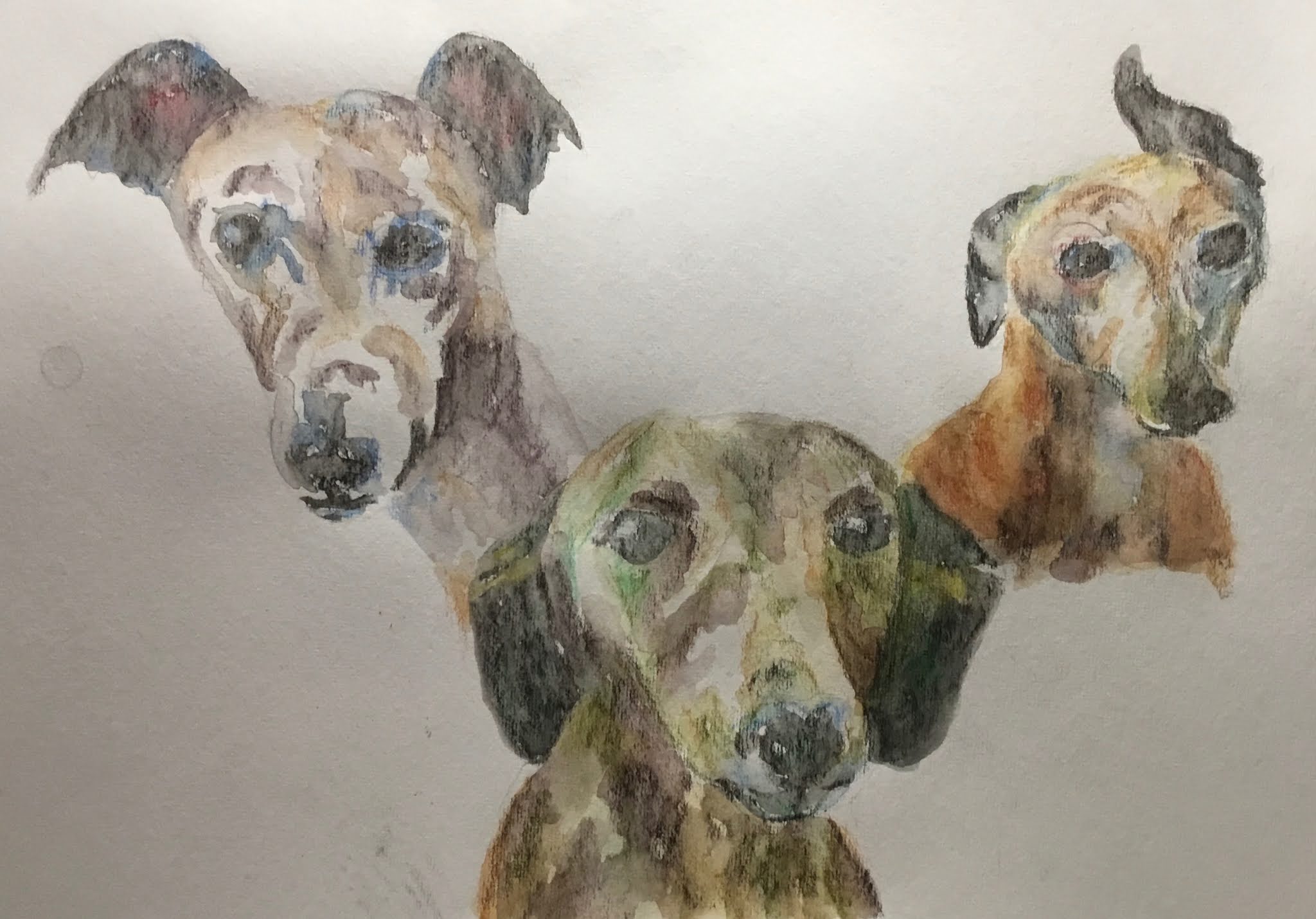
So, first I painted the eye, as described earlier (https://artisticactuary.blogspot.com/2020/10/an-eye-work-in-progress.html).

Next, surface preparation.  I cleaned the glass, then roughed up the front of it with some sandpaper, dusted it off, then applied a first coat of watercolour ground (Daniel Smith titanium white watercolour ground).  In the sanding and the grounding, I was careful to leave a gap for the eye to peek through.  The gap needed to be the right size, to let the best bits of the eye remain visible and to look like the sort of shape that you make when wiping away a hole to look through the condensation on a window.  Once dry (a 24 hour wait) I added a second coat.  After waiting another day, I taped the eye to the back of the shelf using really thick gaffer tape.

And then I was ready to go.  After yesterday's experiments, I wanted to use both salt and spattered masking fluid for falling snow.  And I'd decided to use a palette of French ultramarine, burnt sienna, quinacridone magenta and transparent yellow.  With both a warm and a cool red in there, it's been painted in a mixture of cool purple and triadic right keys.

So, masking fluid spattering first, then the sky and trees.  Wait until the paint starts to lose its shine, then straight in with the salt.  Then foreground, wait for just the right moment and, bang, salt again.  Finally I added some "superforeground" (a term I just invented) in the form of a happy tree trunk and some grasses.  I've been watching too much Bob Ross.  The grasses were added first, using paint squeezed straight out of the tube onto the palette with no water and a Terry Harrison "Merlin" brush.  The tree was painted using the same brush and only a very tiny addition of water to the four paints from the tube, and with very little mixing.  I also added a bit of snow on the tree trunks in titanium white, with some of some of the blue on top.  And after letting it all dry, I rubbed off the salt and masking fluid.

So what went well and what went badly?  As I experienced before, as a wild card at Landscape Artist Of The Year, in a post that I can't publish until the episode airs, it's hard to get dark values when painting on watercolour ground.  This worked to my advantage, with the sky and foreground coming out at sensible values, not too dark.  The superforeground has also come out at a sensible value, thanks to me using paint almost direct from the tube - something that I need to remember to do in future.  Masking fluid turns out to be quite difficult to remove when working with watercolour ground on glass - you can see a bit above the eye where I accidentally rubbed off the paint and ground.  I was lucky that this happened at a spot where there was white paper behind the glass.  If and when I paint on a fridge shelf again, I won't be using masking fluid.  And then there were the lucky accidents.  The way the colour of the snow near the eye looks like flesh tones.  The white squares on the fridge shelf, which you can see on the top half of the eye, looking like falling snow.  The brush strokes in the watercolour ground still showing up and making the painting look windy.  And the greens and reds showing up in the tree trunks.  The worst bit about the painting is the snow on the tree trunks - the painting would have been better off without it.

Overall, though, a big success.  The whole batshit mentality of it all and the amazing colours in the sky, background trees, snow, grasses and superforeground tree trunks.  It's up for sale.

Finally, here's another picture of the painting, looking more like a fridge shelf:

Thursday 22 October 2020

Three Days Of Snow

Back to painting again today and, for reasons that will become apparent, I wanted to get in some practice at snow paintings.  So I looked through the Ron Hazell (https://artisticactuary.blogspot.com/2020/06/the-artists-guide-to-painting-in.html) and Zoltan Szabo (https://artisticactuary.blogspot.com/2019/10/zoltan-szabos-70-favourite-watercolor.html) books for inspiration and came up with three ideas to try out.  Those two books, by the way, are great as reference works when you want to look for something specific.

I wanted to try out all three ideas, so decided to divide the paper into three.  Rather than using a ruler and masking tape, though, I just decided to mark out a couple of ragged divisions with masking fluid.  Quite a smart move as those jagged lines seem to make everything feel colder.  I also allowed a bit of leakage to spill over between adjacent paintings, which I'm quite pleased with.  It makes the viewer wonder whether this really is three separate paintings or a single painting with two jagged white lines obscuring most of the transitions.  Anyway, let's go through the three sub paintings.

First, the one on the left.  The snow was created using masking fluid, although I've also allowed some salt from next door to spill over.  The sky and snow a made from cerulean blue and permanent rose.  The trees use those two colours plus olive green and sap green (from the experimental palette, making their debuts).  I like the foreground and falling snow on this one but the green trees are a bit too jarring and complementary - in retrospect they'd probably have looked a lot better in a blue/purple colour.  Maybe next time.

In the middle, the sky and foreground use those old favourites French ultramarine and burnt sienna.  The trees use those same two colours plus the olive and sap greens.  The falling snow was made by sprinkling on salt.  I followed Zoltan Szabo's advice and only added the salt just as the paint started to lose its shine.  The effort put into getting the timing right was worth it.  These colours granulate really well too, which increases the impact of the salt.  I like the trees more on this one, even though the original idea was to have them in a more neutral colour with only a hint of green in the mix.  The weakest bit about this on is the hard edges along the bottom of of the shadows on the drifts.  The tops of the shadows are hard but the bottom edges need to be soft.

And then there's the third one.  A much warmer day, using some Zoltan Szabo ideas.  The sky is warm, using rose dore and Indian yellow.  The trees use those two colours plus cerulean blue and the olive and sap greens.  The foreground started with cerulean blue and rose dore all over.  The idea was to leave it to dry, dab out light areas and glaze over with a warm colour.  But, of course, rose dore is staining and as soon as  remembered this I dabbed out the light areas.  Finally I glazed over the foreground with a very thin layer of Indian yellow.  And this is what I ended up with.  I think it works.  The granulation of the cerulean blue just below the tree line is great.

Overall, I'm definitely happy with this one.  And it's been sold.

Sunday 18 October 2020

Annie Mac

Portrait Artist Of The Week is back.  This is supposed to be Radio 1 DJ Annie Mac.  Believe it or not, I actually knew who this was - there used to be a Radio 1 ad before films at the cinema and Annie was in it.

Annie had a bit of a greeny yellow parlour to her skin today, maybe because of the lighting.  This was a great excuse to use some of those colours in grey more shadowy skin tones.  The purple on the background was chosen to clash agains and energise those yellows and greens.

The likeness isn’t great.  In fact, with its 1960s/70s feel, it came out looking more like my mother in her 20s.  Which is a bit spooky given that today would have been her 75th birthday.

And someone else just pointed out that this also looks like Rizzo from Grease.  That's a good call Kris.

My excuse is that this was all a bit rushed, with me needing to finish early and watch this guy playing football.  Portrait Artist Of The Week was so much easier to participate in during lockdown proper.

Saturday 17 October 2020

Michael

All my figure drawing so far has been of naked females and there are a lot of people out there who would rather see naked male bodies, so I thought I'd pick a male model for a change.  This is Michael.

Like with the seated version of Aubrey yesterday, I've gone for a single colour.  Today it's indigo.  Somehow, this doesn't seem to scale the same heights as Aubrey.  While the musculature is good and the hair fantastic, the hands and toes aren't great.  And you can't see it here but the figure is badly placed on the paper with a big gap above his head and the toes almost touching the bottom.  The biggest difference between this and Aubrey, though is that Aubrey had more lost edges to her.  Maybe if there wasn't a hard edge to Michael's right thigh and no indication of where his thigh stopped and the background began, it might look better.

This one's up for sale.

An Eye (A Work In Progress)


Today I painted an eye.  This is part of a larger work, the full details of which I'll keep a secret for now.  I can't get any further with that project today without doing a bit of shopping first.

Anyway, the eye is looking good.  Most of it uses only Winsor red, cerulean blue and raw sienna, these being very close to a set of three that the late Charles Reid recommended for skin tones.  Charles recommended cadmium red rather than Winsor red but I thought I'd take the easy option and choose three colours that I already had in halfpans in my experimental palette of 24.  The only other colour in there is viridian, which was mixed with the red for the black in the pupil.  Any green in the iris comes only from the blue and the raw sienna.

Watch this space to find out what's going to happen to this eye!

Friday 16 October 2020

Aubrey, Seated


As I said in the previous post, it was time to do something different with the figure drawing rather than just turning the handle on the sausage machine and churning out the same painting over and over again, albeit with different models in different poses.  So I thought I'd do two things differently.

The first difference was to try out something recommended by both Kagan McLeod and Bill Buchman.  The idea is to do all the shading and texture first, then add the outline afterwards in big sweeping, energetic curves.

The second difference was to just use one colour, putting more importance on both observation and use of values rather than just looking for all the "love the colours" feedback.  Observation and use of values are the things I need to get better at to become a better artist.

The model is Aubrey again.  Not a deliberate repetition - I choose the subject matter based on the poses rather than on the identity of the models.

I actually cheated a bit and sketched out some rough outlines in pencil before rubbing them out until they were barely visible.  One thing I've discovered is that the "outliner pencil" in the inktense sets isn't a normal pencil and is very difficult to rub out, so I've started doing outlines with normal pencils.  And then I did all sorts of shading using quite a neutral colour and trying to distinguish between dark and light values.  It looks like I've managed to get in four values here, one of them being the white paper.  The final stage is to wet  the pencils.  I was really careful here to not wet lighter areas immediately after wetting darker without cleaning the brush.  It's very easy to contaminate one area with the colour or value from another.  In my colourful figure drawings it's not a big issue but it could have caused problems with this one.

The final stage was going  to be to add that sweeping, energetic outline to the drawing but I changed my mind.  This looks great as it is, leaving the viewer with the job of imagining the edges for himself.

I rate this one a big success.  It's up for sale.

Aubrey, Standing

Back to figure drawing with the inktense pencils.  This is Aubrey.

To be honest, this feels a bit lazy.  I've done so many of these figures using similar colour schemes.  It's not taking me forwards in any way churning out the same old stuff.  It even feels like a bit of a cheat using a pose like this with the body arched backwards showing off the breasts after a similar sort of pose proved to be popular on Facebook.  And the background curtains are becoming a bore.

Still, a decent painting.  The worst thing about it is probably the curtains where the light looks like it's coming from the left when it should be from the right.

For my next figure drawing, I need to do something different.  Challenge myself.

<Edit: I originally put this one up for sale but looking at what I've managed to produce as at September 2021,  this is a long way short of my best work.>

Thursday 15 October 2020

Landscape Artist Of The Year 2021

I've got my entry in early for Landscape Artist Of The Year 2021.

I needed to submit a landscape painting.  I chose Sedona, Arizona (https://artisticactuary.blogspot.com/2020/09/sedona-arizona.html).

I was allowed to submit a second landscape if I wanted to, so why not?  I went for Lancashire Sunset (https://artisticactuary.blogspot.com/2020/07/lancashire-sunset.html).

And then I was allowed to submit a third painting, which didn't even need to be a landscape.  Again, I couldn’t say no, so picked (Two Of) The Hateful Eight (https://artisticactuary.blogspot.com/2020/06/two-of-hateful-eight.html).

The three paintings show off how, on a good day, I can make the colours zing.  That's the common theme across the three of them.  And the Hateful Eight painting shows, in the background, how I can keep the colours calm and under control if I need to.

I also provided a link to this blog, so if you're one of the judges reading this, hello!

Friday 9 October 2020

The Cheetah Woman


After the painting experiment two days ago that I unwrapped yesterday (https://artisticactuary.blogspot.com/2020/10/another-abstract-underpainting.html) I had an overnight think and decided that I was going to press ahead and turn the abstract into the cheetah woman.  Here's what I did today:

- I masked out the cheetah woman with masking tape!  Crazy idea but there were straight lines in the painting already and I wanted more.  There's a nice positively painted negative triangle between the head and the supporting arm.

- Negatively painted the cheetah woman using the French ultramarine along the bottom.  I decided to let this blue also go into the white band below it, which I later regretted.

-  Negatively painted her along the top, initially in raw sienna.  I swept the strokes upwards to look like grasses.  The raw sienna was looking a bit monotone, so I added in the viridian, ultramarine and quinacridone magenta in places.  I was careful not to negatively paint the feet, not just because that would have been difficult but also because odd lost edge is good.

- Tried drawing tree branches in the top right and top left with masking fluid for variety and painting over them.  These didn't really work out right, so I painted some foliage over them.  This also covered a lot of the white band in the top left.

- Added the usual finishing touches: lots of salt in the foliage, grass and shadows.  If it works, great.  If it doesn't, then not a disaster.  And, because things were looking a bit dull and dark, I spatttered over my usual opaques: cadmium red, cadmium yellow, cerulean blue and titanium white.  I was careful to cover up the cheetah woman while doing the spattering.

- And at the end of all this, the thing I was most disappointed with was the former white bands that were now painted over but still visible.  They looked like a mistake that I was trying to disguise.  So I painted over them with titanium white to bring them back.  But they still didn't look quite right, looking like bands for the sake of bands.  So I encouraged them to bleed downwards into the paint below, in what turned out to be quite pleasing patterns.  And I added a touch of ultramarine because white with a bit of blue shadow looks whiter than white on its own.

So, job done.  Is it better than its abstract predecessor?  I don't know and don't really want to think about that anyway.  Is it any good?  Well I say it is.  It's crazy bonkers.  There are so many questions that this painting raises.  What is that leopard woman thing?  Does it have legs or does it have the body of a worm or a fish?  Is that grass behind it or flames?  What are the white bands?  Wooden beams?  Something covered in snow?  What are those cabbage lines?  What's that spotty triangle in the top left corner?  And do I have this painting the right way round?  I've not even looked at the other three orientations.

This one was gifted to my sister in law.

Thursday 8 October 2020

Another Abstract Underpainting

The markers and inktense pencils haven't really been working out for me over the last week or so, so I thought I'd better brave the cold outside and get back to the watercolours.

This is going to be another painting that starts off as an abstract and that maybe turns into something more representational. But this time, I thought I'd go all out on textures.  So, to start with, I went for granulating colours: French ultramarine, raw sienna and viridian.  I also threw in burnt sienna to keep things grounded and earthy and because it makes such a good double act with the ultramarine.  And I included quinacridone magenta because the green needed an intense complimentary to keep it under control.

I prepared the paper first with a spattering of  masking fluid, trying to get a bit of a diagonal pattern going, to put a bit of energy into the painting.  I put on a couple of strips of masking tape because I was throwing everything but the kitchen sink at this painting.  They were put in positions that added to the diagonal energy from the masking fluid.

Then I put on the paint, making sure it was thick enough for the resulting painting to be able to stand up for itself rather than being doomed to being an underpainting.

And, finally, I added bubble wrap, French stick wrapper, a net bag that full heads of garlic come in, cabbage leaves and a bit of salt in  the only remaining empty space.  Then I weighed it all down with bricks and left it overnight.

I opened it all up this morning.  There is a video of this happening but you'll have to search for me on Facebook (https://www.facebook.com/watch/?v=3304681352957790 ) to see it as it was too big to be put up on blogger.  So how did all the textural tools work out?

- The colours definitely worked.  Lots of granulation.  Burnt sienna mixes well with absolutely everything. And the green and magenta vibrate strongly when on the same page together.

- Masking fluid spatters always work.

- The masking tape has a weird effect.  The photo of the painting looks like the painting is at an angle, with the two corner triangles being a work surface under the painting.  It adds a tension.  I'm not sure whether that's a good or a bad thing.  And there's been some leakage under the tape, especially in the bottom right but that's not a big deal.

- The salt hasn't done much this time.  Just a little bit of crystalisation in the brown at the top, just to the right of the tape.  It hasn't really done anything in the green and purple just below it.

- The cabbage produced those branches in the top left below the tape and the blobs in the top right corner.  They were always going to look like bare trees and it feels like a bit of an easy cop out to me, especially if they end up as trees in the final painting.  Maybe a I should have tried one of the leaves the other way up for a bit of variety.  Still, every cabbage leaf on the paper is one less on my dinner plate.

- The bubble wrap was used in the top left and bottom right, producing the expected result in one place but something different in the other.

- The French stick wrapper took up all the bottom right quadrant except for the triangle in the corner.  It produced a similar effect to clingfilm as usual, but was better for the environment.

- And the garlic bag produced the "bacteria under the microscope" effect around the middle of  the bottom half.

So far, this has been pretty successful.  I now need to think for the rest of the day about whether to leave the painting as it is (tempting!) or to turn it into something else.  If I do change it, the most likely plan at the moment is to keep it this way round and to turn it into a sleeping cheetah woman.  There's a cat-like face that the French stick wrapper has produced, along maybe with an elbow to lean on.  And there's a red shape that could be the bottom half of a torso and a pair of legs.  It would have to be a cheetah woman and not a leopard woman because of the pattern of the spots in the top left corner.

I still have time to think about this though.

Tuesday 6 October 2020

Ayame

Back to the figure drawing and inktense pencils.  I wanted to come up with something with lots of white highlights on the flesh.  And at the same time, I thought I'd do something with winky blues and violets (with a tiny touch of red) rather than keeping churning out rainbow people.  Oh, and I deliberately picked out a pose that would allow me to put in a huge sweeping line.

When I finally master the knack of being able to lay down energetic gesture drawings that are in proportion, I'll be the master of figure drawing.  But I'm still having trouble with proportions.  Despite taking a few attempts and using pencil measurements, this is still not right.  The head and arm look too small for the body.  And all the corrections mean that the picture has lost all the energy that was in the original gesture drawing.

Catch this one out of the corner of your eye and it looks like a dog.  So I'm wondering whether I've caught Ayame part way through transforming into a werewolf.

<Edit: I originally put this one up for sale but looking at what I've managed to produce as at September 2021,  this is a long way short of my best work.>

Stephen Hawking

After John Paul Jones came out so well a couple of weeks ago, I wanted to have another go at drawing a portrait with markers by concentrating on shadow and value patterns rather than on facial features.  I found a black and white portrait often late Stephen Hawking that I thought might make a good subject.

So I started this all off with neutral colours and came up with a black and white portrait.  Looking at that,  I thought it needed a bit of colour but not excessive amounts.  So I added in some flesh tones, blue on the clothes and green on the cushion.  I also added some stars to the sky using a white gel pen.

The drawing was instantly recognisable as Hawking (and still is) but something wasn't quite right.  I thought it that his left jowl was a bit too baggy, so I went over part of it with a black marker and incorporated the black into the shadow on the cushion. The neutral colours do make him look pretty ill but there's life and intelligence in those eyes.  It's a tough decision but Professor Hawking's not going in the shop window.

Did I ever tell you I queued up behind Stephen Hawking at a cash point once?  Barclays in Market Hill, Cambridge.  It's a clothes shop now.