This post has been planned for a while but it's only now that I've got enough data around to be able to finally put it together.
A while back, I did a post on colour keys. If I do a painting that's dominated by three primaries, there are eight different combinations of warm/cool blue, warm/cool yellow and warm/cool red that I could use. I’ve given these eight combinations names and, for all watercolours that have been based around three primaries, I've been stating in the posts which key I've painted in. What I'm doing today, though, is grouping together paintings by key in an attempt to identify common themes within individual keys and to just understand the keys a bit better. Basically, I'm a scientist at heart (more of a scientist than an artist) and I want to look at some experimental results and learn things.
First up is purple cool, made up of warm/purpley blue, cool/purpley red and cool/greeny yellow:
Interestingly, these paintings are not always purpley. If there's purple anywhere, it tends to be in some cold looking skies. This key is capable of producing a wide range of colours (check out the two guys from the Hateful Eight in the middle). On the other hand, look at the two on the right in the middle row - when used with a bit of finesse, this key is great for painting chilly village mornings. And there are a couple in the top row that are a bit too dark and show how important it is to control values in this key.
Next, purple warm, made up of warm/purpley blue, cool/purpley red and warm/orangey yellow:
There are some outliers there but it's clear that this is a fiery key, great for warm sunsets and for warm, inviting buildings. With the yellow and blue being as far from green as possible, it should come as no surprise that there's not a lot of green in these paintings. And I don't see a much of it here but there must be an opportunity within this key to set up some great orange/purple clashes.
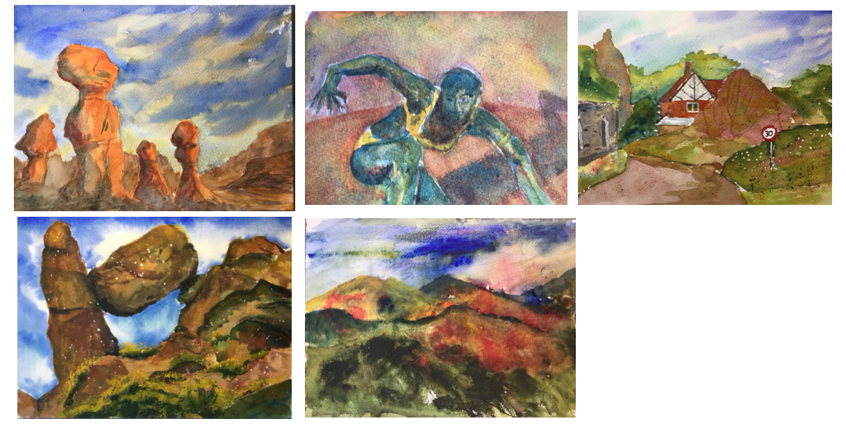
Next up, orange warm, made up of warm/purpley blue, warm/orangey red and warm/orangey yellow:
Another warm palette, but this time, with warm versions of all three primaries, it's much hotter. It's a desert heat rather than a nice warm U.K. summer evening heat. The one in the top right is an exception but this is because I didn’t use much yellow in it. Again, the combination of warm blue and warm red mean that it's hard to get any decent greens.
And what about orange cool? Cool/greeny blue, warm/orangey red and warm/orangey yellow:
The temperature has come back down. These paintings feel cooler but they still have orange in them. So if I want orange colours but not the heat of the desert (e.g. for autumn landscapes), I need to include a cool blue in there. This key also seems to work well for churches if I want to make them warm and inviting. And green is back; some of these paintings have just as much green in them as orange.
Then there's green warm: cool/greeny blue, warm/orangey red and cool/greeny yellow:
Not much green in there, is there? To be honest, cool blues and cool yellows rarely make the best greens, I'd rather one of those two primaries was warm. Maybe it's just that the cool yellow is raw sienna so often in these paintings rather than transparent yellow. Raw sienna is more earthy, so the sort of yellow I'd go for if the main subject of the painting was rocks or buildings. The best greens here are probably in the bottom left, showing that if I want to use the non-earthy transparent yellow within this key, I need to apply a delicate touch (something that may be lacking in the top right).
Where there's green warm, there must also be a green cool: cool/greeny blue, cool/purpley red and cool/greeny yellow:

With the cool versions of all three primaries, it's no surprise that the paintings in here are the chilliest looking so far. There's more green around now than there was in the warm green key and they don't look garish: the cool red does a good job bringing them back. The purple skies and shadows do a great job bringing the temperature down and there a some interesting green/purple clashes going on in places. The two on the right were a big surprise to me today, with little or no green in sight despite the use of cool yellows and blues.
And then there are the two triadic keys, with more evenly spaced primaries. First there's triadic right, made up of warm/purpley blue, warm/orangey red and cool/greeny yellow:
The set here includes one from the future (while I'm correcting some triadic left/right). It's hard to spot common theme through all these paintings. If anything, maybe there's a message that the use of a cool yellow (and this has to be raw sienna, not transparent yellow) and warm blue in the sky cools down the ambient temperature - the other key with this combination is purple cool. Maybe compared to purple cool, this key is fighting harder against the chill? In this key the houses seem to have the heating on whereas in purple cool you think everyone inside is wearing jumpers.
And finally, there's triadic left, which I suspected before starting would be my favourite (cool/greeny blue, cool/purpley red and warm/orangey yellow), again including a future painting:
While these paintings look like they've all been painted in different keys, there's one big common theme here and it's that the colours are amazing. They all seem to work together, benefiting from each others' presence. They blend nicely into each other and it's easy to drop extra bits of colour into washes to variegate them. All these paintings have quinacridone magenta and Indian yellow in there and the blues could be Prussian blue, Winsor blue (green shade) or cerulean blue.
So what have I learned? What do these keys have to offer? Here we go:
- Purple Cool. For chilly village mornings when people don't have the heating on. Include some red in the sky. Have some greenage. Control values: try to keep the painting quite light.
- Purple Warm. For sunsets and either warm summer evenings or chillier evenings with warm inviting buildings. Not much green around.
- Orange Warm. The heat of the desert. No green in sight.
- Orange Cool. Paintings with orange that are not baking hot, eg autumn paintings. Try a bit of green to contrast with the orange.
- Green Warm. Jury still out. Has been used mainly for buildings so far. Need to try out this key with transparent yellow.
- Green Cool. Seems OK for green paintings but also works well with no green. Feels like a cool day late in the summer. Good green/purple contrasts.
- Triadic Right. Possibly for cool days when people have the heating on indoors.
- Triadic Left. The most amazing colour combinations. Try to resist the temptation to use this every time.
That was definitely an interesting investigation. Lab coat off now, though, and back to painting today or tomorrow.


No comments:
Post a Comment