Sunday 29 November 2020

Charlie, Dobbie And Mia - Best Two Yet?

Back to those three dogs.    The plans for today were to:

- make the other dogs' heads more similar in size to Dobbie's - achieved!

- use black rather than charcoal grey in the darkest bits - achieved!

- tone down the impressionistic colours in Mia - make her a bit more earthy - achieved!

I think this is the best Charlie and Mia so far.  It's not the best Dobbie though.  His greens are more understated but there's a green stripe on him that's a bit too hard edged for my liking.  On the other hand, he does have that look in his face as if he's in trouble.  He's not a failure by any means.

I like this one.  But then I had another go.

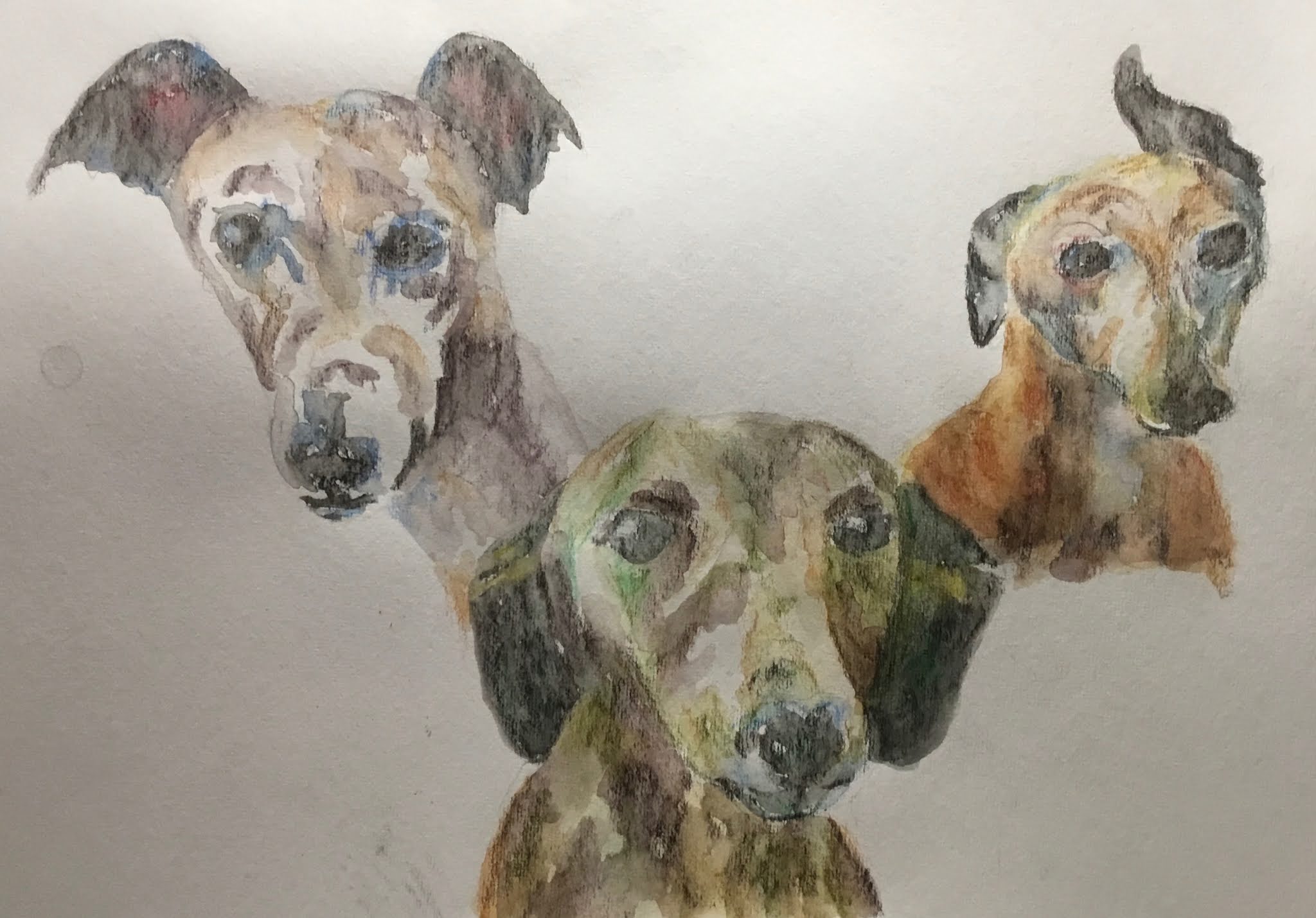
I think this is even better.  Mia on the right is definitely better.  Dobbie in the middle is still looking guilty but I think he's a bit better.  There is more green back in the fur but it's back to being more subtle after that sharp edged green mark first time round.  Charlie on the left is bigger, which he deserves to be, being the best model.  He has less impressionistic  colour to him this time (notably less red)  but is still the best of the three.

And indeed, this version of the portrait was sold and is going on the wall somewhere in the flat above the pub.  My first portrait sale, my first inktense sale and (if you want to call it that) my first commission sale.

Saturday 28 November 2020

Heather

Time for a break from the dogs, so I did a bit of figure drawing.  Today's model is Heather.

I chose quite a straightforward pose with an easily detachable head as I was feeling quite lazy.  I thought about a monochrome painting but instead chose to go with violet, shiraz and a red.  I found myself adding some indigo to the darker bits at the end.

Three interesting deliberate techniques things that I did with this one were:

- to have some missing edges.  Today they're on the left breast and thigh.

- to use interesting shadow colours.  The shadows mainly indigo closest to the model (whe shadows are most intense) but more colourful further away.

- to be more choosy about which pencils marks I wet.  There are a small number of places on this one where I left the pencil dry because more ink would not be beneficial to the painting.  In particular, around some of the limbs, I painted the shapes of the limbs with water rather than painting over all the pencil marks.  As well as helping to correct inaccuracies in the original drawing, this seems to add a bit of energy.

The only niggle I have about this painting is how, if you screw up your eyes, it looks as if a lot of Heather's body (her left arm in particular) is outlined very thickly in purple.  This is because I followed the shadows on her body quite literally, wanting a painting that would make sense in monochrome if all the colours except purple were filtered out.  Maybe I should have used a different colour for the shadows on the other side of the arm.

Heather's a winner though.  She's up for sale.

Still More Charlie, Dobbie And Mia

Had another attempt at Charlie, Dobbie and Mia.

I'm getting pretty good at Charlie on the left and it's tending to look like the same portrait over and over again.  The red and blue touches look good on him.

Dobbie in the middle has lots of green flourishes as usual.  Today I ended up with his left ear, left eye and some shadows on the left of his face running together.  It's an interesting Charles Reid-like effect but I've done better Dobbies than this.

Mia, of course, continues to frustrate.  The purple/red/orange colours might be the best I've found for her so far.

This one's Ok.  It's definitely getting there.  I'm going to have one more go at these dogs, probably tomorrow.  In tomorrow's I'm planning:

- to try to not make Dobbie's head so much bigger than the other two

- to use black rather than charcoal grey in the darkest bits

- to avoid the impressionistic colours in Mia's muzzle.  Maybe make it white with some very light greys.  Depending how this goes, I may tone down the impressionistic colours on the rest of Mia's head too.

Sunday 22 November 2020

Charlie, Dobbie And Mia Again

It's been a busy day.  Three works of art but two of them were so bad I'm not even going to show them here on the blog.

The first was an attempt at Mia using markers.  I tried to get around the awkwardness of her orange colours by using the most orangey skin tone marker in my set, with grey overlays.  It really didn't work, and Mia ended up with such a long snout she looked more like a crocodile.

So I went on to the inktense pencils and tried to draw all three dogs.  My first attempt was too rushed and ended up with Charlie and Dobbie having the wrong shaped heads.  But my idea of ignoring Mia's natural colouring and going for blues and violets showed promise.

So here's my fourth attempt at the four of them together.  Charlie and Dobbie are looking good again and Mia may have a bit of personality coming through at last, although she's still not perfect.  She may just be one of those subjects that's impossible to draw - the polar opposite of Noel Fielding.  I admit I did cheat a little on this one, using an app that drew grids in photos.  But the grids I drew on the paper were freehand and not measured out perfectly, so I see that as only half cheating.

That's my lot for this weekend.  Back to Christmas shopping now.

Saturday 21 November 2020

Charlie, Dobbie And Mia

It's all very well putting together a collection of marker drawings of the Rose And Crown dogs, but I think the landlady wants a painting.  While a watercolour portrait is still beyond me, I thought I might have a go at a triple portrait using the inktense pencils.

My first attempt is the one at the top of the page.  Charlie on the left has list of red and blue and Dobbie in the middle has greens.  Mia on the right is tricky though.  She screams out for orange but I've also put some reds and blues in there.  And all three dogs have browns and greys in them too.

I quite like this one.  There's some great blending going on in places, making this look like a watercolour.  Charlie looks best and Mia worst but they're all interesting.  I maybe made a mistake making this quite small.  It could fit into a 8x6 or 9x6 inch window.  Will be interesting to see the landlady's reaction to this on Instagram and/or Facebook.

And then this was my second attempt:

It's a better composition, with the dogs closer together and overlapping.  It fills the page too.  Charlie is still good, Dobbie not too bad, but Mia has definitely deteriorated and makes this the worse one of the two.

Charlie


The artwork is slowing down for a while now as I'm working on another actuarial contract during the week now.  But at the weekend, I'm back from being the actuary ti being the artist.

To start with, I'm back onto the Rose & Crown dogs.  Charlie is the second of the three.  He started with lots of blue around the eyes and orange in the fur but the orange was looking a bit garish, so I turned it down to something more neutral by putting some blue over the top.

I don't think he's come out as well as Dobbie, whose green tones were amazing.  But, as is always the case it's only when the collection is all viewed together that a proper judgement can be made.

Sunday 15 November 2020

Dobbie

Too distraught after a bad experience with the inktense pencils, I thought I'd have another go at Dobbie but with the markers.

This has come out much better.  The photo that I based this on had lots of greens and pinks in the fur that I've tried to reproduce here.  They actually came out really well in my opinion, resulting in one of my better impressionistic pieces.  If I were to do this again, I'd leave out the collar, which distracts from the dog and looks like either a medal around its neck or a toy that it's holding in its mouth.  And the pose is a bit weird, looking like a human head and shoulders shot.

Overall, though, a success.  It's not going up for sale yet.  Dobbie's owners have first refusal and might go for a set of three if I'm lucky.

Dobbie On The Sofa

Last night, when I nipped over to the Rose & Crown to pick up a takeaway (I had the duck pizza since you ask), the landlady suggested she might be interested in a portrait of her three dogs at some point and would send over a photo.  If I'm to do something about this I really need to practice drawing dogs.

The inktense pencils seemed like a good place to start.  I found a photo of one of their dogs, Dobbie, on line that might make a good starting point.  It was in black and white, so gave me a chance to go impressionistic with the colours.  I started with my usual favourites: deep indigo, violet and bright blue.  I also threw in some highlights on the dog in tangerine.

After this first attempt, I found that the dog didn't stand out well enough against the sofa and cushion.  I should have remembered that my best figure drawings have little or no background.  So I tried adding some chilli red to the sofa and leaf green to the cushion.  I also added some sunshine yellow as a background.

But the sofa came out too red and the green bin the cushion was too similar to the yellow background, so I went in with a third coat.  I put more bright blue on the sofa, more indigo into the shadows, some indigo onto the shadowy bits on the cushion and finally, in an attempt to bring it all together, some sunshine yellow highlights on the dog and cushion.

I've ended up with something that's way too overdone.  One for the bin.

But there are lessons here.  If I'm to paint dog portraits, I need to leave out the background. Maybe just go for vignettes with a little complementary background colour aura around them.  Or the sort of plain curtained background that I've used in some of my figure drawing.

Thursday 12 November 2020

Easter Island

I might have settled into a rut.  It's quite easy to keep drawing naked figures with inktense pencils, shading in the shadows and painting over with water (important lines first) and leaving the odd missing edge.  I can't keep doing this forever.  People will get bored.

So I decided I needed to draw something else.  If I can't draw real people, then my obvious next port of call must be statues, right?  So I googled for statues in search of ideas and ended up at Easter Island.  What I liked about the scene I found was the interesting shadow shapes (and interesting shadow shapes seems to be my thing in recent weeks).  In this case, the shadows were not just interesting but also looked like sunglasses.  So I had to give this one a go.  It will also be my first landscape for a while and I need some landscapes up here for when the Landscape Artist Of The Year judges come calling.

I used way too many colours in this one to list.  Mustard turned out to be quite a hero, putting those yellow highlights on the statues.

After my first attempt, I had two problems.  One was that the rocks in the background didn't contrast enough against the head in front of them.  The other was that the heads stood out too sharply against the background.  The first problem was solved by putting lots of blue in the rocky hill.  The second was solved by going over the grass three more times, adding some darker grass at the front to anchor the heads (a green and red mixed well to give that neutral brownish colour) and making the grass at the bottom of the heads grow up in front of them to softer people the bottom edge.  At the same time I added lots of blue to the furthest grass just to get away from the blue sky green grass colour scheme which I'm not keen on.

End result?  Yeah, not bad.  The head on the right is the best bit with the yellow highlights and the vertical lines adding some bulk.  The colour scheme is still a bit blue for sky, green for grass.  Maybe I should have made this a vignette of a pair of heads with very little background.  The shadows on the grass are combined with the shadows on the head, which would normally be good, but the effect is spoilt by the hard edges on the shadows.  In fact, hard edges are a general problem with these pencils and something I either need to find a solution to or allow for in how I paint.  Compositionally, the big head looking out of the painting is theoretically undesirable but I think it works here because the eye moves in a spiral from the big head to the next biggest, then to the two in the background.

This was an interesting runout.  It's up for sale.

JenB, Kneeling


 It's JenB again!  This is my third drawing of her.  Her poses are just consistently powerful, and that's what keeps me coming back to her.

Today's drawing was mainly in violet but with a bit of bright blue and shiraz in places to vary the hue and value of the shadows.  

It may be the worst of my JenBs.  The bottom half is great but it's let down slightly by the arms and head.  That top half looks a little small but I wanted to tweak proportions a bit, emphasising the bottom half by using a lower eye level.

Still, JenB's up for sale.

Sunday 8 November 2020

JenB, Recumbent


Much too early to put my gear away, so I followed up the marker portrait with a bit of figure drawing.  This is JenB's second appearance as one of my models.

I wanted to get back to simplicity by using just one colour.  Today it was charcoal grey.  I also wanted to leave at least one lost edge, which I've done near the right knee.  There are some great flowing lines, body contours and value contrasts in there today.  This is pretty good.  The right hand has to be one of my best limb ends for a while.  I left out the face today but maybe I chose the wrong painting to do this.  When I've left our faces with nothing behind them, things have looked OK.  But here, there's a pouffe behind the head and I wasn't sure whether to leave a head-shaped hole or to just fade things out the way I've done here.  I need to think about all that a bit more.

Still, JenB Recumbernt is up for sale.

Samira Ahmed

We’re into lockdown and, with grass roots football missing from the calendar, my Sundays are no longer messed up and I can participate again in Portrait Artist Of The Week.  This week's subject is Samira Ahmed who I believe is a TV journalist.

When Samira turned up in a black top, I knew immediately that I would be sacrificing creases and curls to merge the black top into her black hair.  I think that worked.  I thought the Asian skin tone might be a problem but that seemed to go OK.  In reality, I use the same colours as I do for white Europeans as it's the values that are more important than the colours themselves.  There's a bit of a likeness there too, although I think the face shape isn't quite right.  Maybe the face should be shorter, or maybe narrower at the top and wider at the bottom.

Let's be honest.  This one's a reject.

Thursday 5 November 2020

Thinking Jenni

A second appearance for Jenni, drawn using violet, light blue, deep indigo, fuchsia and sherbet lemon.  Those violet and indigo pencils are going to be the first to go.

The colours can be accused of being a retread of past glories but, like the difficult, second album, are struggling to achieve the same heights as the original.  And I'm not sure the yellow works in this one to be honest.

The worst bits about this painting are the right leg and foot - all in shadow and not looking right.  Hands could have been worse.  The left thigh,  though, is great.  And the face has something to it - the faces on my figure drawings are slowly getting better.  I also quite like how I got the outline of the figure to bleed slightly into the figure itself.

<Edit: I originally put this one up for sale but looking at what I've managed to produce as at September 2021,  this is a long way short of my best work.>