Sunday 30 July 2023

Looking For Source Material For Charcoal

I'm still not painting today.  I want my next piece of art to be charcoal based after reading the Kate Boucher book.  I don't even want to read another art book before I've had a chance to put some of Kate's ideas into practice.  And I can't get started until I've got all my charcoal gear together and swatched colours.  And getting all my gear together doesn't just mean waiting for a delivery to arrive - I'm also planning in heading to the shops and maybe adding another four colours to my set of charcoal pencils.  Maybe even a brush to clear charcoal specs from the paper.  Or even more paper with a different texture.  But before I hit the shops I want to check out the paper and pencil case that I've ordered, so I'm still in limbo.

Charcoal's definitely on my mind though.  So when I went for my daily four mile walk today I took along my phone to take photos that could serve as source material for the charcoal pencils.  And I've shocked myself a little bit.  Maybe it's Kate Boucher's influence but I found myself not taking photos of sweeping landscape vistas but instead snapping forgotten decaying corners that nobody ever looks at and lots of views that included signposts or telephone wires.  Most of my artwork is pretty colourful but I can already tell my charcoal work is going to be sparse, grim, dusty and brutal.  It's going to stick out like Nebraska or Tom Joad in a Bruce Springsteen album collection.

I'm so looking forward to getting started.

Saturday 29 July 2023

AveryA

I quite fancied putting up my feet today and continuing to read the latest Guy Gavriel Kay novel out in the studio with the cricket on the iPad in the background but it's been eight days since my last painting.  I do keep telling myself that it's not a great idea to paint when I'm not in the mood and I think the message has got through but the thing is sometime ps you have to paint when you're not in the mood?  What if I was a wildcard on LAOTY and not in the mood on the day?  Well, I think I had to do some painting today, just to keep my eye in.

I picked out this pose by AveyA because it would give me the opportunity to paint a couple of hands, something I thought I needed to do after reading the Eddie Armer book.  It's tempting to charge through my stack of birthday books, making whites and posting reviews but it's a better learning experience for me if try putting some of this stuff into practice as quickly as possible. Hence hands.  As my order of charcoal paraphernalia from Jackson’s still hasn't been dispatched, it might be a while before I can try out the charcoal, so hands it is.

After getting down an initial drawing, I stared by putting down deep indigo in the darkest areas.  I then assed in some sea blue in the mid value areas and areas where dark shapes covered adjacent areas on the body and the background.  Maybe I should habe just merged dark shapes in the background and on the body - I'd have had no hesitation doing this in watercolour.  And then I remembered an idea from the Kate Boucher book on adding little bits of colour to a monotone painting and thought I'd try this out by adding some poppy red in places.  But I screwed up by adding too much of the red.  Oh well.

After wetting all the marks, this point I stood back from the painting and asked myself whether it was finished.  Well I liked Avery's left hand but not her right and thought that both would benefit from having some sketchy outlining added.  I picked out a new colour, bright blue, for the outlines and added them all over the painting.  To keep things harmonious, I also added some light blue shading with the side of the pencil to the background.  Then I had second thoughts, thinking the outlining looked too sharp.  So I added some bright blue shading to outlines around the background and poppy red shading to outlines around the body.

After wetting this second set of marks I could see that the bright blue was much more vivid than I was expecting.  Maybe it's a pthalo blue, because that (as Winsor blue green shade) is highly pigmented as a watercolour.  But, because any more marks would have made things worse, I stopped painting at this point.

Avery's left hand and forearm are close to perfect here, making this a worthwhile exercise.  But everything else is a bit bleugh with no redeeming features.  Outlining almost never works for me in these paintings and there's a disconnect between the body and he background.  This one won't be going in the shop window.

I might just need to take a break until I can get started with the charcoal.

Thursday 27 July 2023

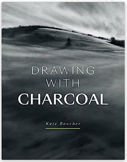
Drawing With Charcoal, Kate Boucher – Book Review

Ok, let's have one more book review.  This was the first book. I read after the first batch of birthday presents arrived as I was keen to read any advice it had on what paper and fixative to buy to do with my charcoal pencils as I'm itching to get started with them.  I was wondering whether to hold back on this review until I'd started using charcoal but I actually already have a pretty good idea about this book's merits.  So let's go.

This is a 144 page paperback, divided into six chapters on materials, what to draw, basic mark making, advanced mark making, framing/fixing/etc and on introducing soft pastels as an extra medium.  I was hoping this book would be a good introduction to drawing with charcoal and this already sounds good.  Let's go through those sections one by one.

The introduction chapter lay good.  There's other stuff I need apart from charcoal. Paper and fixative.  I need stumps, cloths, different sorts of eraser and there's even other stuff that could be useful.  Kate's not too dogmatic about the choice of paper, pointing us towards thick, acid–free paper if anything and leaving it up to us to experiment with rough and smooth surfaces.  The first indication of Kate's style which is to throw out some ideas and encourage us to work out for ourselves how we prefer to work.  Because my tinted charcoal includes a white, my choice of paper was limited; I've ordered some tinted pastel paper but it's not quite as heavy as the paper Kate likes to use.

Then there's a chapter on how to choose something to draw.  Kate talks about getting us to use our "charcoal eyes" but it felt to me on the one hand like this was just talking about our artistic eyes and that the ideas in this chapter could be applied to choosing subject matter for any artistic medium.  On the other hand, the introduction of some randomness into subject selection may just be a sneaky way of getting the reader to loosen up mentally to prepare to start painting in what's a pretty loose medium.  If this was the plan, then that's genius.  Otherwise it's just a happy little accident and we all like those, don't we?

Then we have the important chapter on mark making.  We can make marks in lots of  different ways  with with each of charcoal, smoothing tools (cloths, fingers, kitchen paper, paper stumps) and erasers (rubber, putty) so there's a lot to talk about here.  Kate sets the reader loads of exercises to explore these different types of mark, shows a few photos of her own attempts and throws out a few ideas on variations to the experiment that we could try.  It's an unusual way to teach us but I like it a lot.  It pitches the teaching style right on that sweet spot between telling us everything and telling us nothing.  I can't wait to try out my charcoal pencils after reading this chapter.

Then we get a chapter more advanced, avant garde techniques.  The charcoal equivalent of painting watercolour with twigs and gesso.  If Ann Blockley, Jane Betteridge or Carole Robson ever dumped the watercolours and started using charcoal, I'm sure this is the sort of stuff they'd be doing and writing books on.  As well as this, there a also some interesting examples showing how easy it is to correct huge errors in charcoal drawings and how what started as errors can end up making a painting interesting.

Then we have a chapter on fixing, photographing, framing and storing.  The bits on fixing were of most use to me here.

And finally there's the chapter on introducing soft pastels.  I was only talking earlier today about how I like it when the bonus chapter at the end of a book starts talking about abstractification but tend to be turned off by bonus chapters on mixed media.  But I quite like this chapter.  While there's some stuff in there that's specific to soft pastels, there are also lots of higher level ideas around I traducing a splash of colour to a black, white and grey painting.  So a lot of this chapter applies equally to the tinted charcoal pencils that I'll be using.  But it also got me thinking about the approach I took with the markers to United Underworld and whether I could try a similar approach to figure drawings with inktense pencils.

So, as you can probably tell, I'm feeling really happy about this book.  It's a perfect beginners' book on charcoal, answering all the important questions while also teaching us in a non–dogmatic way, encouraging us to experiment and work out what equipment and techniques suitability best.  There's the odd demo in there but they didn't feel like demos (let alone paint along with me recipes): they were just part of the story.  What else?  Did the artist have a voice and a personality?  Yes.  Was her artwork inspirational?  Yes.  Amazing book.  Five palettes all day long.

🎨🎨🎨🎨🎨

Oh, sorry, one little afterthought.  This is a book about how to use charcoal if you can already draw.  But surely anyone getting into charcoal has experience of other media, so can already draw, can't they?  I can't believe anyone will kick off their artistic career with charcoal; it's way too messy.  But there really is someone out there who's determined to go in at the deep end, I'd advise them to buy a pencil and either this book or this one and, only after learning how to draw, move on to this book and to charcoal.

Drawing Hands & Feet, Eddie Armer – Book Review

Time for another book review.  This is Eddie Armer's book on drawing hands and feet.  Because hands and feet let me down so often in my figure drawing (and maybe because on PAOTY they like an artist who can draw hands) I thought I could do with a book like this in my collection.  I liked the look of both Eddie's book and that by Ken Goldman but definitely didn't need both, so added Eddie to the wishlist and he landed on the bed on my birthday a couple of days ago.  But will he make a difference?  Read on.

First up, page count.  This is quite a skinny one, a 96 page paperback.  To be fair, the price of the book normally reflects this.  And the book is on quite a niche subject, so it's going to struggle to make it to 144 pages without going off at a tangent.  And I'm picky when it comes to tangential bonus pages.  Abstractification of ideas in the rest of the book yes, extending the medium in the book into mixed media no.

For me, the book separated out into three sections:
– 30 pages of introduction including materials, the structure of the hand and foot and an introduction to life drawing techniques
–16 pages on the basics of drawing the hand and foot face on
– 50 pages on more complicated drawings, including perspective, gesture, holding objects, clothing, etc
If this sounds like a weird way to divide up the book, it's because it's the quality of the advice that I've based this on and not the subject matter.  Believe me, if you read this book you'll notice this division.

So, yes, that first 30 pages wasn't of too much interest to me.  There was some interesting stuff, though, on materials and preparation for anyone that likes to draw with graphite pencils.  And a two page spread that I liked that neatly summarised five things to be looking for when drawing by eye: five things that I knew about and that could easily be five chapters in a book somewhere but that I appreciated seeing all at once on a two page spread.  It makes things easier to remember.

Then we get to the meat of the book.  Sixteen pages that go through how to draw the back of the hand, the front of the hand and the bottom of the foot in detail.  It's all very methodical with rectangles outlining shapes and instructions about where to divide them up into halves, thirds, etc.  At the end of these sixteen pages, I felt that I understood the hand and foot a lot more. In particular, the big learning point for me was how different the back and front of the hands are.  The fingers look longer from behind than they do in front!  And the creases on the front don't line up with the knuckles on the back.  I had a go at drawing a hand from the front and from the back and was amazed at the difference that this book was already making.

And then we get to the last 50 pages where we look at hands and feet from other angles and at hands that weren't perfectly straight.  There's still lots of useful stuff here but it felt to me that the energy dropped.  After all the attention to detail in the sixteen pages of gold, things started to feel a bit rushed.  It also started to feel more like general advice on drawing or figure drawing with hands and feet as examples rather than advice on drawing hands and feet.

I'm going to give this one three palettes because I think it's worth the money and because I'd buy it again if I lost it.  The most interesting stuff is concentrated into 16 pages but they're gold dust and this is a pretty cheap book.

🎨🎨🎨

Wednesday 26 July 2023

Birthday Stash 2023

Right.  The post has arrived and I'm pretty sure that I won't be getting any more birthday presents for another year, so it's time for me to share the news.

First up, that's a set of Derwent tinted charcoal pencils at the front.  I've been thinking for a while that I should try drawing with charcoal and I can start on that pretty soon.  The big attraction of charcoal for me is being able to get physical with the medium and to sculpt shapes on the paper with my fingers, much as I do with oil pastels.  And I like to sculpt 3D shapes with my strokes in figure drawing whatever the medium, so figure drawing with charcoal is calling to me.  But I'll be giving landscapes and portraits a go too.

Also there, poking out from under the lid is a Jacksons gift voucher.  It's already spent and I'm waiting for more stash to arrive.  There will be the paper and fixative I need to be able to start drawing with the charcoal.  And. Pencil case for t pencils as I don't trust these Derwent tins to not ping open at the wrong time and send pencils all over the floor.  And then to fill out the pencil case I'm needing paper stumps, an eraser to draw with, a sharpener, paper stumps, sandpaper for the stumps and a chamois to draw with.  It's all on the way.  I may also nip into the local art store to pick up three or four more charcoal pencil colours in open stock and maybe a cheap wide brush for tidying up.  Let's see what will fit in the case first though.

And finally, there are nine art books there sitting waiting to be read and reviewed and I expect it will take me three months plus to get through that pile but we'll see.

Fun times ahead!

Tuesday 25 July 2023

101 Textures In Colored Pencil. Denise J. Howard – Book Review

It's that time of year when the artwork slows down a bit because I've been through a birthday and have a pile of new books that I'm eager to get reading.  My birthday was yesterday and not all my parcels have arrived yet, so I'm holding back on posting news of all my new books and gear until I can photograph them all together but that doesn't stop me getting started with reading and reviewing, so let's go…

First up is 101 Textures In Colored Pencil by Denise J. Howard.  It's a 128 page paperback and more A5 sized than the typical A4–ish art instruction book.  

There are about 15 pages of introduction at the start on materials and basic techniques.  It was interesting to see how Denise holds a pencil, right down near the end as if she were writing with it.  At least one other book that I've read (and quite possibly all of them) tells me to hold the pencil as far away from the endpoint as possible, and that's something I've been doing.  It helps me to remember to keep the pressure light and I won't be changing my approach in the near future.  Still, I didn't put this book on my Amazon wishlist because I thought it could teach me basic techniques.  Because it's the rest of the book (apart from a five page gallery at the back) that I was interested in.

You see, the rest of the bookings about creating textures in coloured pencil.  I can’t believe I just looked at the contents page to check this but there are 101 textures covered.  People, animals, nature, food and drink, materials, it's all there.  101 textures is a lot.  Each texture has a single page devoted to it, with each page being a four step demonstration of a little vignette featuring that texture.  Like most coloured pencils demonstrations, they're a bit prescriptive and reminiscent of knitting patterns, telling the reader exactly what colours to use.  But I quite like these demos.  Four steps is just right, neither too many nor too few.  I don't mind the prescriptive style and the photos of the steps are even more useful than the text.  And I like how the first sentence or two in the first step is a little introduction.  Like having a couple of sentences about a dish in a cookery book before getting on to the recipe.

This is absolutely not a book to be read from cover to cover.  I've read through the introduction and a handful of individual demos, that's all.  Because this is a reference work, to be consulted whenever I'm drawing something where I want to realistically replicate the texture.  So there's no inspiration to be found from huge photos of the author's work and none of the author's personality coming through the way it does when you read a book from cover to cover.  That's why books like this will always struggle to score more than three palettes.

And three palettes is what this one gets.  Remember, three palettes from me mean that a book was definitely worth buying.  It's just that a reference book isn't ever going to excite me enough to get that fourth palette.  Of course, if I find myself keeping coming back tenths book and using techniques from it, I may end up upping that score.  But it's three palettes for now.  Good job Denise.  Glad to have you on. Y shelf.

🎨🎨🎨

Friday 21 July 2023

Tundra Colours

This painting was long overdue.  I'd had these tundra colours for a while and had painted a few snowy scenes in Nuuk, Greenland plus the odd U.K. scene where they've added a certain hill to the air.  But I'd not actually painted a tundra landscape.  I didn't even know what a tundra landscape looked like until today.  But I did some googling, found a scene and painted it.

This one uses the five tundra colours plus raw sienna.  The greens in my source photo were more yellow than the tundra set could match, so I thought I should bring in one yellow.  I've used cadmium yellow with this set in the past but that was for the odd bright green here and there.  With the amount of green in this painting, though, I needed to use a transparent yellow.  I went for raw sienna simply because it was the closest match in my palette to the yellow ochre in the tundra green.  With yellow ochre being warm and raw sienna cool, this painting can't be classified under any particular colour key.

So, first things first.  A pencil outline, some masked out white bits and a spattering of masking fluid.  Then I put down an underpainting with only a very rough connection to my source photo.  I only used the five tundra colours at this stage but tried to keep things interesting by charging in the odd wet into wet mark hoping for some granulation effects.

Then I added a second layer.  This layer paid much more attention to the colours in my source photo and included lots of raw sienna wherever the greens were most yellow.  But, most importantly, in this layer I was defining edges properly, making the top edges of all the hillside shapes sharp.  I worked through one shape at a time, working from top to bottom but skipping shapes so that I wasn't painting in one shape while the adjacent shape was still wet.  When I reached the bottom I went back to the top and started filling in shapes I'd missed.  It took me three top to bottom sweeps to complete all the shapes.

I added a third layer,  wry similar to the second, adding more colour where the values or hues needed adjusting or where edges needed to be better defined.  The dark shape at the top was looking too dark, so it was in this stage that I wet it, dabbed off paint and added in some more interesting, lighter colours.  There was probably some more tinkering but I see this as layer 3.2 rather than layer 4.

Layer 4 did eventually arrive though.  After I removed the masking fluid, the white shapes were (as expected, to be honest) a bit too white, so I dropped in some random tundra colours to bring them back a bit.

I stared at the painting for a while, wondering whether there was enough distinction between the foreground and background planes and whether I should perform the titanium white trick to add some texture to the closest hills to make them appear closer.  But I decided that this would be too risky and that the painting was fine as it was.  So that was me done.

I think I ended up with a decent enough painting.  The colours and the granulating effects are interesting.  The Schmincke supergranulators are like a cheat code - it's almost impossible to go wrong with them.  And definitely impossible to go wrong with the tundra supergranulators.  While the colours are interesting, I'm not sure I can say the same about the shapes although saying that there's a hint of an eye in the top left.  This one was in the shop window at one point but has since been taken down in a quality purge.

Thursday 20 July 2023

Look Over Yonder

I'm still on the watercolours today but not in the mood to work long and hard at a painting.  Maybe it's because The Ashes are on; maybe it's because I quite fancy doing some reading and making sure I don’t get to my birthday on Sunday in the middle of a novel with a load of new books there to tempt me.  Whatever the reason, I decided that today was a day for an imaginary landscape.

Colour-wise, there were some colours that needed an outing for various reasons.  I still have tubes of light red and cobalt blue in my tub despite neither if them being part of my first choice palette.  I had tubes of Winsor red and burnt sienna that were almost empty and just begging to be finished and thrown away.  And Winsor blue green shade, raw sienna and viridian were all feeling a bit underused.  So I went for all seven of those colours, along with titanium white for some texture.  With a cool and a middle blue, three warm reds, a cool yellow and a green, this painting is in the key of green warm.

I worked from top to bottom with no particular plan in mind.  First up was the sky with cobalt blue on the left and Winsor blue green shade on the right.  I greyed things out in places with Winsor red and then dabbed paint off above the grey bit to create clouds.  The mountains started off pretty randomly with all seven colours.  In a second layer I sharpened all the edges against the sky.  Then I added a thin glaze of raw sienna all over it to unify it and dropped in other colours wet into wet wherever I thought the painting needed it.  It was probably at this stage that I started making the mountains more shaowwy on the right facing sides.

The foreground hills have a lot more layers of paint.  The greys that come from mixing blues with raw sienna had a big role to play here, but I also dropped the green and the reds in in places.  At one point the two hills had very different colours and one of the reasons I put on so many layers was because I needed them to harmonise more with each other.  I also painted on and dabbed off some watery titanium white to create some texture there.  And that was me done.

And this isn't too bad.  The sky is good.  It feels like my first blue sky in a while and those two blues worked out well.  The mountains are banging, with an amazing shade of orange, a lot of granulation and some great orange/green clashes.  And I like the foreground hills, with their texture and colours.  But do the three planes go together though?  I think the sky goes well with the mountains but that the foreground hills seem to belong in a different painting.  Or am I being too harsh?

Whatever this paintings merits in my own eyes, it's going up for sale.

Wednesday 19 July 2023

Sky Above Hartlip Church

I'm back o to watercolours today and onto my proper palette rather than following any Schmincke supergranulator cheat codes, much as a love painting with those colours.  I picked out a photo of our local church that someone had shared either on Facebook or on the local WhatsApp group.  The amazing thing about the photo was the sky, blue up in the top left but with orange stripes running down diagonally from top right to bottom middle.

For colours, I started by considering using Indian yellow and a warm red to get the orange in the sky.  But then what to use as the blue?  Winsor blue green shade would make everything too green, Mayan blue genuine would be too "bitty" for the sky and cerulean too pale for the darkish blue that I could see in the sky in the photo.  So that left only French ultramarine.  But that would have left me with warm versions of all three primaries and a very warm feeling painting.  In the end I decided to change my red to quinacridone magenta, which still created decent oranges.  This left me in the key of purple warm which, according to my extensive notes, can give the feeling of it being cold outside but warm inside buildings.  Which sounded good to me.  I decided to also include hematite violet and titanium white to create some texture, while still leaving the painting in the same key.

I started by wetting all the paper and dropping in all three primaries.  This was a mistake that I never really recovered from.  I should have mixed up an orange for the sky in the palette and dropped this in rather than expecting the reds and yellows to mix tobte right colour on the paper.  A pretty dumb mistake to be honest.  The sky ended up interesting enough but it's nothing like what was in the source photo.

I then worked from back to front, so the trees were next.  I didn't think too much about these to be honest, apart from not wanting them to be green.  For the branches I started painting them in with the point of the brush I was already using but then switched to a rigger brush and was amazed at how much thinner a line I could get.  Lesson learned.

And then the church itself.  The plan was to buildup colours in multiple layers and I guess I did do this, even if the colours on the rooves are a bit thick and opaque looking.  There are probably too many layers there, including two titanium white trick layers, where I outbound a watery white and then dab it off before it dries.  And two layers of a brown mix where I charged in all three primaries to make things interesting.  The church walls have fewer layers and are less opaque.  My attempt to add a yellow glow around the lantern didn't really come off.  But the individual bricks that I put in worked out OK.  At one point I added lots of white highlights.  Too many in fact and I had to hide most of them under more layers of paint.

Right at the end I added in the birds and a couple of coniferous treetops behind the church that I dabbed out most of, leaving just a couple of faint shapes.

As you can probably guess I'm not feeling that proud of how I painted this one, making far too many mistakes.  On the other hand, though, the painting seems to have come out OK.  The sky is interesting, as it should be, and the church roof and walls and even the trees have little bits of the primaries showing up in places.  This one's going up for sale, a decision not entirely down to my experience of church paintings tending to sell quickly.

Tuesday 18 July 2023

Miriam

After three days off at Upchurch art and craft fair and a day off chilling on Monday (for which read housework, daily German lesson, daily four mile walk and posting up another 75 old paintings on Threads before I was jailed) I was getting people asking why I wasn't painting.  Welcome to the life of a retired actuary.  I'm back in action today, though, and easing back in gently with a figure in inktense pencils.

Today's model is Miriam, making her debut.  I especially chose a pose that didn't just have interesting shadow shapes buttons where shadows covered most of the face and I thought I could include the head in the painting without worrying about facial features and likenesses.  Just let the shadows do all the work.

I started in a monotone mood and had decided to use indigo in all the darkest places, softening it at the edges with bright blue if required and adding the odd lighter shadow in bright blue.  Before wetting the pencil marks, though, I had a change of heart.  Indigo in its own is one thing but when combined with bright blue everything looks a bit cold.  So I added some warm spots in poppy red. Normally, if I did something like this, there would be some plan behind it like putting red on everything facing in one direction or everywhere I could see red or a little warmth in the source photo.  But today I just put the red wherever I thought it looked good or wherever I thought the painting needed it.  Slowly but surely I'm becoming less of a slave to my sources and making decisions based on what would make a good painting.  I look forward to the day when I think this way when painting landscapes.

Am I pleased with the final result?  Yes!  Everything came out pretty close to what I was hoping for.  The red bits definitely liven things up and the painting is better for their presence.  And there are lost edges down Miriam's left side, which I always like to include in a figure drawing.  Miriam's up for sale.

Thursday 13 July 2023

A Hot Day In Nuuk

It was part 2 of the challenge today.  After painting a rocky scene with the tundra supergranulators yesterday, I wanted to paint an Arctic scene with the desert supergranulators today.  As is my forte, I headed to Nuuk, the capital of Geenland.   My source photo had a blue sky, a blue sea and lots of brightly coloured houses but I restricted myself to the five desert colours (desert grey/green/brown/orange/yellow) to up the ante.  The big benefit of this was that if I couldn't replicate the colours in front of me, I'd have to both think more about colours and values and be inventive.  And I was interested in finding out whether restricting the colours in this way would turn the painting into a desert landscape.

Because the houses were absolutely critical to the painting, I used a grid and some accurate measurements to get them right.  I followed up by masking out all the whites, giving me a huge safety net and allowing me to go wild with the colours, knowing that there was a decent image underneath them, waiting to emerge at the end.  I also added some masking fluid spatters, being careful to use a paper mask to restrict them to the foreground and background hills.

Before applying any paint. I came up with a rough value plan in my head, making the roofs and the top of the foreground hill the darkest spots and the houses and the big triangle shape on the right the lightest.  At the same time, I came up with a plan for what colours to use where.  I'm pleased to say I managed to stick to both of these plans.

So for the sky,  I mainly used the yellow with a bit of orange and brown near the horizon and some grey for a bit of cloud.  It came out in an acceptable state, maybe if anything a bit darker than I was looking for.

Then it was on to the distant islands and the sea.  I decided that I'd work from back to front with green, then brown, then orange, then yellow to create a bit of depth by warming up colours as I got closer to the viewer.  I didn’t use these as pure colours, instead dropping a little of the other colours in to keep this interesting while still using that ordering for the dominant colours.  I tried to add reflections of the islands in the sea success, so islands in the sea became sandy dunes in a desert.

The houses were the stage I found most interesting.  I'd already decided that the roofs and window panes were going to be dark, so I applied three layers of desert grey, dropping in some wet into wet grey into grey in an attempt to keep things interesting.  For the brightly coloured houses, I translated green into desert green, yellow into desert yellow, orange into desert orange and blue into desert green.  There were two different blues in the source photo, sanforisiere one of those blues I dropped a bit of desert yellow into the desert green.  Once the houses were dry, I used desert grey to add shadows in a few places, under the roof edges in particular.

And then for the near hillside, I wet the whole area then dropped in all five colours wherever I fancied them but with a vague plan to use the darker green and grey along the top edge and to use yellow in all the brightest places on the source photo.  While this was drying I decided there wasn't enough pigment on the paper, so added more paint, still following the plan of semi randomness.  And I threw in some salt but tried to use more salt in some places and less in others.  And that was me done.

And after rubbing off all the salt and masking fluid I'm left with an interesting painting.  It's Nuuk but it's not Nuuk.  Because the snow has been replaced with sand and all the bright colours have faded in the sun.  It's pretty well exactly what I was hoping to get.  It's interesting to do some temperature comparisons between different paintings:
The rocky scene on the left on desert colours feels warmest and. The Arctic scene in tundra colours on the right the coolest.  But the two in between, the rocky scene. In tundra colours and the Arctic scene in desert colours, feel similar in temperature.  Interesting.

So, yeah, a success this one, in terms of the painting I ended up with as well as well as discover8ng new ideas through experimentation.  This one's up for sale.

Wednesday 12 July 2023

Abandoned Quarry Ruins, Carbilly Tor, Bodmin Moor

Right, enough messing about.  I really should be doing more watercolour painting.  I had an idea in my comfy chair last night at about midnight.  I've done plenty of Greenland landscapes with the tundra supergranulators and I've started doing some rocky scenes with the desert supergranulators.  But what would happen if I swapped things around?  Could I paint a Greenland scene in desert colours and a rocky scene in tundra colours?  Only one way to find out.

So I had a go at painting a scene on a Bodmin Moor with the tundra supergranulators.  There's not a huge stack of rocks there but it was rocky and stony enough for my purposes today.  I've only used the five tundra colours plus titanium white.

It was important to get the perspective right on this one and it's something I screw up far too often, so I don't feel guilty about using a grid and a ruler to get things right today.  Once I had a pencil drawing down (without the tree) and had softened on some masking fluid, I was ready to start.

I went for the sky first, wetting it all and then dripping in some quite wet colours.  All five tundra colours are in there, even the green (albeit only in a grey mix with one of the other colours, might have been the pink).  For once I let the sky dry naturally rather than dabbing it with kitchen paper.

Next up was the building and all of the ticks in the hillside.  The building started with a fairly random but very wet underpainting, looking to get some granulation going.  More layers were added on top, including a lot of layers in the darkest places.  A thin glaze of purple and green (I think) on the shadowy walls (in particular the right side of the chimney) helped a lot.  I went to town a bit on all the rocks with all five colours dropped into a wash of water, creating lots of granulation while trying to keep the top edges hard and bottom edges soft.

At this point, with the sky, building and rocks all colour in and a white hillside around them, things looked pretty good and I seriously considered turning this into a snow scene with some very thin blue, pink and purple glazes over the snow.  But, no, that wasn't sort of painting I'd had in mind.  So I filled in all the white on the hillside.  I used all five colours again, trying to create granulation while keeping the hard and soft edges that I'd worked so hard to create.  I guess my subconscious plan was to keep the rocks darker than the rest of the hillside and not have identical colours to each other on and behind the rocks.  And I added some grassy bits with dry paint on the Merlin brush to ground the rocks.

Looking at the painting at this stage, there wasn't enough distinction between the rocks and the rest of the foreground, so I reached for my new secret weapon, the titanium white.  I added a watery glaze of white along the top edges of the rocks, put on more water to help it spread a downwards, then dabbed it off.  I did something similar to the left facing faces of the building to lighten them up and make them look more mam made.  This titanium white trick is my big new discovery for 2023.

And then I was ready for the big decision that I'd been putting off right from the beginning.  Whether to include that tree branch.  Although the painting would have been acceptable without it, I felt that things were slightly unbalanced.  So I put in the branch.  I started with a mix of the green and the purple, with a medium brush before moving in to a thinner brush.  I dropped all five tundra colours into the branch in various places while it was still wet.  I stabbed in some leaves with dry paint and the Merlin brush.  Rather than sticking to the green, I also used the blue, purple and white.  Maybe even a bit of the orange and the pink.  And to help the branch stand out against what was behind it, I played the titanium white trick again.  And that was me done.

I like this one a lot.  The sky, the titanium white effect on the branch, the shadowy side of the chimney, all the granulation going on in the hillside.  So much to love.  If the tops if the rocks he’d been more jagged and if the foliage in the tree didn’t gently touch the cloud and the building, it would have been perfect.  Definitely going in the shop window, though, this one.

Tuesday 11 July 2023

Upchurch Craft Fair

I have a stand at Upchurch Craft Fair this weekend.  It's at St Mary’s Church and is open from 11am to 4pm for three days, Friday to Sunday.

I'm assuming that, as this is called a craft fair and not an exhibition, I'll be on site for all three days.  I've framed eleven paintings to putting display (see below), none of which were in November's art exhibition in Upchurch.  But I'll also be taking along loads of watercolour paintings in display folders, along with some empty frames, for anyone who's interested in seeing more of my work.

Anyway, here are the framed paintings:

Adhira

I warning the mood for an oil pastel landscape today and spent ages looking through loads of photos on my iPad before deciding that all of them would look better in watercolour, or even in coloured pencil.  So I gave up on that plan and instead went for some figure drawing.  Today it's a debut for Adhira as model; I chose the particular photo because there were some big, bright highlighted areas on the body that I fancied leaving as plain white paper.

I started by putting down a 3x4 grid and marking out an outline in pencil.  For once I trusted my eye to fill out the grid with shapes rather than using a ruler to accurately pin down important points.  Then came the colours.  I started with the body, intending leave the background white.  I stabbed in lots of spots in lots of different colours.  Some of these were impressionistic colours I could see in the source photo, some were  dark or light colours inspired by the values in the source photo, some were sensible local colour and some were just random.  The random colours were often greens as I'm working from a set of oil pastels designed for landscapes.  I was intending to keep the lightest places white but that didn't really happen.  In fact I ended up putting in a layer of white stabs but these, rather than being vertical stabs resulting in spots, were angled stabs that began smearing out some of the darker spots underneath.  And finally, of course, I mixed all the colours together using a rubber tool on a stick in detailed areas and my fingers everywhere else.  With the fingers, I was trying to sculpt the body with finger strokes both along and around cylindrical shapes.

For the hair, I just kept throwing in whichever colours I felt like at the time.  At one point my fingers were mixing it into quite a muddy colour, so I scraped off a lot of the paint, added on a few stabs of my favourite colours and gave it a minimal mixing with my finger.  I think I managed to rescue the hair from disaster but it was looking close at times and there are lessons there for me about the dangers of mixing too many colours in this medium.

I added the background at the end after seeing far too many finger prints on the paper.  I stabbed in some blue, red and green spots, then started the mixing by stabbing yellow and white into them at an angle, just like I did with the white on the body.

After stepping back, I decided that Adhira's right shoulder was looking too pale compared to the rest of her body, so stabbed in some pinks and blues and mixed them in with a finger.  And that was me done.

It's a decent effort, with lots of the individual components of the impressionistic flesh tones still visible.  I like that.  Adhura's right hand isn't brilliant but I guess if someone didn’t like it, they could still buy the painting, crop it and put it in a square frame.  I've given the game away there: this one's up for sale.

Monday 10 July 2023

What If Da Vinci Drew Comic Covers?

I was reading this post tonight and was so fascinated by it that I had to share it here.

The author talks through various compositional armatures that can be used in comic covers and gives loads of examples.  Reading this racks my appreciation of silver age cover artwork up a couple of notches.    I especially liked the examples of Archimedean spirals where the rectangle containing them is at an angle rather than having sides parallel to the edges of the cover – it's something I'd never have thought of.

It's well worth a look.

Saturday 8 July 2023

Doctor Vivian Crellin 1925—2020

Sometimes somebody just springs to mind whose portrait I want to paint and everything else has to be put to one side while I work on this sudden impulse project.  Yesterday I hit upon the idea of a portrait of my secondary school headmaster, the scary Doctor Crellin.  He was headmaster of the Knights Templar School in Baldock from 1960 to 1984 and worked wonders in that time, introducing a more professional culture I to staff and pupils and eventually turning the school intonation well respected centre of excellence.  I'll remember him most gefordert giving the kick up the arse I needed to apply to Cambridge.  It got to the closing date for applications and I was still faffing about.  I didn't even have a passport photo so he have me half the day off, sending me down the road to Letchworth, the nearest place with a photo booth.  So I've lot to be grateful to him for, even if he scared me so much I could barely talk to him.  Oh, and he's also a fellow Christ's boy.

There's never very much to say about these coloured pencil paintings.  I put down an accurate pencil drawing using a grid, remembered for once tonisier a pointy tool to scratch out some hairs, then set about adding the colour.  I started with the darkest areas, using delft blue, dark pthalo green, madder and pthalo blue for my darks today.  I used these colours, some other blues and some cool greys in the hair.  And for the restricted the face, I used first whatever weird colours I could see in my source photo, then the three James Gurney colour bands of gold along the forehead, red through the middle and blue and green at the  bottom and finally a layer of flesh colours all over, mainly beige red but with a bit of cinnamon.

The shirt is all blues and violets.  The background has lots of different greens, and some browns, blues and yellows.  It was jammed rather than coloured with precision.

To finish off, I smoothed out the background with a paper stump but the face and shirt, which I wanted to make paler, were burnished with the white pencil.  And that was me done.

One of the attractions of painting Dr Crellin was that I was pretty sure I'd capture some aspect of his personality.  That's not me saying it's easy to get a likeness.  Sam Allardyce is the perfect model for that, with me a close second.  No, I thought I'd capture something like his intellectual superiority, his fierceness, his focus, his sense of humour.  Something like that.  And I have caught something but I'm not sure what.  I've definitely caught him by surprise with his defences down.  It's as if I've caught the man inside the armour.  There's a bit of vulnerability there but also a slight look of disgust in his eyes.  I feel like I know him better after seeing this painting!  RIP Doctor Crellin.

This one's not going up for sale, simply because I don't see anyone wanting it.  This was a painting that I wanted to create; there was never any intention for it to be something that I could sell.

Friday 7 July 2023

Threads

I've set myself up on Threads today.  Here's a link to me.  I was intending to post up most of my artwork to date there but only managed to get unto June 2020 before they started rejecting my posts because there were too many of them.  If they're limiting me to ~115 posts/day, I should be nicely settled in at some point on Monday, but who knows?  What a pain.

But don't take this blog down from your favourites.  This is where I go into the most detail about my paintings and where I post up book reviews.  That's not going to change. Threads, Instagram and (Artistic Actuary on) Facebook won't get to see much more than paintings and their names.  LinkedIn and (personal) Facebook get very short commentaries with the paintings.

I only really wanted to rant about my Threads posts being blocked.

Thursday 6 July 2023

Bridge Over The River Risopatron

So after that brief dalliance with the Artgrafs this morning, I was back to the watercolours in the afternoon.  For subject matter, I picked out this abandoned bridge in Chile, one that was taken on a friend's recent cycling tour of the Andes.  So cheers for that, Derek.

For colour, I picked out French ultramarine, Winsor red and transparent yellow, so this was in the keynote triadic left.  Cadmium yellow and titanium white made cameo appearances towards the end.  I picked out French ultramarine because I wanted some greens (ruling out cerulean blue), none of the Mayan blue granulation and none of the full on–ness of Winsor blue green shade.  Having picked a warm blue, I needed a cool yellow to be able to create greens, so transparent yellow was an easy choice.  And for the red I picked out Winsor red.  Quinacridone magenta would behave given me the purple cool combination that I keep using for white buildings and I wasn't feeling up to the rewetting travails that come with rose dore.  And that's how I picked out my colours.

Input down a rough pencil outline with the aid of a grid , marked out the rail and posts on the bridge with masking fluid and spattered some more masking fluid in the bottom right foreground area.  Then I put down a very tough and ready underpainting.  I should have stopped somewhere around here to come up wit/ a value plan but instead moved on to filling out all the colours without much planning.

The mountains came out OK in the background, despite my plan to have them partly obscured by mists coming to nothing.  I like how they've set up a red/green complementary clash with the trees.

I had several attempts at the water, ending up putting on too many colours and making it too dark, although the resulting mudiness is probably pretty accurate.  I threw on some salt and that produced some interesting effects today.  I added some ripples and crashing waves in titanium white and also used the white on the other side of the bridge to make the water a lighter value.  And I also added some highlights to the bridge's supporting pillars, lightened some of the bridge's woodwork and added some fallen logs on the other side of the river.

When the masking fluid came off, the rails and posts on the bridge looked quite bright.  I darkened the shadowed sides of everything slightly and then decided to stop there, happy to have some value contrasts on the painting even if they didn't reflect reality.  That's a good sign, deliberately not replicating what's in front of me if I can create a better painting by changing things.

Finally, I was wanting to add some foliage I. The bottom right but finding (as usual) that transparent yellow was too transparent and (as usual)reaching for cadmium yellow.  I dabbed on the cadmium: yellow with a Merlin brush, then used a small thin brush that was dirty with other colours to move the cadmium) spots upward and turn them into grasses.  It looked good.  And I added some cadmium yellow to the big bush on the other bank for balance.  And that was me done.

I don't think this one's good enough to go up for sale.  There's not much to dislike about it but then again not much to love about it either.  Or maybe that's just me.

Warming Up With Collibrina

I was going through my folders of watercolour paintings yesterday, tidying them up ready for an art and craft fair later this month.  And I found one painting that I'd detached from the block with an empty page behind it.  So I separated the empty page.  But what to do with it?  I didn't want to do a watercolour painting on it because, no longer being attached to a block, the paint would buckle all over the place.  So I thought I'd try the Artgraf paints out on it.

Being a sheet of watercolour paper that wasn't going to end up with a watercolour painting, this felt like a free life, so I thought I'd just go crazy and loose.  I started with the blocks on their edges, mapping out very rough, loose shapes.  Blue everywhere first then some red on the shadowy bits on the left and yellow on the lighter bits on the right.  Then I drew on an outline with the corner of a dark brown block, trying to only look at my source photo and ignoring what was on the paper. And then I put on water, moving around from place to place and trying not to drag colours into each other, except in places where I wanted string shadows.

And that was me done.  A rubbish painting but (i) look at that ugly granulation: this was on rough watercolour paper and I'm wondering whether Artgraf paints might be better suited to hotpress paper (the smoothest there is).  And (ii) I feel suitably loosened up now for some serious watercolour painting…

The model today was Collibrina, making her debut.  I chose a simple pose, befitting the loose nature of this exercise.

Sunday 2 July 2023

United Underworld

And here's the United Underworld collection all together.

Catwoman maybe looks a little weak but, being drawn at a different distance and with her extra colour limited to the background, she does contrast enough against the of restive the team to distract attention away from her artistic merits.  The scheme of black and white with a dash of colour works brilliantly from where I'm sitting, and the decision to limit the extra colours to the villainous combination of green and purple also works well.   But, most importantly, putting the Joker and The Riddler alongside the Penguin has raised them up a few levels from bang average paintings to portraits that capture and exude personality.

I do like this collection.  They're going up for sale.

Catwoman

Gosh!  And the Catwoman too!  The four of them, their forces combined…why, the sum of the angels in that rectangle is too monstrous to contemplate!

And last up in the collection is Catwoman.  This is the version of Catwoman from Batman The Movie, played by Lee Merriwether rather than by Julie Newmar or Eartha Kitt who both played her in the TV series.  This seemed appropriate to me as it's only in the film version that these four villains team up together under the United Underworld banner.

The home for purple in this one was the sea and sky background.  I also blended in a couple of blues for a bit of variety both within this painting and within the while collection.  While this one started off with loads of greys in it, the longer I worked on it, the more I thought Catwoman deserved to s much black in her as possible, so the costume and the mask are entirely black and there's a lot of black in the hair.  Maybe I was just in the mood for putting down big shapes, something that's generally a good thing.

This one feels like the weakest in the collection, not just because of the poor likeness (I can tell you that the likeness to my mother–in–law is definitely an accident) but also because of the pose which lacks a bit of energy.  Still, just like United Underworld themselves, all four of these paintings are expected to look stronger when combined together.  Let's see how that goes in the next post.

Catwoman, just like the rest of the team, is not up for sale on her own but is up for sale as part of the United Underworld collection.

The Joker

The Joker!  Woi if only Oi had a nickel for every time he's foxed us!

Yes, third up it's The Joker, played by Cesar Romero.  I decided overnight that the way to go with this collection was to use greens and purples as my extra colours rather than using a different colour scheme for each portrait.  So we have the hair and shirt In green here rather than the makeup and maybe the jacket in red.  Time will tell whether that was the right decision.

I have a decent enough likeness here and an interesting look in the eyes but seem to be lacking a bit of the 1960s zaniness.  Even though part of the idea of restricting the colours was to tone things down a bit, it still feels as if I've lost something.  Maybe I'm just never happy. 

This one's not going up for sale as an individual painting, instead being included as part of the United Underworld collection.

Saturday 1 July 2023

The Riddler

The Riddler!  Back to plague us with his criminal conundrums!

Next up in the United Underworld collection is The Riddler, played by Frank Gorshin.  Probably the only one of the Adam West Batman villains to actually be unpredictably scary.  A personal favourite.

I have to confess, my second attempt of the day was of The Joker.  I thought I'd do him mainly monotone in red, pink and black but with a bit of green in the hair to break the pattern.  Maybe I was putting down too much green, including some in his shot (and trying too hard to replicate the colours in my source photo) but I abandoned it before completion.  I just didn't like the green/red combination.

And it was at this point that I decided to change my strategy.  I decided that all four portraits in the collection would be mainly built from black and greys, but with each portrait to include one extra colour.  And then each portrait will look like a  black and white photo that someone's attacked with a single highlighter pen.  It's a good look.

There only needs to be a certain amount of the extra colour.  Too much and the black and white look will no longer dominate.  So in this one, there's green on the hat, the tie and the glove.  The jacketing my source photo is green and I'm really proud of myself for leaving the jacket in grey tones.  Can you see how  adding green to the jacket would ruin this one?

I also can't help noticing that my two extra colours so far have been green and purple, the colours that signified villainy in 1960s Marvel comics (yeah, I know Batman is DC not Marvel).  I need to have a think overnight about whether to continue to use green and purple for the remaining two team members or to diversify with, say, red and brown.

While this one (and the likeness in particular) feels like a step down from The Penguin, it's still pretty good, especially the hand.  And the collection is looking really good so far: four 7/10 paintings would make for a 9/10 collection.  That's how statistics work.

Anyway, The Riddler won't be going up for sale as a standalone, instead being included in the United Underworld collection.

The Penguin

The Penguin!  Pompous waddling master of foul play, maestro of a million ubiquitous umbrellas!

We're off on another collection of marker portraits and first up is The Penguin, as played by Burgess Meredith in the 1960s.  My original plan was for the four in this collection to all be monotones: one in black and white. One in red, black and pink, one in blues and black, one in greens and black.  But after getting started on The Penguin, I decided that he'd look better if I added in the purple of his hat and bow tie.  Somehow a black and white painting with a single non–neutral colour added looks good and emphasises the quality of my black and white work (which could be a good or a bad thing but was good this time).

I'm more than happy to kick off the collection with this one.  The Penguin's not up for sale on his own but will be up for sale as part of the United Underworld collection.