Sunday 31 July 2022

Drawing Scenery: Landscapes And Seascapes: Jack Hamm - Book Review

This is the third of the classic Jack Hamm books in my collection.  There's a fourth one out there on cartooning that I won't be bothering with.  Before we go on to content, let's talk about the physical book.  It's a 120 page paperback.  It's all in black and white, as expected, and, to be fair, it's about pencil drawing so a colour version would be like watching High Noon on a colour telly.  Also vaguely expected but still disappointing, the quality of the images and the (Times new Roman font) words are a bit scratchy.  But worst of all is the quality of the paper in the book.  Billy Wilder once described France as a the country where the currency falls apart in your hands but you can’t tear the toilet paper.  Well, the pages in this book are probably like that currency.  It's like newspaper.  Here's a photo:
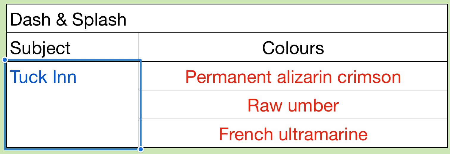
I also noticed the cover of my version is a teal colour whereas the cover on Amazon is more of a French ultramarine.  Maybe there are ultramarine coloured  versions of this book in bookshops with proper paper between the covers - keep your eyes open.

Anyway, let's talk content.  We have something like:
- 40 pages on composition
- 15 pages on trees
- 15 pages on rocks and mountains
- 20 pages on clouds and skies
- 30 pages on water

The stuff in composition was really comprehensive.  Most of it was stuff I already knew but it was presented differently to what I'd seen.  Other artists talk about this stuff by showing us complete paintings and picking out eye paths, centres of interest, etc but Jack shows us really simple drawing, made up of just a handful of lines.  Being a scientist at heart, I appreciated this simplification.

The section on tres was great.  Drawing trees is different to painting trees.  When someone like Terry Harrison talks about painting trees, he talks about simple cookie cutter techniques that are fine for trees In the background.  Drawing trees required more attention to detail and the tips in this book (like putting some foliage behind branches and some in front) will definitely help my painting.

The rest was less useful to me.  The stuff on rocks and mountains was generally stuff that I'd already discovered for myself.  I’ve never needed to draw clouds before, so wasn't too interested in that chapter,apart from some interesting stuff on how to make clouds contribute the composition, te although I may take another look if I start painting landscapes in coloured pencil.  The section on water with all its stuff in waves and reflections  was good but was never going to be able to compete with the Ron Hazell book.

In a couple of places (I think it was in the composition and rocks chapters) there was some interesting stuff on how to create imaginary landscapes by following simple processes.  There was an example with a valley with loads of spurs sticking into it and another with a mountain.  Other books only seem to talk about real world landscapes, albeit sometimes using artistic license to add or remove features or to combine together multiple photos.

The writing style was still a bit clunky and I didn't detect much passion coming through (understandable as this book is now 50 years old).  Compared to the other two Hamm books in my collection (on drawing people and animals), this did feel more like a book than a car manual.  Things seemed to hang together a bit more.

It's definitely a book that was worth going for and that I'm glad is in my collection.  But the old fashioned style drags it down a bit and leaves me somewhere between three and four palettes.  While I was determined to not deduct palettes for the terrible paper and scratchy illustrations, I'm quite happy for them to settle whether to round a half pallets up or down.  Three palettes it is.

🎨🎨🎨

Saturday 30 July 2022

Nuuk Art Museum

It was always going to be another supergranulating day today.  But tundra or shire?  I went for tundra.  The shire set is one that I might be able to use locally on site, so I'm going to save it up for a weekday when I can venture out.  Once I'd decided on a tundra painting, I had to decide what to paint.  After struggling last time to make best use of tundra green and tundra orange for the natural world last time, I was drawn to this view of the art museum in Nuuk, the capital city of Greenland.  I found two great photos of the museum: one with buildings painted yellow and green and with no snow in sight and one with them all painted yellow and loads of snow.  So I combined the two into something that I thought would let my tundra colours shine.

Nuuk, by the way has a population of about 18,900, making it roughly the size of Faversham, Leek or Ely. If those names mean nothing to you, head to http://lovemytown.co.uk/populations/townstable1.asp and you'll hopefully find somewhere that you know that's comparable in size to Nuuk.

I started off with a pencil drawing and then lots of masking fluid.  I resisted the temptation to put down huge white areas.  Instead, for the bigger white shapes, I put down a masking fluid outline and put a big X in the middle to remind me not to paint over it.

So, on to the painting.  The sky was made up of tundra blue and tundra pink with a little bit of tundra violet in places for cloud shadows.  Then I moved on to the buildings.  I started with the windows, dropping in tundra blue, violet and pink with one eye on my source photo.  Then I painted the green and yellow buildings.  I painted both with just single colours.  I used two different values of tundra orange, with a darker value on the shadowy side of the buildings.

Then I moved on to the darker bits of the buildings, mainly using tundra blue and violet but also some interesting greys that I got from mixing these colours with the tundra green.  Then I added some shadows under the eaves, under straps and on some of the shadow sides.  My main shadow colour was the tundra violet but others may have sneaked in.  I also added grey edges along the bottom and down the right hand side of windows.

Finally I got to the fun part.  All the masking fluid came off and I painted in the snow.  I started with tundra pink (the colour I was always planning to use) but later added some tundra blue and violet.  The painting was a mixture of solid washes on shadow sides and dry brush technique wherever I felt like it.  There's a strange yellow patch on one of the roofs.  I have no idea where this came from.  One minute it wasn’t there, the next minute it was.  I looked and couldn't see any yellow paint on my hands.  Maybe it wasn't paint at all and was just something dropped on by a passing bird?  It's a mystery.

And then there was a little bit of tinkering, applying some very light greys over the white in places like the flagpole and a door to make things clearer.  And the addition of a door handle.  And then I was done.

This one's another success and is going up for sale.  It's hard to go wrong with these colours.  They work as a team, all complementing each other and putting across a cold atmosphere: in this respect, having buildings painted in tundra green and tundra orange makes for a much better painting than one that attempts to replicate the actual colours.

Friday 29 July 2022

Denali National Park 2

Still making my way through my pile of new art supplies and today it's a first outing for my Schmincke supergranulating tundra watercolours.  They came as a set of five:
- tundra green is a mix of pthalo turquoise and Mars brown
- tundra blue is a mix of French ultramarine and raw umber
- tundra violet is a mix of French ultramarine and Mars brown
- tundra pink is a mix of French ultramarine and potters' pink
- tundra orange is a mix of yellow ochre, potters' pink and raw umber
All five, if put if put in rough enough paper in the right consistency will granulate and divide up into separate colours.

As you can imagine, I've been looking forward to trying these out.  I spent some lazy time this morning searching for tundra photos on the internet that would give me the opportunity to try out all of these colours.  I found five or six photos, settled for this one of Denali National Park and saved the rest away.  It's the second time I've painted a view in this park and the first one turned out pretty well.

I sketched out a rough outline and then masked out the snow in the hills.  I added a spatter of masking fluid, being careful not to put any on the sky.  I thought this might add to that wilderness feel in a glowworm sort of way.

And then I added on the colours from top to bottom.  The sky has the blue and the violet.  The hills used the blue, violet and pink in different places, being allowed to run together.  And the foreground used all five colours at times.  I was never really happy with the foreground and ended up applying several coats, which is why the granulation is less evident here.  I wanted to make the foreground mainly orangey but the tundra orange is more like a brown than an orange, so I added in more colours.  The green was annoyingly opaque at times, not letting the colours around and behind it shine: it's my least favourite of the five.

After adding the ground shapes, I finished by putting in the trees.  I tried using the green and the blue but wanted my trees to have a bit more life to them (quick aside: one of the features of tundra is that trees don't grow there) so reached outside the supergranulating for a yellow.  I tried transparent yellow first but it was stifled by the tundra green so I had to go nuclear with the cadmium yellow instead and this seemed to work.  The closest trees look really good and I'm very grateful for this: without their voices, the painting would be let down by all those individual tree marks in the middleground.  But with those foreground trees, everything hangs together.

My overall verdict is that this one's a success and will be put up for sale.  That's despite me not getting the best out of the supergranulators.

And my verdict on the tundra supergranulators?  The blue, purple and pink are amazing.  The orange is OK and the green seems weakest, at least for the moment.  But I can make better use of these colours.  I need to apply thinner coats of paint, resist the temptation to glaze multiple layers and find something to do with the green.  The green wasn't designed for trees and I need to find something else that grows in tundra regions that has a bit of chlorophyll in it.

Thursday 28 July 2022

Big Sam In Coloured Pencil

I still have loads of new art gear to try out, so no dash and splash for me today.  It’s time to give the coloured pencils a first outing.  For subject matter, I thought it best to start something easy as a confidence booster.  I could either have done some naked figure drawing of a portrait of Sam Allardyce, someone whose likeness I never seem to have any problem with.  In the end I decided to go with Big Sam because I suspect I may be doing a few portraits with the pencils.

Paper-wise, this is on 150gsm smooth cartridge paper.  I got two cartridge pads for my birthday: this and 96gsm medium.  While these will be OK to get me started, I'm already wondering whether I'll be wanting to move on to watercolour paper at some point.

I started with a tough pencil drawing.  It was a freehand contour drawing rather than something drawn using a grid: I find this works better for portraits, especially Big Sam portraits.  I then went about shading everything in using the side of the lead trainer than the point.  It was like walking around the mountain before climbing it but also allowed me to put down lots of overlapping colours.  I used all sorts of impressionistic colours that I could see in my source photo.  Once I was happy with this underpainting, I set about doing the painting properly.

For the proper painting, I used the points of the pencils and pushed down hard for any detailed bits.  I worked through the face section by section: eyes, then ear, forehead, nose, left cheek, right cheek, mouth, chin, 'tache space, neck.  After filling out each space, I would burnish it by putting a layer of white over it and pushing down hard: the idea is to flatten any texture in the paper and to make the pencil work look a bit more shiny.  I don’t know whether I've done this properly: I may have to wait until I use rougher paper to really know.

Then it was the jacket.  The sort of shape that was begging to be coloured in monotone black and to wipe out half my black pencil in one go.  But while I made the collar quite solid, I was a bit looser on the rest of the jacket, just applying various sideways fillings of black and grey with the side of the lead in different directions.  I also threw in some blue and magenta to fit with the rest of the painting and keep things interesting.  All burnished again with the white, of course.

And finally it was the hair.  I was expecting this to all go wrong but it didn't come out too bad.  I just imagined I was combing it in and then blackened in some areas at the end.  The hair has a greasy look to it, which I quite like.

Paper-wise, I found this smooth cartridge paper a bit frustrating.  When I was putting down colour by pushing down hard, the paper didn't really let me put one colour down on top of another.   I'm hoping that tougher paper has the capacity for more colours.  If it doesn’t then it's the way I use the pencils that's the problem.  I'll find out another day.

Anyway, what's the final result like?  And, more importantly, what's my style like with the pencils (because this is the first I've seen of it)?  Perhaps unsurprisingly it looks like I'm going to be wild and impressionistic with the colours, much as I am with the inktense pencils. In fact, this felt like one of those days with the inktense pencils when I put down too much colour and don't leave enough white.  So it's a bit like using inktense pencils but with the shackles removed (and without all the fun of wetting the marks afterwards).  And the picture's decent enough to go up for sale.  Coloured pencils are looking like a great medium to use when I don't want to go outside.

<Edit: Sam was later used as a guinea pig for coloured pencil solvent testing but is still up for sale.  Here¡s the new version:

>

Wednesday 27 July 2022

Inside The Tuck Inn

After doing two drawings from the other side of the road opposite the Tuck Inn, I was ready to step inside and enjoy a milkshake while doing a third drawing. What I didn’t know until today was that the Tuck shuts at 3pm, so I only had 10-15 minutes to do my drawing.  So it's another rushed drawing and the perspective's wrong in a couple of places.  I'm starting to notice that the more I rush, the more my drawings start to look like the work of Quentin Blake or Bill Tidy, two legendary artists.

Anyway, I did manage to finish the drawing and the milkshake in time for people to get off home.  I wandered back home with my three drawings, chose the colours for the first two, changed my colour randomiser (reclassifying raw sienna and Winsor orange as yellows) and ran it, only to be presented with this set of colours:
With no red or blue, it's a slightly underwhelming set of colours.  On the other hand, the transparent yellow would enable me to add a bit of brightness.  I was hoping that the burnt umber and viridian might mix to give a nice dark, neutral colour, but no such luck - they just gave a dark greeny brown.

So I just did the best I could with these colours.  I tried to brighten up the walls with transparent yellow but had to add a bit of green and brown to bring them under control.  For the front of the counter and the floor, I added some random stripes of green and brown to give the impression of separate planks.

I've need up with something dull looking that the Tuck won't thank me for.  Please remember the computer chose these colours - I didn't.  The Tuck is a much more welcoming place than this painting would suggest.

Cherry Stand In Tuck Inn Car Park

While I was drawing the Tuck Inn, I also had one eye on a stand in the car park where someone was selling cherries.  I thought it might make a good dash and splash painting.  But it looked as if they might be closing any minute, so my drawing was really rushed.  The stand itself is terrible but the unnecessary haste did mean that when I added a couple of people, they were very loose, gestural and energetic.

When I got home, the iPad picked out these three colours for me:
Now that is a grim set of colours.  First there's no red.  Red was the colour of the sun umbrella and also the colour of cherries, so part of the atmosphere.  A spattering of red at the end would have looked good.  But worse still was the greenness of the palette.  From yesterday, I know that Winsor orange mixes like a yellow, so I had two yellows and a blue.

Immediately after being presented with these colours, I made a change to my random colour selector.  I reclassified Winsor orange from orange to yellow and raw umber from brown to yellow.  Yellow ochre was already classified as yellow.  This will reduce the chances of me being presented in future with three colour sets that look like two colour sets.  Too late for this one though: I'm stuck with two yellows and a blue.

I did the best could with those three colours.  This might be the best I've been so far at not colouring in.  The figure in the left looks good, with lots of white left showing.  But those three colours are a bit too drab (and two of them too similar) to make anything interesting.

The Tuck Inn

This afternoon I took a stroll down to the Tuck Inn, my local purveyor of breakfast baguettes with the intention of running off another two or three dash and splashes.

I started with a view of the outside of the building from across the road.  It was a deliberate ploy on my part to not include the whole building: I didn’t fancy the alternative of a long thin building with a large empty space above or below it.  I deliberately combined most of the cars together into a single shape and didn’t add detail.

When I got home, the iPad recommended these three colours:
A red at last, along with a decent blue and a yellowy brown.  It would have been good to get a nice primary yellow to go on the lights and to give a decent green for the trees but beggars can't be choosers and this is definitely the best set of colours so far.

So I applied those three colours.  I actually quite like the muted green that I ended up with for the trees and the way the car colours merge together fits with the looseness of the underlying drawings.  I would have preferred a less pink car park though, and I really should start leaving more white areas.

This one was up for sale at one point but I've taken it down as I've done much better stuff since.

Tuesday 26 July 2022

Looking Towards Hartlip House

And here's today's third effort, a different view from the same bench.

The drawing feels like a step down from the first two.  There are various bunches of flowers that feel a bit half hearted and it probably wasn't a great idea to use such dark blocks of black in what are background shapes.  The windows on the house would have been fine, for example, cross hatched or even just outlines.  The detail in the background is fine: it's just the big contrasts between light and dark that should only be used around the centre of interest (in this case the foreground gravestones).

Anyway, what does the iPad have to say about colours?
I didn't mind the sound of this choice at first.  I thought the Winsor orange might be able to neutralise the viridian or indigo and produce an interesting dark neutral that could give me a grim looking graveyard contrasting against a bright white house behind it.  But some test swatches revealed this to only be a pipe dream: the orange behaved like a yellow when mixed with either of the other two colours, only ‘extending the range of possible greens.

So I was left having to paint the red roof orange and then, over the rest of the painting, to try to use orange for the brightest bits and indigo for the darkest, fighting hard to not turn everything green.  The iPad had given me a hospital pass and no mistake.  I did have a couple of minor successes, though, with some faint blues and oranges bringing the house to life and some orange trees at the back on the left.  There's also some random dabbing on those gravestones that falls a long way short of colouring in and looks good.

So, yeah, looks like a 33% success rate so far for the dash and splashing.  It will revert towards the mean at some point once that iPad remembers that it's allowed to pick reds.

This one's not going up for sale.

Hartlip Church Porch

Next I moved position to get a view of the porch at the front of the church.  I went against the advice of Alex Hillkurtz and picked a viewing angle where I could sit comfortably on a bench rather than looking for other angles that could be better.

One thing I did differently with the drawing of this one was that I didn’t start with a pencil outline: I went straight to the pens.  There's definitely something fresh about the way this one looks but I don’t think there's a right way and a wrong way.  I went to town a bit on the roof tiles, settling into a repetitive scribbly indication of their presence, again showing much more detail than I normally would.  I also used the brush pen a bit more than before to mark in the darkest shapes.

For colours, the iPad chose these:
This didn't feel like too bad a selection when I first saw it. The brown and grey are quite grumpy, earthy colours and the yellow is bright enough to shine through ahead of the grumps.  But I tried a bit too hard with the yellow on the sunnier bits of the building, resulting in a very green painting.  I really could have done with a proper red in this one to get that roof to a better colour.  And I'm wondering whether I should have just ignored most of the lines on the page and thrown the paint on fairly randomly.

I didn't think this was as good as today's first painting but it proved to be popular on Facebook and was quickly sold to a Hartlip resident.  All proceeds going to the church.

Hartlip Church Tower 2

Tempting as it is to binge read my pile of new art instruction books, I do really need to test out some of my new art gear.  First up are the fineliner pens, which means I'm dashing and splashing for the first time. As a gentle introduction to this new direction, I thought I'd head to Hartlip Church as it's one of those subjects that it's hard to go wrong with.  I took my 5x7 inch hot pressed pad and my pens and didn’t know how many drawings I'd be doing.  Being too tired after one drawing would be a fail.  Two would probably meet expectations.  I actually ended up with three drawings and could easily have done more: the sketches were completed more quickly than expected.

I started with a drawing of Hartlip Church tower.  After putting down a very rough pencil outline as a guide, I used a thicker pen in the foreground and thinner pens in the background.  I added a lot more detail than I would have done with any other medium and (I think) for the first time used crosshatching to shade in the darkest areas.  I later marked in some really dark bits with the brush pen.  And this all felt really easy and natural.  Having eight pens of different thicknesses is a million miles away from having just the one pen.

I was pretty pleased with the pen drawing: it was pitched at exactly the level I wanted a dash and splash painting.  Although maybe I need to think about how to draw in trees that are obscuring bits of buildings.  And I have a birthday book that should help me with that.

When I got home, I got the iPad to choose my three colours for me and this is what it came up with:
I should probably explain how this colour selection works.  The spreadsheet was asked to pick one of 22 colours, all with equal probability.  It chose Prussian blue.  Then, from the 22 colours I eliminated all the blues (Prusssian, cerulean, French ultramarine, indigo, Windsor (green shade) and Payne's grey).  This left 16 colours all given equal probabilities and the spreadsheet was asked to pick one.  It picked yellow ochre, so I eliminated the all five yellows, and from the remaining 11 colours the spreadsheet picked out Winsor violet.  The box where I've written in the subject doesn't feed into any formulae but every time I enter in a different subject, a new set of colours is selected.  This was all done in an app called Numbers - if it was in Excel I could have incorporated a randomise button instead.  It's also quite handy to have the subject filled in when I'm doing multiple paintings and I can take screenshots and keep track of which colours apply to each painting.

Anyway, about the colours.  Not too bad a selection.  A blue and a yellow, the yellow being fairly earthy.  No red but the violet may well be OK.

After drawing and dashing, on to splashing and I don't think this is too bad at all for a first attempt.  The sky is suitably messy, almost showing up individual brushmarks.  The colours on the church are laid on quite loosely, roughly following shapes but without any effort to get the colouring in right.  And that main wall facing us includes all three colours, running into each other: just the sort of thing that's needed.

If I could change one thing, it would be that purple colour in the shadows.  Maybe I could have mixed the purple with the ochre to get a more neutral colour?

Anyway, this worked out well.  It’s going up for sale.

Monday 25 July 2022

Line And Wash Painting: Liz Chaderton - Book Review

Another book review, and today it’s Liz Chaderton's book on line and wash painting, something I wanted to read before I head outside for some dash and splashing.  This is a 128 page paperback and, like her other books, only about 7 inches by 9.  To be fair, that's roughly in line with the size of painting that this book's readers should be considering, so this would fit nicely in a bag alongside a pad or shetchbook.

On to the book.  Just like with Liz's book on painting animals, the advice is all packed in pretty tightly just like the notes that I make for myself.  And just like that other book, this one can be accused of going off on a tangent in places.  But I'm getting ahead of myself.

We have seven chapters.  The first one is on equipment.  Not much use to me because I've already decided that I'll be using Liquidraw fineliners and W&N watercolours.  But I appreciate that there definitely needs to be something there about the options for inking tools and all the different pros and cons.  This section's definitely comprehensive.

Next is a chapter on inking.  I thought this fell a little short.  I expected to read more about drawing, and drawing buildings in particular.  Stuff about starting with a big vertical line in the middle.  Starting with simple shapes then adding windows, doors and other details.  Even all the stuff about perspective that I already know.  There were brief discussions on types of mark and on how to hold a pen but not much more than that.  And, bearing in mind this was a book about line and wash and not about ink and wash, it was a bit jarring to see some stuff here that seemed to be more about painting in ink than about drawing.

The third chapter on watercolours was really basic stuff and not much help to me.  The same was true for the fourth chapter, all about line and wash techniques.

And then we get to the last three chapters on further experimentation.  Normally I'd expect this to make up about 10% of a book but here it's 46%!  The three chapters cover collage, different surfaces and introducing a third medium.  Interesting stuff and very comprehensive (not just ideas but specific details on what to do including warnings about things that could go wrong) but it felt like a luxury when the necessities had been skimped on.

The best bits for me were right at the start of the book.  Three inspirational paintings of buildings (including the one in the cover) before we even get to any written words.  These paintings all show quite detailed ink drawings with imaginative, impressionistic watercolour overlays.  These are the paintings that I wanted to hear about.  There was also a really tightly packed three-page introduction before the first chapter that talked about this style of painting.  The pros and cons of applying the ink before the paint or vice versa, how the paint wash doesn't need to relate to the linework, etc. In fact there's half a page with a table of eleven tips that's great.  I was just hoping for a book that expanded on these tips rather than talking about painting with inks and further experimentation.

So how do I grade this book?  Well it scores high on inspiration, high on ideas that I don't yet need (all the future experimentation) and low on the ideas that I was looking for.  People may well ask what it was that I wanted to hear about beyond that half page table in the introduction but I don't know the answer: I was hoping to find the answer in this book.

According to my rating policy, this is a two palette book.  I don't regret wishlisting it but I'm not sure I'd buy it again if my house burnt down.  This could, of course, change at some point if I become interested in some of the experimental possibilities in the second half of the book.  And anybody looking for ideas for how to move beyond plain simple line and wash painting should definitely check out this book.  I feel guilty about giving this rating as Liz has a great YouTube channel but, yeah, it's two palettes from me.

🎨🎨

Sunday 24 July 2022

Sketching Techniques For Artists: Alex Hillkurtz - Book Review

In the end I got eight books for my birthday.  Six of them are already here in front of me; two aren't published until August, so I know exactly which ones they are.

First up for review is this one by Alex Hillkurtz.  It's a 144 page paperback.  Initial impressions are that it feels good in the hand.  It has one of those slightly sticky feeling covers like the Charles Reid books.  Just taking a quick flick through, though, it looks a little light on content with not too many words, but we'll see.

We have about 65 pages of general stuff, 55 pages of subject matter specific tips and about 20 pages on watercolour.  In that first 65 pages there's the usual stuff about equipment and about composition, but also a really interesting chapter on choosing what to paint and from what angle, something I don’t think I've ever seen discussed in a book.  And there's probably the best explanation of one, two and three point perspective that I've ever seen; stuff that I already knew about but also including at least one useful tip that I'll be taking on board.

Then we have the subject matter chapters on still life, landscapes, architecture and figures.  The chapters in architecture and landscapes were the most interesting but the other two felt a bit like padding.  Maybe this was because the more general chapters in that first 65 pages were very buildings focused.  I get the feeling Alex may have started writing a book about sketching buildings, came up a bit short on pages and was faced with the choice of extending it to drawing and painting buildings (with lots more detail on painting) or extending it to sketching generally (with some extra bits on still life, people and hills thrown in).  I might have preferred the first choice but we'll never get to see how that would have turned out.

And then there was the closing chapter on watercolours, which did include a couple of interesting ideas.

But all the talk above about the content of the book doesn't do it justice because it leaves out what makes this book different.  And that is the overall tone/message/feel of it.  In terms of tone, this book slips down like a half melted cornetto.  It's tempting to read through it all really quickly but you instead have to force yourself to slow down and take in every point.  Alex's passion comes through on every page too, and that includes even in the chapter on perspective, which could have been very dry in the hands of a different writer.

And there's an overall message/theme coming through from this book.  Which is that sketching isn't just about getting what's in front of you down on paper.  You also need to show the personalities of the buildings and trees.  You need to show what the buildings and trees are doing.  You need to record the gestures in front of you.  Each person in the painting needs to have their own story.  We're composing a poem in light in the same way as a symphony is a poem in music and a film is a poem in, oh, whatever.  This all sounds very weird but it comes through on every page of the book.  It's what this book is really all about: adopting a new mindset.

Overall, this book ended up exceeding the expectations I had from that first flick through.  It's very well written, full of passion and relentless in how it tries to change our ways of thinking.  There are some interesting tips on there that I've not seen before, albeit not that many.  But I can recognise how this book does make me think differently.  I think it's worth three palettes (remember this is a good score and means that the book is definitely worth buying).

🎨🎨🎨

Saturday 23 July 2022

Polychromos Swatching

So I've done a huge swatch of those Polychromos coloured pencils and here it is.  They look good.  Even the cobalt green and rose carmine will end up getting used at some point.  Looking at the while set, I'm wondering whether there are any areas where I'm short of colours and could expand the set - after all I have 36 colours and a case with 72 slots.  And it's hard to find holes.  Maybe at a stretch I could do with another yellow and another brown?  Or some more flesh tones if I go down the portrait or figure drawing route?  Or maybe if the set is so well balanced, I could only expand with a well balanced collection of 12-24 more colours?

Birthday Stash 4/4: Everything Else

And then there's all this other stuff:

- a backpack big enough to fit the big white plastic bits that come with my easel.  No more lugging two carrier bags around when I'm out in the big wide world.  I'll be wearing most of the stuff on my back.  I'll still need to carry the water separately in a plastic milk bottle though.

- a case to keep my brushes in.  My brush roll was starting to look a bit dirty and past it and I was always nervous about whether the brushes actually felt comfortable in a roll.  But this case is great, with a hard outside that will stop bristles getting folded around.  It also folds into something that allows the brushes to stand up and dry.

- a couple of water cups that can be squashed down to save space.  More professional looking than the old food containers I've been using.

- two books (so far anyway) that will be reviewed on this blog at some point.  I think I'll be reading the one on coloured pencils first.

Birthday Stash 3/4: Polychromos Coloured Pencils

And there's more.  A set of 36 Polychromos coloured pencils, a case with room to expand to 60 pencils and a couple of pads of cartridge paper.

I've not used coloured pencils before but I've seen some amazing stuff produced with them.  I might try some portrait painting with them.  Or maybe figure drawing.  I don't know yet whether my style will be realistic or bonkers (like my inktense pencil paintings) or something in between that looks realistic from a distance but close up has lots of weird impressionistic colours.

Birthday Stash 2/4: Fineliners

Next up are these fineliner pens, complete with pen case and extra smooth watercolour paper to use them on.  The case is big enough to also fit the pencil, rubber, white gel pen, mapping pen and plastic tubes to blow through that I take around with my watercolours, which is good.

I already have plans for these pens.  I'll be heading out and about with the pens and the pad and drawing landscapes in quite a bit of detail with dark areas blacked out or hatched.  Maybe two or three landscapes in a day.  Then when I get home, I have my tin of Winsor & Newton halfpans earmarked for adding a bit of colour.  I've thought ahead a bit and built a spreadsheet that will pick three colours from the tin, excluding black and white, and only allowing one colour from each of a set of defined families (red, yellow, blue, violet, green, orange, brown).  Whatever three colours are picked for each sketch, they'll be used to add colour to that sketch.  There will be no redraws.  It will add a bit of risk and excitement.  I'm looking forward to it.  It will also give that tin of halfpans some purpose in life: with so many colours it's prefect for this role.

Because this is all about doing a sketch, running home and throwing on some loose watercolours, I'm calling this technique dash and splash.  I'll fill out the whole of that book with dash and splashes.  Who knows, maybe I'll put together a dash and splash series of every Cambridge college if number two son makes it into Trinity Hall and I have 24 taxi runs to do over the next four years.

I'll wait and see whether any books on line and wash arrive before setting out though.

Birthday Stash 1/4: Schmincke Supergranulating Watercolours

So it's my birthday and I've got a lot of new art gear.  Jeepers.  So much that I've split it all over four posts, three of which will set me off in new artistic directions.

First up, here are two sets of supergranulating watercolour paints by Schmincke.  I've seen swatches of these and they're amazing.  They don't just granulate but they divide up into separate colours.  There are ten colours here, far too many to crowbar into my main palette.  Instead, I'm going to dedicate an old palette tin to these.  Both sets will fit in the tin, one down one side and one down the other.  There may be room to fit a couple more colours in there: I may well put in a red or two to supplement what's a very green looking Shire set.

Needless to say, I'll be getting some more rough watercolour paper in and doing some paintings using only these sets separately (maybe with an extra red or two for Shire).  The two sets each look like they harmonise together around the theme named on the box.  This should be good.

Looking further ahead, if these work out well, then I may look at their component pigments and consider introducing them to my main palette.  In particular, Potters' Pink is in some of the tundra colours and could be an alternative, less dirty looking, alternative to hematite violet genuine at some point.

Looking forward to relying these out.

Friday 22 July 2022

Red House

Today's one of those weird days of the year.  The day before my birthday.  Who knows what sort of art gear or art books will appear tomorrow?  Whatever does, tomorrow will be the start of something new, making today a bit of an anticlimax and a day when I'm always going to be short of inspiration.  But I needed to be painting after a fairly long break from the watercolours.  I searched through a list of Hendrix tracks and a list of Blackwood short stories, looking for potential names of paintings but without any luck.  Instead I searched through my pile of painting ideas,  I found a black and white photo that Olly Crook had put up on Facebook of a hilltop covered in trees and surrounded by fog with another hilltop faintly showing through the fog in the background.  It was the sort of photo that I could look at and put away before heading outside to paint an imaginary landscape without having a photo reference close to hand.

The plan was to do this painting using just three colours.  I picked a cool blue, Mayan blue genuine, because my warm blue, French ultramarine, had recently been doing a lot of heavy lifting.  I went for Indian yellow for similar reasons.  Following the same logic, I might have been expected to choose a warm red but I didn't to be working in an orange key, so picked quinacridone magenta yet again to to end up in the key of triadic left.  Hematite violet genuine, cobalt blue, titanium white and cadmium red all ended up playing a part later though.

For a while, everything went according to plan.  The sky worked well.  So did the tree lined hill top, with trees tending to be yellow on the left, blue on the right and a green mixture in the middle with a bit of red thrown in here and there to hold the greens back a bit.  And the red and blue hills on the right came out well too.  The Mayan blue adds granulation; to both the hills and the sky.  Definitely a good thing as far as the hills are concerned.  Debatable for the sky but not necessarily wrong.

Where things started to go wrong was the foreground, which was supposed to be fog and which I hoped to be similarly valued to the sky.  But my first attempt was too dark and, after that, I made a long series of failed attempts to rescue it.  I tried glazing over with a mix of cobalt blue and titanium white (a recommendation by Zoltan Szabo) but this didn’t work.  I tried the same thing but dropping some red, blue and yellow into the foggy glaze but that didn’t work.  I tried adding hematite violet genuine to the mix but that didn't work.  I tried my three primaries with hematite violet genuine but that didn't work.  And with all these tries and with my original wash, I threw on loads of water and tried to remove the paint with kitchen paper but that didn’t work.

In the end I gave up and ended up with what you see here.  A textured, purple hillside that looks like a dead, post nuclear landscape.  I added some birds just to get some life in there and then a house with a (cadmium) red roof just so I could name this one after a Hendrix track.  Maybe I also needed to add some red, white and yellow opaque spatters but they wouldn't have been enough to rescue this one.  I'll quietly put this one to one side and chill out for the afternoon, psyching myself up for my birthday.

Thursday 21 July 2022

Tidying Up The Shop Windows

I've not done any painting for a while, although obviously the weather's had a lot to do with this.  I've not been completely idle, though, and have done a bit more work on the website.  This time I've been looking at the pages of artwork that I have up for sale.  I've done two things:

- I've removed a number of works that, while they might have deserved to be up there at one time, were now looking out of place among better works.  As well as removing them from the for sale pages, I've amended their individual blog posts, removing any references to them being up for sale and removing their for sale search labels.

- I've reordered the works on the two longest for sale pages : the 8x12 inch paintings and the inktense pencil figure drawings.  In both cases, the paintings were presented in an order that was fairly random except that the better works tended to appear near the top and the worst ones near the bottom.  They're now in a more sensible looking order.  The 8x12 paintings are grouped into subject matter themes and the figure drawings are roughly ordered by colour scheme.

Looking through the for sale pages, I feel better than I did a few days ago.  They feel a lot more like an exhibition or an Argos catalogue and less like Woolworths in the final days.

Anyway, it's all sorted now and I'm back to painting tomorrow, weather permitting.

Friday 15 July 2022

New Court In Colour

Bearable temperature outside today?  With worse to come, I thought it best to get out there with the watercolours while it was still possible.  The subject matter is New Court, Christ's College, Cambridge.  I think this is my fourth attempt at painting this concrete monstrosity and looking for beauty in a deep dirty hole.  This time, though, it's in response to a request from a Christ's old boy to paint New Court in the same style as my painting of Murray Edwards College a few weeks ago.

So the main three colours are again transparent yellow, French ultramarine and quinacridone magenta (so this is in the key of purple cool).  You can see, though, that cadmium red, cadmium yellow and titanium white made appearances as spatters at the end.

I followed the same methodology as for the Murray Edwards painting as long as I could.  A pencil drawing using a ruler.  Then a bit of masking fluid for some safety rails.  Then the sky, with all three primaries and some kitchen paper dabbing.  Then it was on to the darkest darks: the windows,  these started off as a dark purple and I was expecting to need to apply several coats.   Next came the darker shadows, where I started introducing some yellow to the mix to get a more neutral colour.  Then I added the impressionistic sunny colours to the concrete in unmixed form wherever I fancied and allowed it to mix on the paper.  And added some hard edges in places where some of the shapes needed them.  If I'd then just darkened my darkest and next darkest darks and maybe added some light darks, I might have been done and left holding something similar to the Murray Edwards painting.

But somehow I lost the way at this point.  I wanted to add a bit of three dimensionality by adding a light shadow to all the left facing surfaces.  But this meant that the sun was coming in from the right and the colourful wall of concrete on the right of the where I'd left some dazzling whites would now have to be put into shadow.  And once I'd added these extra shadows, I ended up with the feeling that my darker tones weren't all working together.  So I started adding glazes (most of them blue but at least one purple) over all of my different shadowy areas in an attempt to unify them.  What I ended up with was just about acceptable.

There are a number of things I could have done differently, like:
- starting with a value plan
- maybe having all shadows a similar colour (but different values)
- or maybe mixing a black for the windows and using purple shadows everywhere - purple shadows make for a sunny scene
Anyway, what's done's done.

Once I reached the point at which I was convinced that any more painting of the building would make things worse, I stabbed in the greenery at the top with a Terry Harrison Merlin brush.  Blue at the bottom, yellow at the top and both in the middle.  Simple.  I added spatters of opaque paint because I thought the painting needed it: there wasn't enough variety in the colours of the windows.  And then I rubbed off the masking fluid and I was done.

I think this one's a decent enough effort despite my misgivings.  The impressionist colours in the concrete are what make it.  It's up for sale.

Wednesday 13 July 2022

Sarah Ann, Pensive

 
It's just too hot outside to paint this week, so I'll be having a run on the inktense pencils.  Today I picked a pose by Sarah Ann, someone I've painted in oil pastels before.  This might even be based on the same pose.  I didn't even check the model's identity before starting, though, so didn't know I'd painted her before and the similarity in colour schemes is a huge coincidence.

I quite liked how my most recent painting turned out.  The leaf green, baked earth and willow produced together a very realistic, flesh-coloured set of colours but we’re maybe a bit lacking in darker values.  So today I started with bark in the shadows, supplementing this with leaf green, baked earth and willow.  Oh, and mustard too.  But I wanted things to be a tiny bit more interesting, so tried to add some poppy red and iris blue in places. But I went a bit overboard with these colours and soon decided this would be a multicoloured painting it’s little or no white showing.  The red and blue at this stage were so bountiful that I thought I'd add a little teal green in places for interest.  And a bit of violet in the shadows because I was now on tilt.  I went all over the painting covering up all the white on the figure, even using my original fleshy colours in places.  Here's what I ended up with before I added any water:

Once I'd added the water, I thought the resulting painting was a bit too green and that the shadows were a bit too light.  So after a lunch break, which I thought was long enough for everything to dry, I put some more bark in the shadows and added more of the poppy red in places to offset the green.  The water hadn't dried completely in places and my red pencil left inky marks rather than pencil marks but you'll only spot these if you know they're there.  I noticed that my first wetting of the pencil marks had left some textured effects in places, so thought I'd add to these by dropping on some tiny drips of water.  These only resulted in the one cauliflower mark at the top of Sarah Ann's left thigh.

Overall, the painting is interesting and clearly identifiable as mine.  But the shadows ended up a bit too dark and there was something that doesn’t look right about either Sarah Ann's right leg or abdomen or both.  I managed to solve these problems by cropping off the painting at the bottom but I'm still not putting this one in the shop window because I don't know whether I'd be able to find an off the shelf frame for the cropped version.

Here's what the uncropped version looked like.  Pretty horrible, isn't it?

Saturday 9 July 2022

Adrina In Inktense Pencil

After that last painting, I wanted to have another go at painting Adrina in this pose, so it was back to the inktense pencils.  It's quite good painting indoors while it's so hot outside and while the local pub has live music playing.

For colours, I started with willow in the darkest places then added baked earth in some middle value places, remembering for once that baked earth is a light orange rather than a dark orangey brown.  And, because I thought this left things looking a bit brown, I added some leaf green in the darkest places, hoping this would add a little colour to the browns.  I normally like to add reds and greens but was feeling a bit coloured out after this morning's painting.

I'm reasonably happy with the final result.  I've left plenty of white, including some missing edges.  What I have of the face isn't a disaster.  But maybe I need to be a bit heavier with the willow in future.  Or use bark instead.  Those darks aren't as dark as I’d like them to be.  Anyway, this one's up for sale and I feel like I've done Adrina justice now.

Adrina In Watercolour

My plan today was to play things fast and loose by putting down a random colourful underpainting and then to convert it to something else with some subtle negative painting and a little bit of detail.  I was expecting to end up with a landscape painting with a skyline and some windows but ended up with something else.

For colours, I went for a warm green colour scheme because it gave me the most colours to choose from.  I have three cool blues (cerulean, Mayan, Prussian), two cool yellows (transparent, raw sienna) and two warm reds (Winsor, rose dore).  I used all of these plus the viridian.  Cadmium red, cadmium yellow and titanium white all made cameo appearances as spatters at the end.

I started off with a random underpainting, featuring all of the main eight colours, generally painted along a diagonal.  I threw on loads of salt and spattered some Prussian blue and Winsor red over the top, writing off a t-shirt in the process.

Once this had dried, I had a good look at what I had and looked through my stash of photos with ideas for future paintings.  As I said at the top, the idea was to come up with a landscape but I actually ended up with this figure drawing pose by Adrina.  The attraction behind this was that Adrina had some diagonal lines in her pose in the same direction as the underpainting and that I might be able to bring her out of the painting with a simple outline and a handful of extra marks.

Pencil marks didn't show up well on the underpainting, so I was effectively painting the figure freehand.  This was made even more difficult by having to paint her negatively.  It took a lot of painting and a lot of corrections to get to my final painting.  In places I've had to paint her positively, which isn’t necessarily a bad thing.  Positive and negative marks for variety.

I finished off with spatters from my three favourite opaque colours because this felt like the sort of painting that needed that sort of finish.

Overall, I'm undecided on this one.  I like the ideas behind it but the execution isn't as good as I'd hoped.  It feels muddy when I wanted it to be colourful and energetic.  The left hand on the thigh is light coloured and negatively painted but it's easy to mistake the blue/green shape above it for a misshaped arm.  I'm thinking this one won't be going up for sale unless it gets rave reviews on Facebook or Instagram.

Meanwhile, I'm reaching for the inktense pencils.  I'm going to have another go at doing this pose some justice.

Wednesday 6 July 2022

Stonehenge III

I fancied having a go with the oil pastels today as it's been a while.  It's still too hot for them outside, so I was painting indoors.  To be honest, even then there was one pastel that was starting to melt.  For subject matter I picked another if the Stonehenge pictures that I have sitting around.  I'll eventually need to start numbering these Stonehenges, so thought I'd start today.

I followed the usual back to front methodology: draw an outline, paint the sky, then stones, then grass, then the birds.  The birds are in sap green as this was the main colour in all my dark areas.

It should be obvious from looking at the painting that the painting of the stones was the step that I took the most time over.  I started today by dotting in lots of different colours, generally going for browns in the darker areas but also throwing in greens and yellow where I could see them in the source photo and crazy reds and blues in random areas.  Ranger then smooth these out using my finger, I smoothed them out with strokes from the white pastel in the light areas, just using the finger in the shadows.  This made the light areas a bit too light though.  I tried to add some strokes of grey green to darken them but felt as if I was starting to lose some of the impressionistic colours.  So I scraped off most of the white and grey green with a craft knife and things started looking better again.  My original dots had been smoothed out but the lightening effect of the white had gone.  A few extra strokes of sap green in the shadows, yellow deep on bits facing the sun and impressionistic colours where they might look good and I was done; all these additions were smoothed out with a finger.

And that was me pretty well done.  A bit of tinkering around the edges between stones and sky to make them clear and some marks in the grass with a craft knife and I was done.

I'm happy with this one, even if I slightly prefer the watercolour versions of Stonehenge.  It's up for sale.

Tuesday 5 July 2022

Sgurr A'Fionn Choire And Baruch Na Frithe

The distracting FIDE Candidates Tournament is over and I need to get back to painting and make up for lost time.  But the test match was on this morning and looking like finishing soon after lunch so there was no morning painting.  And I wasn't ready to go back on the road and my iPad was charging.  That left two choices: something random or something from a book.  I had a search around the bookshelves for some suitable material and found a book on walks on the Isle of Skye.  I quite fancied painting snowy mountains so decided to go for this one, showing the walk home from Baruch now Frithe (the hill on the right).

Despite only having cold pressed paper in my supplies (no rough) I thought I'd give the granulating mixes a go again.  The main three colours today were viridian, Mayan blue genuine and rose dore.  I guess this counts as being in the key of green warm if you think of the viridian as a really cool yellow.  Also appearing were cerulean blue, hematite violet genuine and titanium white.

I didn’t start with a pencil outline today but just went freestyle with the paint.  I started by carefully painting the sky with just water so that I could get my skyline roughly right.  This feels like an important first step in freestyle painting.  Then I painted in the sky, most of it in Mayan blue but with the creamier cerulean blue at the bottom and some white spaces for clouds.  Then I added in some viridian and rose dore, trying to get them to mix with each other and with the blues and not showing up as individual colours, something I didn’t achieve but that's not a problem.  I dabbed the sky dry with kitchen paper as usual, trying also to remove paint where it had spilled over into the mountains.  Despite there being no hematite violet in the sky, it has that dirty, granulating black look to it: this presumably all came from the crystals in the Mayan blue.

Next I moved on to the dark shapes on the mountains.  In terms of shapes, I tried to roughly follow my source photo but for colours I was more unrestrained.  I created three colour mixes, mixing each of the rose dore, the Mayan blue and the viridian separately with the hematite violet genuine.  I then painted all the dark shapes in with these three mixes, switching randomly between the three mixes, often within the same shape.  I also sprinkled on some salt in a couple of places.

The third of my three planned steps was to add a shadowy glaze over the top.  This was mainly Mayan blue but with a tiny bit of hematite violet mixed in: it was a blue colour rather than the granulating grey that these two colours produced in the second step.  It was also much more watery than the dark colours in the mountain.  This glaze went over parts of both the dark shapes and the white areas.

Finally, there were three, no, four bits of fiddling at the end which (touch wood) didn’t worsen what I already had down on paper:

- I added a second glaze of the dark colours in places where I thought the painting needed it.  In particular, I added the diagonal line of reds down the right hand side of the nearest mountain, trying to balance the green/grey gash down the middle of the painting.

- I added the hikers and the footprints on the left where the large white area was looking a bit boring.

- I added some white to the tops of the hills, on top of both dark colours and whites.  Somehow contaminated titanium white looks snowier than empty white paper.  And the hills, which didn’t have snow on their peaks in the source photo, looked like they needed it.

- It's  hard to see but I spattered on some titanium white at the end to make it look like there was some snow in the air.

And that was it.  I like this one.  For once there's nothing that bugs me about the painting.  I only have positive thoughts about it.  Using the same colours in the sky and hills (apart from the hematite violet, which is more like a special effect medium, and the cerulean blue) makes it all hang harmoniously together.  And yet the sky and the hills are clearly separated by their completely different textures.  The red, blue and green greys in the hills make things more interesting than exact replications of the original colours would have done.  The figures create scale.  And everything feels cold.  This one's up for sale.