Friday 28 May 2021

Margaret

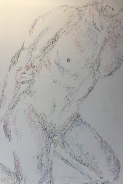
Inktense pencils are just too much fun to draw with, so here's another.  It's a debut for Margaret.  I've cropped her so I get no hands or feet.

You can see that colour-wise I've gone back to purple.  I've not touched the indigo though - I'm a bit indigoed out this week to be honest.  Also in the are fuchsia, chilli red, leaf green and mustard.  Mustard looks like a good yellow for these figure drawings - nowhere near as garish as the other two yellows in my set.  I put a lot of colour on this one but was careful to add it all lightly.  I'm also finding myself pencilling one colour on top of another before wetting them both at the same time.

This is another one to be proud of.  The colours are great and there's a good missing edge in her back.  The face (that was supposed to be cropped out but is still there) doesn't look like Margaret but it's not as if all of you out there know who Margaret is; the main thing is that the face is passable.  Worst bit about this one?  The purple edging, especially around the right breast - this particular bit of purple edging was a late addition as the breast didn't look quite right without it.

Margaret is up for sale.

Kevin At The Interview

It's too hot outside today: watercolour paint will dry far too quickly.  So I'm indoors with the inktense pencils.

It's back to one of my favourite models, Kevin.  I drew him quite loosely, not worrying too much about shape and angles but concentrating more on rhythm and gesture.  I wanted to stay away from blues and violets today - they're my fastest shrinking pencils.  So I started my colours with charcoal grey, then added bark and balked earth.  And I couldn't resist throwing in some leaf green and shiraz.  And then I added all the water.

Best bits about this are the face and the shapes between the arms and the left leg, all of them spot on.  Worst bits?  Maybe the left foot is misshaped (I need to leave feet out of these) and the bottom undersized.  But not too bad overall - inktense pencils are great.

Kevin's up for sale.

Thursday 27 May 2021

I Said In That Case I'll Have A Manhattan. She Said Fine. And In Thirty Seconds Time...

Right then.  How we doin'?  Back on the roooad!

Sorry.  Been watching too many Rate My Takeaway videos on YouTube.

Anyway, back to painting today after taking a few days off to read some books and play some chess.  Someone messaged me this morning asking if I'd be interested in a commission, with a painting made up of six mini paintings of alcoholic drinks that he could put up in his home bar.  So what else could I do?  I said I'll see what I can do.  See what I did there?  No, actually I told him lifes weren't really my forte, especially when I'd need to be adding all sorts of highlights and reflections.  But it did get me thinking and I came up with the idea for another alcohol-themed painting while I was in the shower.

It's a row of bottles that's been made to look like an evening Manhattan skyline.  And then the bottom of the painting is their reflection in the water, except that I've gone for a daytime sky and the sort of colours in the reflections that I might use for trees.  There's some inspiration from one of the two jigsaws that I used in It's A Jungle Out There!  Click on the jigart label at the top of the page and you'll find it there.

Obviously I started by searching online for photos, then drawing a skyline and adding highlights and lit up windows using masking fluid.  I don't know why but I had to start it somewhere, so I started there.  Oh, I'm good at this.

Then the nighttime side.  The sky was Winsor orange with bits of permanent rose, permanent alizarin crimson and Winsor violet thrown in.  Maybe I should say at this point that this painting isn't in a particular colour scheme.  Rather than being based on three primaries, I've thrown in all sorts of colours from my 24-halfpan palette.  Then the buildings/bottles went on in indigo.  There are also bits of all four sky colours in there, some underneath the indigo and glazed over, some just dropped in.  It was a hot day today and the paint was drying fast; normally this is a bad thing but today it meant I was able to add a second coat of indigo over some of the bottles to separate them.

Then the daytime side.  I started by thoroughly wetting the whole half page.  Then I painted on some French ultramarine with some dabs of viridian in places and allowed it to do it’s thing.  While it was drying, though, I added some wet into wet bottle reflections that I also allowed to do their own thing.  I varied the colour along the row using sap green, olive green, permanent rose, permanent alizarin crimson, Winsor violet and maybe some yellow ochre.  The violet was looking a bit dark valued, so I did a lot of dabbing of this and indeed all the reflections with a paper towel.

Final result?  Not my best to be honest.  The orange sky looks amazing as always though.  It kind of guarantees that the will be something good about a painting so it might be a good safety net to save any embarrassment if I'm on the telly.

It's in the reject pile - I don't want it lowering the average standard of what's in the shop window.

Thursday 20 May 2021

Glean a'Chroin

I felt inspired by one of the subpaintings in my last post (The Joy Of Six).  It was the one in the bottom right. Winsor Orange and Indigo are like a match made in heaven when placed next to each other.  And a Winsor Orange sky with some reds and violets cropped in looks good, especially if a big triangle is left white on the left.  So I thought I'd take the lessons from that one and turn them into something bigger.

This wasn't painted in any particular colour key, instead using lots of different colours from my 24-pan experimental palette.

The first thing I did was to search around for a suitable skyline that I could silhouette in indigo.  I found this glen up in Scotland (you wouldn't recognise the photo after I used these colours).  As I sketched in the outline, I found my plans changing.  Rather than just sketching a skyline and silhouetting the whole thing in indigo, I found myself looking at the shadow shapes on the hills and thinking about only using indigo in the shadows.  And so it all changed.

After masking out the buildings, I put in the sky.  I started with a big triangle of Winsor orange, leaving white on the left.  I then charged in some Winsor violet, permanent alizarin crimson and permanent rose and tilted the paper up to let the colours run.  I was happy to let some of the orange bleed into the hilltops to help unify the painting (like Charles Reid told me to do with flesh tones).  Just for the hell of it, I added some transparent yellow on the left behind the hills and dry brushed a bit on the top border of the white expanse.  I ended up with less white than I'd intended but maybe this was for the best.

Then on to the hills.  I started with some indigo in the shadows I'd marked and in some random other places.  After letting it dry, I glazed over Winsor blue (green shade) and Prussian blue in different places.  The tops of the hills, where the orange overlapped, were looking a bit green, so I dabbed in those two reds to neutralise the colour a bit.  And then, because this went so well, went a bit crazy, dabbing in more reds, some Winsor violet and some raw sienna and yellow ochre.  I think some burnt sienna might have gone on too.

The foreground went pretty much the same way except that I used French ultramarine rather than the two cool blues.  There was a bit more burnt sienna this time, especially in the hill on the left and lots of the reds, earthy yellows and violet everywhere.

For finishing touches, I removed the masking fluid and added roofs in permanent alizarin crimson, then added some grassy bits in Winsor orange and indigo using the Terry Harrison merlin brush.  Those two colours are just as amazing mixed as they are in pure form adjacent to each other.

Standing back from this one, wow.  My best painting this year by far.  This feels like the start of a new era in my painting.  After spending over a year doing paintings that were largely based around only three primaries, I might take a break from that and do more of these multicoloured paintings and start to make a dent in those halfpans in the experimental palette.

A year and a bit later, when one of my other paintings was a prize in a local church raffle, there was a primary school age lad who was really disappointed to not win it after spending all his pocket money on tickets.  So I met up with him and he took a good look through everything I had up for sale and told me this was his favourite.  So it's his now, free of charge.  Don't all expect this.

Tuesday 18 May 2021

The Joy Of Six

I'm normally pretty good at restricting the number of colours in my paintings but sometimes I just need to let go and throw everything down.  This painting has 22 different colours in it.  There are 21 of the colours in the Winsor & Newton professional half pan set ( all except aureolin, the black and the white) plus transparent green, which I've poured into that palette in place of aureolin.

I got the idea for this from The Mind Of Watercolour on YouTube.  In this video https://youtu.be/30qyclTocfo, he does a set of "minimal studies" that look great.  I thought I'd have a go at doing something similar but decided to go a bit further by putting them within a multi coloured frame.

So the plan was to:
- measure up a grid on the paper
- negatively paint the grid lines using masking tape, so leave the lines clear and use tape to mask aro7nd the inside of the six individual white rectangles
- spattering on some masking fluid
- paint the frames with lots of different colours, letting each colour take up maybe an inch before switching to the next and allowing adjacent colours to mix
- chucking on some salt at the right moment as the paint was drying
- removing all the tape and masking fluid (so the white bits reserved by the masking fluid spatters only show up in the frames) and not in the sub paintings
- painting six minimal studies like those in the YouTube video

I did make some mistakes though
- I messed up the measurements, so the six subpaintings aren't all the same size - annoying but not a disaster
- some paint crept under the tape in places and there's one spot (top right of the bottom right painting) where a rogue bit of tape masked part of the border.  Again this wasn't a disaster - I think these imperfections add something
- I went a bit OTT on those subpaintings.  Not just on the thickness of the paint and on giving in to temptation by adding a second wash in places but, most frustratingly, by not leaving enough white.

But actually this came out OK.  If someone hasn’t seen that YouTube video and what I was aiming for, they might like this.  They’d probably be impressed that I'd left more white space then normal.  They'd like how the six subpaintings seem to stick out from the painting ahead of the frames, which look like the wall behind six paintings.  They'd like the white spots and salt effects within the background.  And they'd really like some of the bright colours in there and the colour schemes and jarring contrasts in the subpaintings.

This one was a lot of fun after all the Hartlip paintings and figure drawings where I've had to hold myself back and keep everything under control.  It's given me some ideas for full size abstract landscapes that I could whip out really quickly.  Maybe I'll have a go at a fast painting tomorrow.

This one was sold to a collector in North West London.

Monday 17 May 2021

Annual Self Portrait 2021

As the drawing seems to be going well at the moment, what better time for a self portrait?  I've decided that I need to do a self portrait every year and that this will be my 2021 effort.  I've changed the name of my last self portrait, labelling it as my 2020 self portrait.

I started with some contour drawing, being especially careful with the eyes, which is where I started.  This is a change from last year when I started from the shape between the far cheek and the nose, on advice from Betty Edwards.   After the drawing was down, I added colour using some impressionistic hues that I could see in the photo I was working from.  Which reminds me - this was working from a photo rather than a mirror, so this must be what I really look like.

I'm happy with how this turned out - the colours are generally great.  I'm not keen on the background green though.  I originally added background colour so I could paint some negative white hair on the back of my head.  But I didn’t like the resulting white shape, so added some grey.  This meant I didn't really need the green background.  If it were possible, I'd remove the background and leave it white.  I'd probably remove the neck too.

Anyway, not bad.  I'm still not sure whether I prefer this year's or last year's - they're very different.

Pulling Your Paintings Together, Charles Reid - Book Review

You have to be patient waiting for the prices of these Charles Reid books to drop to something at the high end of acceptability but this one appeared briefly in the window, so I had to go for it.  It's a 160-page paperback.

I know I must say this about every book that I read but this is a strange book.  It's a book of two halves - one 40 pages long and one 120 pages long.  It doesn't sound like an even split, but I learned as much from that first 40 pages as from the whole of the rest of the book.

That first 40 pages are about drawing, contour drawing in particular.  From what I can tell, all four of Charles' most famous books start off in this way.  I've only read two of those books, but the description on contour drawing in this book is better than that in Painting By Design.  My contour drawing took a big step forward after reading this book.  I think it's the way he emphasises things like keeping the pen in the paper, starting with the eyes and face, leaving some edges missing and wandering off into internal and background shapes that does it.  And about how he points out that this brings everything together.  And how he illustrates this with examples.

And then there's the other 120 pages.  It's divided up into chapters but feels like a random ramble among the paintings of Charles and his students with no overriding storyline connecting it all together.  I had no sense of where we were going.  When I look at the notes I've made on this book (I do stuff like that - it helps all the information sink in) they just look like a long list of tips.  It looks like I've started new paragraphs in random places whereas, in reality, I started a new paragraph whenever I got to a new chapter.  That's not to say there 120 pages weren't useful - there was lots of useful stuff in there but it just wasn't organised properly.  I also found Charles contradicted himself in places, telling us not to do something in one place, then doing it himself in another.  And there were far too many places where Charles would show us a painting and ask questions about it without giving us answers ”Can you see where I emphasised local colour?  Why did I do this?"  Well I think I see where you're talking about, but it would be quite useful” if you could tell me why rather than just asking a question.

As is usual in these reviews, a word about the artwork and whether there's any inspiration there in just looking at the pictures.  Well, yes, there's some great artwork in there but (unlike in Painting By Design) there are also some that Charles sounds proud of but look like absolute clunkers to me.  Paintings where the background has similar value and colours to the subject, making them look indistinguishable.  It's one thing to have something like this on a little bit of the subject boundary, so that there's a background shape and a subject shape that combine into an interesting compound shape.  But when the background abuts almost all the subject's outline, that looks amateurish.

This book's an interesting barometer of how far I've come as an artist.  There are a couple of demonstrations in there that I just roll my eyes at - a demonstration has to be really special these days to be interesting to me.  As I say above, there were paintings by the author in this one that I didn’t like and knew why I didn’t like them.  There are ideas in this book that I don't 100% buy into but might try out (eg moving away from my three key primaries approach to letting more than one of each primary have a starting role).  But, on the other hand, I'm not so knowledgeable and experienced that I can confidently answer all the questions Charles asks the reader.

So, the rating.  This wasn't amazing but it was worth reading and I'd buy it again if I was Bill Murray in Groundhog Day.  It's the first 40 pages that are the highlight.  I'm going to give this a solid three palettes.

🎨🎨🎨

Saturday 15 May 2021

Ten Greatest Chess Players

Continuing to experiment, today I'm trying two new approaches with the new drawing technique: multiple portraits crammed together and combining this with the use of inktense pencils.

As material, I used ten great chess players, most of them not still playing, let alone still with us.  Let's go through them first and talk about likenesses.  So, left to right along the top row, then the bottom row:

- Bobby Fischer looks good - there's a likeness there.

- Paul Morphy - not as good but still a likeness

- Tigran Petrosian - pretty bad.  I can tell it's him but I can also see a lot that's wrong.

- Mikhail Tal - there's a likeness but it's a cartoony caricature.  Looks like a Simpsons villain.

- Magnus Carlsen - terrible, unrecognisable

- Jose Capablanca - I've caught the softness of the eyes but nothing else

- Gary Kasparov - no, not got him.  Looks more like a Nigel Short.

- Boris Spassky - again, no

- Emmanuel Lasker - ok but it's difficult to not get a likeness with a face like that

- Anatoly Karpov - another bad one

So likenesses are generally not there.  Bit how did the two experiments work out?

I think the concept of multiple portraits with overlaps is a winner.  Maybe the best approach is to decide first which are most important, draw them in, then add all the rest afterwards wherever there are gaps.  Overlaps are not a problem - they add some energy and fun.

And the inktense pencils?  They work but I could have done better.  I started by choosing and colouring loots of black areas - black and white has to work for chess players, doesn't it?  But then I thought the space above Tal's head looked a bit empty, so coloured that in red, adding some more red in other places to balance it.  And then I added some blues in places.  It's come out OK but I can't help thinking this would have looked better with a lot more white on the page and very little blue and red (if any).

Still, there's a good feeling to this one.  You can feel the concentration.  It's going up for sale.

Friday 14 May 2021

Jimi Hendrix

I have two watercolour blocks here, so straight after drawing Neil Young (and before painting him) I grabbed my other block and drew Jimi Hendrix.  It's a better drawing, even if that right arm shouldn't be up as high as that and his eyes are a bit skewy - either his left eye is too high or his right too low.  The guitar should maybe be a bit bigger too - Jimi played left handed, so the end of the guitar is nearer to us than his face and should be bigger.  Whisper it, but this looks better if it's cropped down to a square by losing the right hand side.

I painted this one while Neil Young was drying.  The skin tones are again in Winsor red, cerulean blue and either raw sienna or yellow ochre or both.  I'd worked from a black and white photo so had no idea what colour the T-shirt should be.  So I just used loads of different colours.  I also used these colours fairly randomly in Jimi's hair and in the background.

At the end, rather than adding salt, I spattered over Winsor red, cerulean blue and yellow ochre.  These came out as strings rather than spatters, some of them even winding around the guitar neck, so it,s as if they're musical notes.

This is definitely better than the Neil Young from earlier.  Unless it gets loads of likes and positive feedback on Facebook, it's not going up for sale though.

I'm also thinking that, at least for portraits like this of individuals, I should do the drawing with pencil rather than pen.  Pen would work, though, for urban sketching of buildings or groups of people.

Neil Young

Dear oh dear.  After the successes of Duane and Big Sam, I felt confident enough to have a go at this style of drawing on watercolour paper and everything went to pot.  My first effort was a portrait of Neil Young. While I managed to get a good scowl on the face and the right shaped torso, I had problems with his right hand, as you can see from the restatements.  This one looks better cropped down to a square, losing the bottom.

I then had a go at painting.  Most of the colour here is cerulean blue, Winsor red and either raw sienna or yellow ochre (I think I used both) although there's also some ivory black in the hair and background where  I was struggling to get a dark enough colour and, with the rain about to come down, rushing things a bit.  I wanted to have a hidden edge between Neil's hair and the background and only partially succeeded.  The salty patterns in the background were a last desperate attempt to get something from the painting but they don't really add much.

The best bits about this one are the shadows on the T-shirt and the scowl on the face but they're not enough to save this one.  It's too monotone and too cartoony.  A bit Felix Schweinbergery but nowhere near as good as his work.  Don't expect to see this one going up for sale.

Duane Allman & Sam Allardyce


I'm going to try out something new this morning.  I'm going to start with a Charles Reid style contour drawing.  He recommends starting from the eyes, keeping the pen on the paper at all times and feeling free to get distracted by interesting internal shapes.  I'm going to do this on watercolour paper and add some paint.  But watercolour paper is expensive, so I thought I'd have a practice run on a scrap of printer paper first.

So I did.  I drew Duane a Allman on one side and Big Sam Allardyce on the other.  I'm not quite following all of Charles' instructions.  First, I'm not concentrating too much on accuracy - size and position and all that.  Second, lots of my my edges are quite straight and boring, whereas Charles keeps them interesting with kinks.

But the results!  Holy @£#&!  This might be the way to go if I'm finally to crack likenesses.  These are amazing.  They're not for sale, only being scribbles on scrap paper.

Thursday 13 May 2021

Michael, Kneeling

There really needs to be a Sky Naked Figure Drawing Of The Year program.  I'm sure I could make a decent crack of it.  Inktense pencils are the secret weapon.  They're just amazing.

Today's model was Michael.  I picked a pose that I could zoom in on and end up with minimal exposure to head, hands and feet.  For the colours, I started with charcoal grey for the darkest bits, then just had a good time with sea blue, violet, leaf green and chilli red.  It's hard to go wrong with those colours.  I just have to remember to not be tempted by yellow.  Yellow never really comes out right and the brightest bits of the bodies are better off being left white, like here.

As a special bonus, here's the painting at the point when I'd finished with the pencils and was about to add water.  Just marvel about how little pencil needs to actually go down on the paper!

Anyway, after the pencils went down I added the water.  With so many big white gaps, I was able to take my time over this, doing one part of the body at a time.  Some of the best bits are where there's no pencil and in the one second or so (honestly) before the ink dries, I'm able to brush over some slightly tinted water to avoid hard edges.

I'm happy with this.  It's up for sale.  BB King didn't used to play many notes on the guitar and people used to talk about there being as much beauty in the gaps as in the notes.  It's like that with this painting.

Tuesday 11 May 2021

Raiders Of The Lost Ark

This was quite quick to paint but took me all day to plan, so let's talk about planning first.  I've had an idea for a while about doing a painting made up of six mini-paintings where one has sensible colours and the other five all have colour schemes that are rotated 60, 120, 180, 240, 300 degrees from the starting scheme.  The hardest bit is coming up with a suitable starting subject.  I needed something made up of simple shapes and that has a nice simple starting scheme.  The only ideas I could come up with were boring ones with sky, foreground, house and tree, maybe in simplified abstracty shapes.  But Inthoughtbthis might look a bit childish (that's not to say I won't try this at some point though).  So I flipped through my collection of painting idea photos and found a shot from Raiders Of The Lost Ark.  The big attraction in this one was the small number of shapes.  But rather than six sub-paintings, this was better suited to two sub-paintings, with each sub-painting having three colour schemes.

Next step in planning: the colour schemes.  I put the main colour scheme (yellow sky, orange to red foreground) in the middle of the top painting because it was so important and because this allowed me to have three daytime colour schemes along the top and three nighttime schemes along the bottom.  The other choice to make was whether to use a 123, 456 or 123, 654 ordering.  The second goes around in a circle whereas the first reads left to right.  I went for the first as it meant there were consistent relationships between colour schemes that were above and below each other.

Right, we're starting to get somewhere.  What colours to use.  I wanted to use a triadic colour scheme so that the six sub schemes could be equally spaced out around the wheel.  I chose a triadic left scheme (Indian yellow, Prussian blue, quinacridone magenta) because the sky in the still I was working from was a very warm, Indian-looking yellow.

After this, the painting was quite quick.  Masking fluid first then the sky, then the silhouettes.  For texture, I used masking fluid spatters in the sky and salt in the silhouettes.  I left the sun in the top painting and moon in the bottom painting white - it felt like the right thing to do.  Job done.

Let's talk first about what isn’t perfect.  The sky in the bottom right and maybe the silhouette in the top left  should be red but are maybe a bit too purpley.  The silhouette shapes aren’t exactly the same.  And the spray of sand flying off the spade on the far right of both paintings isn't great.  There's also not as much blending between neighbouring schemes - it was a hot day today and the paint was drying inconveniently quickly.

But otherwise this is a great painting.  It feels not like a journey through a rainbow but a journey through a long, hot working day.  The contrast between the top and bottom paintings works, with the big white circle looking like the sun at the top and the moon at the bottom.

So this is up for sale.

Sunday 9 May 2021

Orchard Lea, Hartlip

Someone in the village asked me if I'd be interested in painting her house.  I gave her my standard answer, which is that I don't do commissions but that I may well sneak round at some point, take some photos of her house and paint it.  And that if I do, she has first refusal on it and no obligation to buy.  Just like an have mo obligation to paint it.  Deals where both sides have obligations will always end up with one party feeling that they've got the bum end of the deal and I prefer to just sell paintings, leaving both parties happy,

Anyway, I did take some photos of her house the other day and decided it was worth painting.  It's on a junction, which has worked out well for me in the past, giving me the opportunity to cast cool shadows on the road.  I messed up with my drawing, though, and put everything too low on the paper, losing a lot of road and gaining sky.  This meant I needed to do something exciting with the sky, so I thought I'd have a go at a sunset (with the sun behind the viewer and to his right).  With this in mind, I chose quinacridone magenta and Indian yellow as two of my primaries.  For the blue, I chose Prussian blue ahead of French ultramarine for its cool temperature, which I could still use in shadows on what was left of the road.  So that's a triadic left colour key.

I started with loads of masking: the roofline, the window frames, the fence, the signposts and my initials.  Plus a little bit of spattering.  Then I painted in the sky.  It was good at first, but when I tried to add in neutral-coloured clouds, they didn't really work, so I did some tinkering.  At the end of all the tinkering, I ended up with a darker valued sky than I originally intended.  And my planned yellow band in the sky was more of a dulled down orange - more about that later.

Then I painted in the house and the foliage.  With the foliage, I was careful to make it darkest just behind the picket fence.  I ended up with quite a boring shaped hedge going from left to right in a horizontal line as a result of being a bit too vigorous with the sky colours.  So I added a bit more background foliage using cadmium yellow (for its opacity) with Prussian blue.  It was looking a bit too dark and, well, opaque, so I dabbed it a bit with a kitchen towel and it looked better.  Finally O threw some salt on the foliage as the painting at this time was just lacking in interest.

And then something weird happened.  This painting was intended to be set on a warm summer evening, but everything started feeling colder.  The dark, nighttime-looking sky, the warm colours in the windows, the cool reds and cool blues all over the house.  And most of all, the way the salt in the foliage stared forming icy looking patterns.

So I painted the road, pavement and drive in snowy colours.  I put snow on roofs, chimneys and a few other places with titanium white, almost straight from the tube.  Two or three coats were needed to make it really white.  In places in the foliage lane on the roof, I dragged a loaded brush sideways along the paper, using the texture of the paper to give the impression of little bits of snow everywhere.  And. Then I spattered on loads of titanium white at the end.

It's ended up as quite a decent snow painting, especially as it wasn’t planned to be a snow painting (so I couldn't do things like reserving whites).  There are some good complementary colour contrasts there too, and green at the bottom but especially between the blue/purple roof and the orange in the sky.

And it sold quickly to the lady who lives there.  She says the snow gives it a very rustic feel.

Saturday 8 May 2021

Ben Talks Football

Portraits with markers always come in pairs.  After that Tommy Cooper effort, I wasn't feeling confident enough to draw someone famous, so I headed for my Facebook friends list and looked at people with birthdays around now.  I settled in the end on Ben.

So this is Ben.  Despite being born with glycogen storage disease (I think there are less than 20 people in the U.K. with this) he's a great, positive personality.  He used to manage a kids' football team but has n9w progressed to managing an adult team.  He likes nothing better than talking about how his team got on in their last match, and I think that's what he's doing here.

This one's not too bad, although Ben,s hair is a bit too dark.  It's not for sale but if Ben (or his wife or one of his kids) wants it, it's theirs.

Tommy Cooper

I've not had the markers out for a while and it's raining outside, so I'm having a go at a couple of portraits today.  I'm not convinced by my last couple of Avengers portraits, so I'm going for someone different.  This is the late Tommy Cooper.

I picked out a shadowy photo well suited to chiascuro.  The likeness wasn’t there (maybe if I'd given him a fez, it would have been more obvious) so I threw in some impressionistic reds, pinks, oranges and yellows just for a bit of practice and experimentation.

He's not great.  It might only be the left eye that's letting him down though.  He's not going up for sale.

Thursday 6 May 2021

Time

This run of village paintings is all very well but if I don't vary things around a bit, I'll settle into a rut and never get any better.  So I thought I’d do another abstract underpainting and turn it into something semi realistic.

For the underpainting, I started with some masking fluid spatters and joined some of them up in tree-like patterns using masking fluid in a mapping pen.  For the colours, I used the half pans in my experimental set, so different colours to normal: Winsor yellow, Winsor orange, permanent rose, permanent alizarin crimson, sap green and olive green.  Plus French ultramarine and burnt sienna from my normal palette.  I spattered on some indigo (opaque so unlikely to spread out of control) and some salt.  Then I put on some netting bags, bubble wrap and scrunched up Easter egg and French stick wrappers and weighed it all down.  I did this yesterday and, with the day being quite hot, it dried in tome for me to reveal the underpainting and think about it overnight.  Here's the underpainting before the masking fluid was removed:
I had two ideas for portraits: rotating it ninety degrees anti-clockwise to get a concentrating chess player or ninety degrees clockwise to get someone with a Jimi Hendrix perm.  I started on the Hendrix idea, putting down masking tape in an attempt to draw the subject using straight lines.  But I soon lost confidence and removed all the tape.  Because the tape took with it some of the masking fluid, I removed all the masking fluid at this early stage rather than leaving it to later.

Having given up on the idea of portraits, I thought I'd just go down the abstract landscape route using acrylic inks (Earth red, indigo and sepia) and granulation medium.  I found that the inks liked to follow the white lines that I'd reserved on the paper.  I also tried out something I'd never done before, sharply blowing the ink through plastic tubes (the ones that come with thin ended paintbrushes are great for this) and ended up with some great looking branches and thorny bits.  But all the good stuff was around the outside and there was an ugly, empty looking space in the middle.

We then go into a long painful process of trying to make something of the middle.  Spattering with opaque watercolours (cadmium red, cadmium yellow, cobalt blue, titanium white) didn’t make things any better.  Nor did joining all the yellow spatters together with yellow lines (why would it?).  Or putting yellow spots in the middle of all the bigger white spatters (ditto).  So I tried putting on acrylic inks in the middle again (including white, gold and waterfall green this time) and applying sharp blows and salt.  It didn’t make things any better.  If anything, it made the ugly area bigger.  Next I tried scraping with a credit card.  By now the paint and ink was thick like oils, so this definitely did something.  Although the middle was now looking really muddy, I did at this point spot some trees and a bit of top to bottom symmetry in the scraped pattern and this gave me the idea of adding a mini landscape in the middle.

Obviously, the mini landscape needed to be created using opaques, so I used cadmium red, cadmium yellow and titanium white.  The white only appeared in the reflections.

The mini-landscape didn't really fit with the rest of the painting, so I added that cadmium red border around the outside.  This seems to unify things a bit more, with the border both matching some of the mini landscape and having a bit of the background showing through.

Finally I spattered on more cadmium red and cadmium yellow, then stood back.

The painting would have been much better if I'd stopped after the first application of acrylic inks but I've still ended up with something interesting, even if it's not brilliant artwork.  There's both an explosiveness to the painting and (because of the red) a feeling of danger.  But the guy with the dog is oblivious to it all.  Is something about to happen that will change history?  And not in a good way?  Who knows?  This painting feels like it should be the subject of an M.R.James short story.  Some dog lover buys a painting that's supposed to make his dreams come true, and it does but everything turns out really badly.  At the end of the story our destitute art collector is on the streets, trying to sell the painting.  Some busker with a guitar comes up and asks how much the painting is selling for.  The seller is about to quote a price and looks at the painting and finds that the dog walker in it has changed into a busker.

Shall I put it up for sale?  No.  This feels cursed.  No good can come to anybody having this one on a wall.

Wednesday 5 May 2021

Footpath, Lower Hartlip Road

Back to the painting after a few days' break.  This is another scene from the village.  Follow that footpath up the hill over the field and you come out opposite the church.  I remember when all this field used to be pear trees, you know.

The main three colours today were Prussian blue, quinacridone magenta and transparent yellow, the key of cool green, made up of three cool primaries.  I started with French ultramarine rather than Prussian blue (it's in the sky) but at some point made the mistake of switching to Prussian blue.  Very odd for me.  I only noticed at the end when I wanted to use a cool blue in the shadows and realised I'd been using a cool blue all along.

Anyway, this one started with masking out tree trunks, the signpost, fence posts, the gate, bits (but not all) of the wire fence and (for the first time) my initials, followed by some masking fluid spatters.  The wire fence and the thinner branches were added using masking fluid in a mapping pen.  I then just painted away, removing masking fluid where necessary.  For the foliage in the trees, I dabbed on quite dry paint using a natural sponge.  The last bits were the addition of shadow at the front (deliberately in cool colours to make it look like a hot day), the addition of some cadmium yellow notices to the telephone pole and some spatters of cobalt blue, cadmium yellow and cadmium red.

It's come out ok.  The colours of the grass in the field and the cool shadows at the front are the best bit.  The gradation in the tree trunks, the thin white branches and the colours of the leaves are also good but I'm not keen on some of the thicker branches with white edges.  Compositionally, it's a bit symmetrical and central.  I was aware of this but didn't realise how much it would detract from the green footpath sign, which is barely noticeable.

This one was donated to the local church as a raffle prize.  It went to someone from the village who's very active in the church and does a great coffee and walnut cake at the Summer church teas.

Saturday 1 May 2021

Archway Into Hartlip Church

Enough of these village houses!  I wanted to paint some stones, so it's back to the church to paint this archway again.

I first drew the archway using a rollerball, including all the cracks and climbers that I could see.  The plan was to make the archway quote colourful and in a light value, with the trees behind in a dark value.  I was going to leave all the cup racks showing up in rollerball.  Good to have a plan, even if I didn’t stick to it.

The three main colours today were cerulean blue, raw sienna and Winsor red (the key of green warm).  Cerulean and raw sienna are always good for stonework with their tone and granulation.  Winsor red seemed to form a good combination with them according to my swatches.  Four opaques also made guest appearances though (more on these below).

I started with the arch, with all three primaries and allowing them to run into each other.  But because I wanted a few more spots of colour, I reached for my three primary opaques (cobalt blue, cadmium red and cadmium yellow).  I dropped in some big spots but also did some spattering.  Before spattering, I wet all the background so that any spatters missing the arch could be quickly removed.  I painted in all the darkest bits with sepia but didn’t like the random of darks that resulted from this, so also painted over most of my market lines with sepia.  It might have been a mistake to use sepia in this way at all - if I had my time again, I'd just do sepia spatters.  I added salt to the archway but it didn’t react today - maybe the paint was too dry when I salted it.

Cobalt blue, by the way, is doing a better job as the opaque blue in paintings like this than cerulean ever did.  When I finally get a brass 16-colour palette, it will probably join cadmium red, cadmium yellow and sepia as the four extra colours in addition to the 12 currently in my palette.  It means that Payne's grey (as well as titanium white) will miss out.

And then I added the background using only my three transparent (and semi-transparent) primaries.  It's been a while since I used raw sienna in a sky but, rather than going for the Ron Ranson skies that I used to paint years ago, I couldn’t resist throwing in some red to create grey clouds.  I wanted the trees to be darker than the arch but the paints just weren’t having it.  I created interesting textures in there using water drops, creating back runs.

In the end, I think I've ended up with an OK painting.  The reds, yellows and blues in the arch are great.  The background is suitably understated and, despite having interesting textures, doesn't distract from the arch.  The one niggling thing is the contrast between the arch and the background - they look like two different paintings.  The painting may have looked better either without sepia over the cracks or without any rollerball lines.

Still, it's a success.  Just like all my other Hartlip church paintings, it sold within a day and all the proceeds were donated to the church.