Sunday 28 November 2021

H2 2021:Survey Results


Thanks to everyone that's voted.  It's time for me to accept that I'm unlikely to get many (or any?) more responses in, so it's time for me to look at the results and raise the odd eyebrow.  There have been 18 responses so far.  People are welcome to keep voting on this poll or indeed any earlier polls.  I've no plans to close any of them.

Here are the links to all the polls:

And here are the results from the H2 2021 poll.  First up, no votes for these three.  I had all these three down as flops, so no argument from me there.

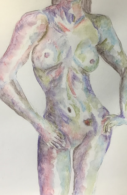
Then these paintings all got one vote.  If you had all these as a collection on the wall, your tastes could definitely be described as eclectic:

Two votes for each of these.  Some decent figure drawings in there, and they seem to look better alongside each other than they do individually.  The figure drawings don’t tend to score well in these polls.  Maybe I just need to accept that they're fun to do but will never sell.  The four mathy portraits in the middle were in the poll as a set rather than as individuals.  In terms of watercolour and oil pastel, we're still sitting around at the bottom of the barrel.

Then it was three votes for these.  I was surprised the balancing rock in the bottom right came out so low.  The first raised eyebrow.

These works all got four votes.  We're definitely reached that weird bit in the results where there's stuff that I'm really proud of sitting on the same shelf as stuff that felt like dross.  I don’t like the top left and bottom left paintings here but the four down the middle felt like big successes at the time.  These surveys always throw out shocks like this.  Oh, I was pleased to to see the Bond villains getting so many votes - my marker portraits don't tend to do that well in the polls.

On to five votes.  The one in top left was more popular than I expected but, otherwise, I think we're getting to the better paintings now.

Yes, we're definitely getting to the better ones, and the leaders are all strung out.  In sixth place with seven votes was this oil pastel painting.  Good to see this one coming out so high after I'd only been using oil pastels for a couple of months.

In fifth place with eight votes, it's another oil pastel painting.  It doesn’t jump off the page as much as the woodland scene but Hartlip Church paintings are a bit popular.

Fourth with nine was this one of Clare Bridge.  This was done back in the summer and there were a few paintings that did well in the previous poll where the colours on the shadows set the mood and temperature of the while painting.  I need to get back at some point to doing paintings in this style.

In third place with 10 votes was another Hartlip Church (third so far).  Some great colours in this one, especially in the tree on the left.

In second place on 11 votes was The Far Country, a James Stewart Western.  Not the greatest foreground but I really like that mountain on the left and the way the colour of the sky sets the temperature.

And first with 13 votes was this one of Hartlip Church.  No surprise at all to see this one come out on top.  The greens and reds in the stonework do it for me.  Very proud of this one.

Friday 26 November 2021

EvaE

More figure drawing.  Today's model is EvaE, making her debut.

I came in today with two objectives, both around reverting back to techniques that I've used successfully in the past.  The most important one of these was to apply the water using a sculpting mindset rather than a colouring in mindset.  There was definitely some progress on this front, most noticeably on the shoulders but also the breasts and left arm.  The legs and right arm aren't quite there yet.  Still, there's a big improvement.

The other objective was to use a lot less colour and show a lot more white.  This didn’t work out so well but if I can keep sculpting shapes rather than colouring them in, I'm a little less concerned about using too much colour.

The colours today were bark, violet, iris blue, poppy red and leaf green.  I keep finding myself drawn towards that left arm and at how the green and blue work well together.  Green, blue and bark are a definite winning combination.  If red or purple are to be added to this, they need to be added in very tiny ways.

Where this one suffers, though, is in the proportions.  Even though I used a grid method to get the shapes down, the waist and hips look much too narrow.  That's even after I applied some artistic license to widen the hips and to tip the waist up slightly more sharply.  Notice, by the way how the waist and hips tip in the opposite direction to the chest.  That's called contraposto and it's pretty essential to figure drawing.  Anyway, yeah, the waist and hips look too narrow.  Or maybe the waist and hips aren’t the problem and it's just that the right side of the body below the breast needs to be a bit narrower.  I'm still not sure.  Hands aren't great either.  What did work in the original drawing, though, is the twist in the body, with Eva's right shoulder thrust forward.  The success there is partly down to making the shoulder a bit bigger but also to me adopting that sculptor's mindset.

Overall, though, this is a marginal fail so won't be going in the shop window.  Bad hands, bad proportions.

Tuesday 23 November 2021

The Allman Brothers Band


An idea came in the night to me.  It was to use inktense pencils to draw some sort of skyliney landscape but negatively, leaving trees and buildings white but only colouring part of the sky around the edges.  Part of the building could be coloured but only if there was something like a tree in front of it, in which case the only bit of the building that was coloured would be the but just around the edge of the tree.  The subject of the landscape could my house, or maybe a Cambridge college.

Anyway, that was the dream.  I deviated from it on all sorts of ways, starting with the subject.  I couldn't find a good landscape subject, so I went instead for a photo of The Allman Brothers Band.  The photo is from the early 90s and looks like it's from the same photo session as the covers on the First Set and Second Set albums.  From left to right we have Jaimoe, Allen Woody, Dickey Betts, Greg Allman, Warren Haynes, Marc QuiƱones and Butch Trucks.

I started off the way that I was expecting my landscape to work.  I just went randomly around the outline of the one big shape using all my brightest colours: sherbet lemon, sun yellow, tangerine, poppy red, chill8 red, fuchsia, violet, bright blue, iris blue,vsea blue, teal green, field green and apple green.  I then deviated from my plan a bit by filling in the gap between these pencils and the edge of the paper using Earth colours: mustard closest to the colours, then baked Earth and finally willow at the edge of the paper.

Then I added the water.  With such a big area to cover, there was the danger of paint drying too quickly for  the whole shape to work together.  So I watered it in outwardly radiating stripes.  I painted in one set of alternating stripes, then filled in the gaps.  I think they work.

Then I looked at the painting and thought that the white shapes looked too white and underworked.  So I decided to add some quite faint details,  I started with any facial hair or any long hair that wasn't touching the edges.  This I did using the yellowish colour that was in my still wet brush.  I then added some faint lines to this in poppy red and, still not entirely happy, then added some random things like belts, hands in pockets and trainer decorations, which was just enough to make these white shapes start looking like people.

It's possible in a painting like this to actually get some good likenesses.  The three in the middle look pretty good to me.

Overall, I rate this one as successful and am putting it up for sale.  The craziness of the idea, the radiating lines, the likenesses and the subtlety of those marks in the figures all seem to work.  It's good to do something different with the inktense pencils once in a while.

Sunday 21 November 2021

KylieB

I have a new model today.  This is KylieB. I thought she looked cold in the source photo, so I thought I'd make the photo cold too and avoid all my reds.

So for colours, I started with willow in the darkest areas, then leaf green, then mustard.  I thought at this point I needed some more dark areas that weren't green, so I brought in baked Earth.  Then I filled in the background with iris blue and sea blue, which looked like the two coolest blues in my set.  I marked in edges and creases with willow,  I also threw in some mustard in the foreground just for the hell of it.  I decided at this point I needed some blue in the figure, so I spotted in some little bits.  I also wanted something in the figure fighting back against the cold and didn't want to use reds,  he’d for the purple and added this in the darkest places.

I then added the water and realised that the purple was a mistake.  So, after letting it dry, I added some bark to all the darkest areas and added the water.  This improved things slightly.

Still, it goes down as a marginal failure.  There's some great mixing and cauliflowering going on in places but the background is too uneven and pencilly and the darkest bits don't blend well enough into the lighter bits - they have sharp borders and look too much like outlines.  I've also realised that I've dropped a good habit that I need to bring back again.  In my best figure drawings, my water strikes have been following the curves of the body, adding volume.  But for some reason I've stopped doing this.  My water strikes have all been applied with a colouring in mindset rather than a sculpting mindset.  I need to stop doing this.  I've written an instruction to myself on a piece of paper that I've put in with my pencils.  My next figure painting will be much better.

Anyway, yes, this is a flop and doesn't go in the shop window,

Thursday 18 November 2021

H2 2021 Poll

I reckon it's that sort of time.  I've created another of my biannual art polls.  If anyone can spare a couple of minutes to vote, I'd be very grateful.  You just scroll up and down 41 artworks, highlight as many favourites as you want and hit send.

This should be interesting; there really is a bit if everything in there.

Wednesday 17 November 2021

The Christ's College Maths Fellows 1982-86 Collection

And here are the four of them together in all their glory.  They feed off each other and the likenesses all improve when they're together.  I feel emotional and nostalgic looking at these four all together.

The individual portraits can be found at:


They're up for sale.

Professor Frank Kelly CBE FRS

Last up in the Christ's College Maths Fellows 1982-86 collection is Frank Kelly.  He may have been lecturer for my course on Markov Chains: I'm struggling to remember.  But what I do remember his supervisions on probability, statistics and optimisation.  He explained everything well and he would drive us really hard.  When we submitted answers to questions on example sheets, he expected us to answer every single question when other supervisors turned a blind (blinder anyway) eye to any laziness.  Academically he's into random processes, networks and optimisation, which I think means he's the go to guy when road, rail or telecom networks are being developed.

Frank was born in 1950, meaning he was in his very early 30s when I came up to Christ's for an open day. He looked and talked more like a 25-year old, though, and seemed really cool and chill.  It was meeting him that confirmed to me that I'd be applying to Christ's.  And he's always been cool and ridiculously young looking.  He's now over 70 and looks like he's in his 40s.  Not only that but he looks like a really cool guy in his 40s.  He was Master of Christ's college from 2006 to 2016.  What a time that must have been, being a student at the college with the coolest master in Cambridge.  I still, by the way, have a couple of handwritten notes from Frank filed away, one congratulating me on my first in my finals and the other thanking me and a friend for inviting him and his wife Jackie to our (premature) joint 21st birthday party.

Although I gave up on the probability and statistics after year 2, I did, of course, end up as an actuary, so diverting back towards Frank's areas of expertise.

This portrait gave me real problems.  I had two really unsuccessful attempts at a portrait from a different source photo before changing.  Even with third third attempt, the likeness is pretty bad.  At times this one looked more like Frank Lampard or Tony Curtis.  In the end I finally settled for this one though.  If you cover up the mouth (again!), the likeness improves.  Maybe I just struggle with people smiling, which explains why I can't draw a guy who always likes to smile for photos.

There were some small hints of blue on one side of Frank's face in my source photo and green on the other, and I needed no encouragement to include some blue and green in his hair and skin tones.

This one's not going up for sale as an individual work but will instead be included in the Christ's Maths Fellows 1982-86 collection.  I'm also going to put this one up on the Christ's alumni Facebook page and am looking forward to seeing what the reaction is.

Tuesday 16 November 2021

Professor John Wilson

Allow me to present Professor John Stuart Wilson.  Our first pure maths supervisor and the guy that dragged us all kicking and screaming from freewheeling A level pure maths into the rigorous world of university pure maths.  It was a painful process, I can tell you, but we made it through.  He was also an excellent university lecturer: I attended his course on vector spaces.  His specialist area in maths, though, is group theory; this means that our paths diverged from about midway through my second year.  He's actually quite a gentle soul at heart. I remember a conversation with him at a mathy dinner when he was struggling to get over to me the beauty that there was in pure maths.  If we had the same conversation today, knowing all that I know now, I'd be firing back with the beauty in applied maths: the way that expected return in equities disappears in the Merton-Black-Scholes theory, the way that a weird solution that Paul Dirac found to a differential equation led him to predict the existence of antimatter, that sort of thing.

Anyway, like Doctor Maunder a couple of days ago, Doctor John is really into his classical music.  He's actually a composer, which you have to respect, and which I've reflected in those musical notes hovering over the portrait.

Did I say Doctor John?  That's how we all referred to him behind his back.  Someone spotted a letter in Private Eye about herpes that had been sent in by someone calling themselves Doctor John and they wondered whether it was our pure maths supervisor.  And the name just stuck.

Anyway, about the portrait.  I was working from a black and white photo, so decided to start off with grey tones.  I thought this would bring out some of the white highlights in his hair but it also clashes against the personality of someone who only (mathematically) believed in black and white, with nothing in between.  I added a few proper flesh tones to the greys later on.  And I added a dark background, which helped me improve the shape of his chin.

Likeness-wise, if you cover up the mouth, the eyes and hair are unmistakeable.  The mouth isn't quite right though.  Probably a mistake to have him smiling.

This one will be included in the Christ's Maths Fellows 1982-86 collection.  The collection will be put up for sale but is too niche for there to be any reasonable likelihood of it selling.

Sunday 14 November 2021

Doctor Richard Maunder

Second up in the Christ's Maths Fellows 1982-86 collection is Richard Maunder.  This guy was an absolute legend.  He was a pure mathematician, into stuff like algebraic topology and manifolds.  Not my sort of area at all but, in my early days before I dropped all the pure maths, he delivered a great lecture course on group theory and was my pure maths supervisor for a while.  I liked how he showed us enough of the maths for us to be able to fill in the "mathematical rigour" in between the lines.  He had a great dry sense of humour too.  I can't imagine him ever being negative about anything. 

But I can't talk about this guy without mentioning his other big interest too, which was classical music.  He played all sorts of instruments, he would compose music or finish off the work of other composers and (get this!) he would build his own musical instruments.  It's only now that I've found out that the harpsichord that would sit against the wall of his room where he gave supervisions was one that he'd built himself.  And he was such a modest guy that at mathy drinks and dinners we'd only talk about maths.  It's a shame I never got to hear him talk about his music.

As for the portrait, my source photo was in black and white and very close up, so I've done a close up and repeated my technique from the Emilio Largo portrait and used three shades of blue.  Unlike with the Largo drawing, though, I've not drawn in outlines, instead adding a contrasting background colour.  The good thing about leaving out outlines is that I can subtly change the shape of the face by creeping in a bit with the background colour.

The likeness is only vaguely there - leaving out the hair makes things difficult.  But there's something of the character there - a little bit of joy.  Once the four portraits are put together, he should be recognisable.

Doctor Maunder died in 2018.  If you knew him, you'd know he's resting in peace.

Professor Peter Landshoff

It's time to start a new portrait collection.  I was feeling a bit short of ideas and a bit out of form so thought I'd do portraits of the four maths fellows from my days at Christ's College, Cambridge, 1982-86.  The idea is to just get a bit better at portraits without the pressure of having to come up with something that I can sell.  Because, let's face it, nobody's likely to want to buy this collection even if it comes out perfectly.

First up is Professor Peter Landshoff.  Doctor Landshoff (as he was, back in the day) was the only one of those four fellows to be into applied maths, let alone mathematical physics.  So he was the one whose interests most overlapped with mine.  Unfortunately, though, he was the only one of the four not to be a supervisor (that means the only one not to provide tutorials to two students at a time).  My only real contact with him was to ask whether he'd be prepared to put his student entertainment budget towards the Christ's mathy dinner, and he was always willing to do this.  And while I never had any Landshoff supervisions, I did enjoy his lecture course on Electrodynamics in my first year.  Oh, and he co-wrote the go to book on quantum electronics.  A top guy.

I tried to continue the good work from the Bond villains collection by including some unorthodox skin tones.  Today it was pink and lime green, although the impact of them has been damped down by greys and flesh tones.  Likeness-wise, there's definitely something if him there and I think he'll be easily recognisable once grouped with the rest of the squad.  There's a little bit of my Knights Templar headmaster coming through as well though.  This also happened in my Doctor No.

Anyway, Professor Landshoff's not for sale.  The Christ's Maths Fellows collection may go up for sale at some point but without any expectation of being sold.

Friday 12 November 2021

The Return Of Thea

It's been sixteen days since my last bit of artwork.  Sorry about that.  I've been playing some correspondence chess, watching the T20 cricket and reading an especially long John Irving novel that I wanted to finish.  So I'm a bit out of practice and am expecting to serve up a clunker.

This is Thea, making her second appearance, and once again not being given full justice.  The pencil colours today were deep indigo, chilli red and leaf green.  I started with the indigo because there were some really dark shadows in my source photo that I wanted to capture.  I had ideas about this being mainly a chiaroscuro work, with indigo being the star and other colours being mere herbs.  It didn't go that way, with more green and red in there than I was originally intending.  I tried to bring out the chiaroscuro effect more by wetting the indigo first and not letting go other colours bleed into it.  This was a big mistake and there are too many really hard edges on some of the indigo shapes.

But there are some great shapes and curves in this one.  Thea's going up for sale.