Saturday 29 January 2022

The Listener

My Dad's had a new kitchen fitted.  When I dropped in to see him, I rescued a bunch of old kitchen shelves from a skip in the drive with the intention of using them to paint on.  This is the first of those paintings.

A couple of days ago, I prepared the shelf.  First, I sanded it down.  Then I applied watercolour ground over bits of it, with a bit of gesso in places.  I wanted to put on some crackle paste too but mine had all dried up, so I ground it up into little pieces and patted it into the watercolour ground.  The crackle paste is generally spread between bottom left and the centre.  The bottom right corner has some interesting textures from pushing down a mandarin net bag into the watercolour ground.  Gesso is generally around the top left and there are some textures in the top right from pressing on some French stick wrappers.  After leaving it a couple of days to dry, I was left with this:

Today I've been painting the shelf.  I started by dividing it into warm and cool areas.  The warm area is the most bumpy area, between the middle and the bottom left.  The rest, cupped around it, is the cool area.  For the cool area, I used my three cool blues (Prussian, Mayan and cerulean), my two greens (viridian and apatite genuine) and one of my cool yellows (transparent yellow).  I stuck to blues in the top left, where’s the surface was smoother and it could be turned into sky, but otherwise went for a mix of greens.  For the warm area, I used my warm reds (Rose dore and Winsor) and my warm yellow (Indian).  I needed to do some watering and tipping to get the warm and cool colours to run into each other at their common boundary but that happens when you don't use watercolour paper.

Next I made a big mistake.  I put on some acrylic inks and granulation medium.  This combination produces great effects on watercolour paper but not on this sort of surface.  I was hoping the inks would help bring out some of the textures on the surface but they refused and even started turning to mud.  So I dabbed out as much of the ink as possible and reapplied watercolour everywhere except the sky area, which was untainted by the inks.

I tried using cadmium yellow to paint the tips of hills and ridges on the paper but without any luck: it kept rolling down into the valleys, so I gave up and dabbed out as much of the cadmium yellow as I could.

I found some strange effects going on along the bottom of the sky when I was trying to dab out the white inks.  I ended up with some greys that started to look like an animal climbing a tree.  So I decided that this was the way the painting was going.  I should probably point out that this was an animal that emerged from some abstract noodling, rather than an animal that was inspired by that Jean Haines book.  Anyway, after several attempts at a purple, orange or grey colour scheme I ended up with the blue/purple shape you see here.  Quinacridone magenta and hematite violet genuine have joined all the existing colours here.  I used sepia to bring out some features on the animal but then also tried to blend the animal into the sky at its back end.

To finish, I added white highlights in places and a spattering of titanium white, cadmium red and cadmium yellow over everywhere except the sky.  Tomorrow, I'll spray the painting with a preservative.

Overall it's interesting but not a winner.  I didn't put this one up for sale but the plan was to let my Dad have it if he wanted it.  There were too many mistakes in the process on this one, most of them to do with being too impatient to let coats dry and instead dabbing at them with kitchen paper.  The animal is interesting but has too weird a shaped head for my liking.  And there's a white spatter just above and to the right of its right eye that looks like the eye is in the wrong place.  I like, though, the sweep of colour just below the head that could be either a front leg or a feature of the branch.

The name for this one comes from an Algernon Blackwood short story but there were a couple of Jimi Hendrix tracks that might have made good alternatives.

But the real question is what the animal is.  Is it a rat, a cat, a panther, a bush baby, a human being, something else?  I've no idea.

Later edit: The painting has gone now.  It lived in the boot of my car for a few weeks and was there when I visited my Dad on his last day in this world at Bedford Hospital on 10 February 2022.  With the gifting opportunity gone, I decided I didn't want to keep the painting but, rather than throwing it away, stood it next to a bin at the hospital car park.  Maybe someone might like it and take it away.

Thursday 27 January 2022

Ruby

I did say that Jean Haines had inspired me to go out and paint animals.  And three days after the book was published, I've painted our cavalier King Charles spaniel, Ruby.

For colours, I used rose dore, Indian yellow, French ultramarine, burnt sienna, green apatite genuine, hematite violet genuine and sepia with cadmium red, cadmium yellow and titanium white used for spatters and a bit of highlighting at the end.  The first three on that list make up an orange warm key but there's too much of the burnt sienna and primateks in there for me to be able to claim this painting to be in a particular key.  The rose dore and Indian yellow were chosen because of their orangeyness and the burnt sienna for its reddy brownness - these were all about fitting the colours to the subject.  French ultramarine was chosen with the intent of making a dark neutral colour for the eyes and nose but this didn’t really come off, which was why sepia was invited to the party.  The hematite violet genuine was chosen for its granulating effects and just to be a bit different.  Finally, the green apatite genuine was chosen for the background but also to be mixed in the fur in places, again to be different.  There was no place for burnt umber in this painting.  Burnt umber really seems to be tumbling down the pecking order.  Maybe it will be replaced in my palette with Payne's grey at some point.

I started by putting down a very rough pencil drawing.  The main aims of this was to get the size, shape and position of the eyes and nose right, along with rough outlines for the snout and ears.  It wasn't like the super detailed sketches you see on Landscape Artist Of The Year.  After this, I spattered on some masking fluid and masked out some highlights.  And then I started with the eyes and ears, doing one eye and the nose properly but only hinting at the second eye.  These are the things that really make an animal portrait and are well worth taking time over.  I should really have waited until these were complete before starting on the fur but I admit I did work on other bits while I was waiting/for successive ear and eye washes to dry.

In fact, most of the painting was spent going back and forth between the fur and the eyes & nose.  The nose caused me a few problems, being a little too far to the left and refusing to expand out to the right despite all my attempts.  For the fur, I really just enjoyed myself, adding whatever colours I thought Ruby needed, while trying to use the blue in the darker places and the yellow in the lighter.

The background is mainly green apatite genuine, painted in energetic diagonal strokes, sometimes softly enough for the white of the paper to be visible.  In places I've added a little bit of French ultramarine for some variety.  The granulating power of this green comes through, as does the granulation of the hematite violet genuine in the snout and below Ruby's left eye.  I didn’t paint the right side of Ruby's head.  There was no need as I'd already achieved a likeness.  But I did roughly paint a negative outline of that side of her head and allowed the fur and background colours to bleed into the white space that I'd left.

The final step was to add some white highlights and spatter over the white and the cadmiums.  I tried to put most of the spattering over the green background but if some's on Ruby, that's fine.  It's not as if she never comes back from the garden without all sorts of bits stuck to her.  And after rubbing off any masking fluid and painting over any resulting highlights that were too bright, I was done.

I'm a bit shocked at how well this one came out but can see a few areas for improvement and expect I'll be back to painting Ruby again soon.  I won't be putting her up for sale because who wants a painting of someone else's dog?  Oh, speaking of which, I don't plan on doing commissions of people's pets - the relationship with the animal is too big a part of the painting.  If that makes sense.

Wednesday 26 January 2022

Atmospheric Animals In Watercolour: Jean Haines - Book Review

This book was only published two days ago and I'm already reviewing it.  It was a birthday present from my sister that was expected to be published in August 2021, a month after my birthday and it only arrived in the post on Monday.  Was it worth the wait?  Read on.

Where do I start?  Well, this book is a hardback and 160 pages long.  There are five chapters in the book but apart from the first, 30 page, chapter that talks about equipment and materials, it blended into one big long experience.  The chapters didn't have names and there was only a very faint number in the background to tell me where new chapters started.  If anything, maybe chapter 2 is about simple studies, chapter 3 about getting noses and eyes right, chapter 4 about textures and chapter 5 about closing the book down with some talk about abstraction and about developing our own style.

Throughout the book there are loads of demonstrations (demonstrations, not instructions) that gradually get more complex with the reader hardly noticing.  Like I say, it's more like one long experience than about a book with chapters.  Demo-wise, there's an elephant, a hedgehog, a dog's nose, a dog, a cat's eye, a cat, giraffe spots, another elephant, a koala, a starfish and an octopus.  It all sounds far too demo-centred than I'd normally like but the demos demonstrated so many interesting techniques that I was totally immersed in them.

There are paintings in there of plenty of other animals too, not just for decoration bit also for a bit of discussion on painting styles.  Of the top of my head there were lions, a panda, a bears, a turtle, dragonflies, butterflies, a pig, sheep, hares, moles and more dogs, cats and giraffes.  These paintings, just like the ones in the demos, are genuinely inspiring.

Jean's style of painting is, as you know, very loose and watery.  Before now, I'd read her book on atmospheric flowers and her more general book on atmospheric painting.  The second of these is a nice grounding in her style and (in my opinion) important pre-reading before attempting the book on flowers.  This book on painting animals, though, I think could stand alone.  It's not necessary to read the more general book before starting on this one but that general book could be interesting to anyone reading this book and wondering how that style could be extended to landscapes and to flowers.  In fact I'm predicting that we'll see a book on Atmospheric Landscapes In Watercolour at some point and that it will be going onto my wishlist as soon as I get wind of it.

As well as the demos and the inspiration, this book provides some great tips.  There are lots of ideas on creating textures using non-watercolour media (crackle paste, watercolour ground, etc) that all sound interesting and that, in some cases, I've already used but never on watercolour paper.  She has some ideas on creating home made inks and granulation fluid that might be useful to some people but not to me when I can buy them in shops.  My favourite tips, though, were around colour.  The idea of testing out colours before painting using the dancing ladies technique was really interesting and I liked what was a general theme throughout the book that including one extra colour that doesn't fit with all the others (like, say, a viridian when the rest of the animal is in reds, yellows and oranges) can be really effective.  That's my sort of style.

There's a general sense of positivity throughout the book.  Jean's been accused in the past of writing in a me me me style but this book is very much you you you focussed.  There are some weird bits I could have done without that talk about motivational tips we can pick up from all the different animals but if that's the price to pay for the motivational style of this book, then I won't complain.

Time to sum things up.  This book is motivational, inspirational and full of tips.  This book did something the Liz Chaderton book didn’t: it made me believe I can paint animals and it made me want to start painting animals.  Probably starting tomorrow.  The Tim Pond book on drawing animals that's been hanging around near the bottom of my wishlist is now moving upward.  2022 could be the year of the animal painting for me.

Am I sounding a bit crazed?  That's because I am.  This is a great book and scores the maximum five palettes from me.  It could be a game changer.  And being a substantial feeling hardback, it's also great value.

🎨🎨🎨🎨🎨

Sunday 23 January 2022

Nicole Vaunt

It's still too cold to be painting outside so I'm on the inktense pencils again.  Today's model is Nicole, making her debut.

Because it's so cold today, I wanted to make this a cold photo by using a lot of blue.  I started with purple in the darkest areas, then got gradually lighter with sea blue, then iris blue.  I thought the painting was missing something and was determined not to add my usual reds and leaf green, so instead added bark into the darkest areas.  Then, because the background worked so well last time round, I added a background in tangerine, sherbert lemon and baked earth, these being roughly complementary colours to the violet and blues in the figure.  And, just to have something different in there, I added teal green in places - this felt OK as it's a very cool, turquoisey green.  Here's what I ended up with before adding water:


And then I added the water and finished up with the final painting.  I’m always careful watering the figure, getting the edges right and trying to get the colours to mix without contamination by working from the lighter colours into the darker ones and keeping the brush clean.  For the background, though, it was the messier the better, waving the brush from side to side like I was drying plates.

Let's talk about what went wrong with this one.  First, I chose the source photo because there was so much shadow in it.  This was a bad mistake.  Because while shadow works well with the markers, where I'm pretty good at the chiaroscuro style, I'm better off with minimal shadow with the inktense pencils.  Big shadow areas don’t look good but big white areas do.  Second, why did I paint in the whole background?  If I wanted some background, wouldn't just a shadow have been OK?  Warm colours in shadows can make the painting look cooler.  Two important lessons for next time.

And what went right?  Teal green, blue and violet make up a good colour scheme.  The teal has been underused and needs to come out more often.  Maybe I could experiment with teal and reds - there would be some jarring contrasts there.  And there's a welcome return for hidden edges on Nicole's left shoulder, although it could be argued that including a coloured background negates the impact.

Overall, I think this is a success and worthy of a place in the shop window.

Saturday 15 January 2022

The Whisperers

With those two jobs out of the way, I was ready to kick off my painting for 2022.  Be warned though, my first watercolour of the year is never great.  It's always loose and random and just serves to clear the cobwebs.

There are four colours in this one.  There are formal debuts for hematite violet genuine, green apatite genuine and Mayan blue.  Transparent yellow is there to add a bit of light in places.

I didn’t want to spend too long outside, so there are no subtle techniques here.  I just wet the paper first, put on paint straight from the tube in all four colours using a palette knife, then smeared it around a bit using the knife.  I also used a wet brush to move some paint around and used the palette knife to scrape tree branches and rocks in places.  The sky was looking too green and too dark at one point, so I dabbed out lots of colour with a kitchen towel and added more of the purple and blue.

The green has dominated the other three colours but when two of those colours were a blue and a yellow, that may not just be down to the green apatite genuine.  The granulation effects are definitely interesting but using all three of the Daniel Smith colours might have been overkill - using just one along with a load of my more conventional colours might have been a better way to go.

Which is my way of saying this painting's not going up for sale.  But it did blow some cobwebs away.

Oh, and Algernon Blackwood provided the title again.

The 18-Colour 2022 Palette

My second job was to load up the Mijello palette that I got for Christmas.  It roughly follows colour wheel order but I've been careful to save the triangular corner plots for my three opaque colours (so I remember they're opaque and don’t use them where I want to use transparents) and for burnt umber, which is looking like becoming my least used colour.  If I go off any of my three new Daniel Smith colours, burnt umber will be moved to a transparent slot and Payne's grey recalled to take a corner plot (being opaque).

So, starting top left and going anti-clockwise, I have:

- transparent yellow (cool, transparent yellow)

- raw sienna (cool, transparent yellow but earthier)

- Indian yellow (warm, transparent yellow, dual pigment but works for me)

- cadmium yellow (warm, opaque yellow for spatters and for wet into wet if I don't want the yellow spreading)

- cadmium red (warm, opaque red for spatters and for wet into wet if I don't want the red spreading)

- rose dore (warm, transparent red, dual pigment but works for me)

- Winsor red (warm red, only semi transparent but a really red red, like the cadmium)

- quinacridone magenta (cool, transparent red)

- hematite violet genuine (granulates into pink with black spots, a wild card)

- French ultramarine (warm, transparent blue)

- cerulean blue (cool, light blue, only semi transparent but there for it’s granulating effects).  I need to buy some more of this!

- Mayan blue (another cool blue there for granulation effects, a wild card)

- Prussian blue (cool, transparent blue)

- burnt umber (a transparent brown)

- sepia (an opaque black/brown, there for wet into wet I don't want the brown spreading)

- burnt sienna (transparent reddish brown)

- green apatite genuine (green that granulates into red/brown and green, a wild card)

- viridian (transparent blueish green, there to add a green tinge to sky or water or to make fatks when mixed with reds)

With the viridian being the bluer of the two greens, maybe I should have put the two greens the other way round.

Titanium white remains part of my plans.  It’s not in the palette because I prefer to use it straight from the tube with no risk of cross contamination.  And looking through my plastic takeaway tub of spare tubes, I also have cobalt blue, Payne's grey, light red and (Daler & Rowney) pthalo blue available if required. 

Testing Out New Colours

It didn’t look too cold outside today so I was out of excuses.  It was time to get outside with the watercolours and start painting again.  But before that, I had two jobs. The first one was to check out the three granulating Daniel Smith colours that I got for Christmas and that's what I'm doing here.

First up was Mayan blue, which I wanted to compare to Prussian blue, the nearest equivalent that I'd been using to date.  So I have a big swatch of Mayan blue in the top right and of Prussian blue in top left.  Both of these have been mixed with my three transparent yellows and my three transparent (and semitransparent) reds.  The greens that I get are similar in tone but the Mayan versions all granulate a lot more.  There's also more granulation when the Mayan blue is mixed with reds but there are also colour changes.  The warm reds make browns with Mayan blue but greys with Prussian.  The mix of Mayan blue and Winsor red looks particularly interesting.  And quinacridone magenta makes a more vivid purple with Prussian blue than with Mayan but that may just be the Mayan blue adding a patina and taking the shine away.

In the bottom right, I compared straight Mayan blue to Prussian.  They're more different than I thought, the Mayan maybe looking somewhere between Prussian blue and cerulean - something that will help me when setting out my new palette.  I also noticed in all this that the Mayan blue is quite thin and watery - I'll need to use a lot of paint to get some dark values from it.

Finally I tried out the green apatite genuine (bottom middle) and hematite violet genuine (bottom left).  Both have a weird way of separating into two colours as they dry.  Fascinating.  At times the hematite violet looked black before settling into becoming pink with black spots.  I also tried mixing the hematite violet with my brightest violet (a mixture of French ultramarine and quinacridone magenta) and got a toned down but granulating violet.

I'm really looking forward to using these colours.

Friday 14 January 2022

Michaela

It's still too cold outside to go back to watercolours (Sunday looks promising) so I'm back with the inktense pencils today.  Today's model is Michaela, making her debut.

There was a lot of dark shadow in my source photo, so I planned on having bark as the main colour with a bit of leaf green here and there for variety.  The idea was to use three different values of bark for shadows of different intensities.  The green would just be a bonus.  Instead, I deviated from my plans quickly by using bark for the darkest darks and green for the semi darks.  A bad mistake.  This also meant that I couldn't use the leaf green as the bonus colour.  Instead, for bonus colours, I used chilli red and sea blue.  And, as usual with reds and blues, I used too much of them.  I'm left with something where red, green, blue and bark share top billing rather than:
- Plan A: bark the star, leaf green the co star
- Plan B: bark and green the stars, red and blue not even co stars really

Because there was a bit of mat at the very bottom, I felt the need to add a bit of mat behind the model.  This was a mistake, with the mat behind the model getting confused with the model (because I used bark and a bit of white - what was I thinking?). So I decided to add some scribbly background, using bark at first but then adding some sun yellow.  I actually don't mind how the background turned out.  It looks a bit dirty and shabby but if that's good enough for Dragons' Den, then it's good enough for me.

Although there are bits I'm not 100% happy with (like the left leg, which looks like a dog toy sitting in the background), this one's going up for sale.  The shabby wall at the back and the gesture in the pose are both great, although I can only take credit for one of those positives.

Saturday 8 January 2022

Rhus' Back

After all that fun with the markers, I thought I really should get back to doing some proper painting with the inktense pencils.  Today I'm back to one of my very first models, Rhus.  I picked this pose out because it was quite simple, with not many lines and contours to draw.  I thought this meant I might be able to reproduce something like Michael, Kneeling with its large white areas and limited use of colour.

But I couldn’t resist adding more and more colour to some of the areas I should have kept empty, as you can see from the dry version of the painting:

Anyway, the colours.  I started with willow in the darkest places, then moved in to violet, leaf green and Shiraz.  The colours were partly motivated by all the green and red I could see in the shin tones.  In fact, the cheeks in the source photo looked so red, I felt I had to introduce fuchsia into the mix.  I actually tried to mix the colours in the pencilling stage today, which is quite unusual for me.  And the hair has all of the colours in it, just to help keep everything together - realistic hair and impressionistic skintones just wouldn't have worked.

When I opened up the pencil case I found a note inside it saying "Sculpt!  Don't colour in!"  It was a touch of genius when I wrote myself that note.  It's very easy to think at the end of the pencilling that the job's all done and that all I need to do is wet all the pencil marks but it's not that simple.  I need to keep thinking during the wetting stage.  It's important to use the direction of my wetting marks to sculpt the 3D shapes in the painting.  And I did that today.  That's one well rounded pair of cheeks at the bottom.

Was this painting a success though?  I think so, yes, just about.  This one's going in the shop window.

Thursday 6 January 2022

The On The Buses Collection

And here's the complete collection.

Mum does stand out a bit, to be honest, but remember that sixth portrait doubles up as Mum and Happy Harry.

The collection is going up for sale.

Mabel Edith Butler

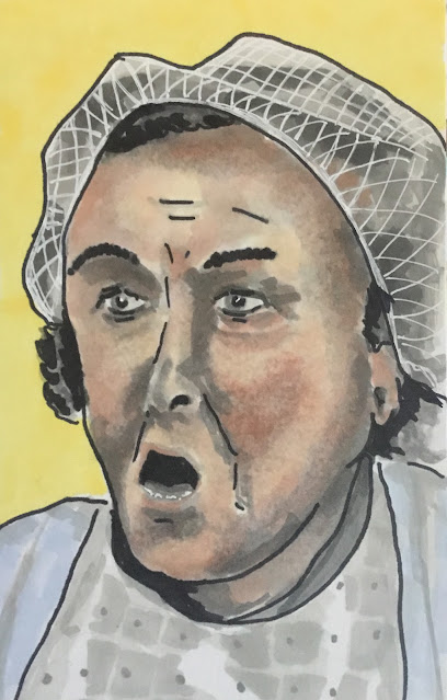
And here it is, the final piece in the On The Buses collection.  It's Mum, played by the late Doris Hare.  And, yes, I know, I've cheated here by copying a still from the opening credits.  Here come the excuses:

- I found Mum was a bugger to draw.  I made two serious attempts and didn't even manage a likeness of the character, let alone the actress.

- The thing about my collections is that I like them to be varied in style.  Just having a cartoon picture from the credits diversifies the style in the collection and actually improves it.

- Really there were seven characters in On The Buses and the seventh one deserves to be recognised for setting the whole mood of the show.  That forgotten character is Happy Harry.  Who was Happy Harry, though, I hear you ask.  Well, I'll tell you,  Happy Harry was the music in the credits.  And if having this picture of Mum in the collection makes Happy Happy Harry into people's heads, then it's doing two jobs.

But what about those rejected portraits?  Well here's the first, from a couple of days ago:
I just didn't like this one.  It could have been any generic old wrinkly.  I added outlines in black rollerball but that didn't improve things.  Then I tried using the blender pen.  It smudged out lots of the black rollerball lines and probably wrote off the blender.  I won't make that mistake again.

And here's my second attempt, from just after finishing Stan:
This one was based on a black and white photo, so started off as black and five shades of grey.  The idea was to add the yellow background at the end for a bit of colour to contrast against the black and white.  It didn't end up looking great, though, so I added some blue pearl to the cardigan and blue pearl and flesh tones to the face.  And I finished by adding black marker outlines.  But it's all wrong.  Everyone that looks at this will think Scrooge.  The face is just too male.  Too young too, which is another matter.  The blending of the colours in the face worked well, though, and the white gel pan gave Mum a good hair net.

Oh, and I've just seen Mum's hair is missing in my drawing from the credits.  Oh well.  Makes it look less like plagiarism.

Stan Butler

Number five in the On The Buses collection is Stan Butler, played by the late Reg Varney, equally famous for being the first person ever to use a cash point machine in the U.K.   Just like all the rest in the collection, it's clear who this is but the likeness isn't great.  Unless you cover up everything except the eyes.  I've nailed those.  I've got "the gaze".  But I'm sticking to this being my take on Stan rather than a portrait of Reg.

Lots of grey, blue and peach in the skintones today - I enjoyed that.  And I can’t tell you how satisfying it is to colour in all those huge areas of black.  And if I do all the black first, which I did on this one, the drawing feels half finished already and I don't feel under as much pressure when it comes to the face.

Anyway, just one more to go now.  A really difficult one and one that unfortunately doesn't come with the black uniform.

Wednesday 5 January 2022

Olive Rudge

Number four in the On The Buses collection is Olive, played by Anna Karen.

Recognisable but not a great likeness.  That's starting to become the theme of this collection.  This one also looks a bit plain compared to others in the collection, but someone might claim that to be genius at some point.   And I still have the hardest two left to go.

Had to put a green background in this one to start to even out the colours for the final collection.  I might have to stay off the blues for the last two too, if this set is to hang together properly.

Jack Harper

Number three in the On The Buses Collection is Jack Harper, played by the late Bob Grant.  This one has taken a while as my black marker and the darkest of my five grey markers both ran out without me having a spare to hand.  These are two of my most important colours with my chiaroscuro style, a style that's especially appropriate to these dark bus uniforms.

I used the black marker to make a couple of late adjustments.  First, I made Jack's face a bit narrower by covering up some of it in black.  Second, I put his right shoulder even higher than in my source photo to combine together the black shapes of the jacket and cap and to make Jack look a bit shiftier.

And, while I remember, a quick word about On The Buses.  When you bring up On The Buses in conversation, the first thing people talk about is the outdated sexism.  These people obviously haven't watched the program in years.  When I get to watch On The Buses, the thing that jumps out of it is the bulling.  The inspector bullies the bus crews, the bus crews bully the inspector and Jack, Stan and Arthur all bully Olive for being overweight and ugly.  And bullying isn’t bullying if the bully doesn't laugh in the face of the victim when something horrible happens to them.  Honestly, there's far more bullying than sexism in On The Buses.

Anyway, off onto number four now.