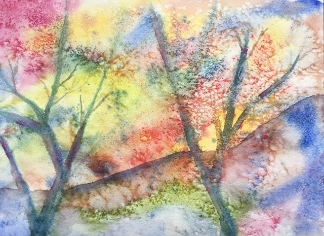
So instead I thought I'd paint some brambles and maybe have access to the iPad later to be able to find some photos for the closer detail. I started off with some Bridget Woods style wet into wet work. Rather than repeat yesterday's sensible sky, I went for random colours, using six primaries: French ultramarine, Prussian blue, quinacridone magenta, Winsor red, transparent yellow and Indian yellow. These colours feature throughout the painting, by the way, so it's not in any particular colour key. Before leaving it to dry, I added in a couple of trees by mixing up some neutral colour (the ingredients of which I've forgotten) and painting it on using Bridget Woods' dry into wet technique. I think my wet into wets were a bit too heavy - those are not gentle, airy background colours. So I also threw on some salt in an attempt to quieten down the background. I'm not sure whether it's quietened down the background or made it more noisy.
Before going any further, I decided to firm up the trees a bit and add a hilly horizon line (in place of one of the tree branches). In both cases I used Bridget Woods' "SOS brushstroke" to get a hard edge on one side of the mark but have it fading away to nothing on the other. Unless it goes wrong in the second half, her book's going to get a cracking rating.
By now my iPad was charged, so I was able to Google around for subject matter. I decided on cotoneaster, some Chinese plant from the rose family. I decided that there would be two layers of brambles, some in the foreground and some fainter brambles behind them. First up were the background brambles. The branches are a mix of transparent, quinacridone magenta and Prussian blue. I painted water on the paper first, then tried to queerer the paint off the brush into it with my fingers (another Bridget Woods idea). This didn't work for me, although it has done in practice exercises. So I dabbed the paint into the water instead and let it run around. I also added hints of berries in Winsor red. At this stage, it's pretty clear I shouldn't have bothered with the trees in the underpainting - this is all pretty planless.
Then onto the foreground brambles: I used the same neutral colour for them: transparent yellow, Prussian blue and quinacridone magenta. But I put on at least two coats to make sure it was much darker than what was behind it.
But things weren't quite right. The berries were not only disconnected from the restof the painting but were also too dull. So I did some timkering:
- going over bits of the berries several times with (opaque) cadmium red
- making the berries more exciting by dropping on water and dabbing it off
- trying to unify the branches and berries by glazing the branches in places with Winsor red and trying to merge the berries into the branch
- trying to bring it all together by spattering all over with titanium: white cadmium yellow and cadmium red
Don't ask me what order I did all these things in.
The final result isn't satisfying and this won't be going in the shop window. The worst thing about it is that the berries are so dull looking. They should instead be the stars of the show in dazzling bright red. If I ever do something like this again, I wave the berries at the start with masking fluid.
The best bit about the painting is this one berry. A one inch by one inch masterpiece.


No comments:
Post a Comment